Monday, 10 March 2014

Autobiography and Identity

I am conscious of the fact that I tend to see the negative side of things in my work, the black side, so I tried to remedy this by thinking about the wonderful and live changing experience of giving birth.

As a concept it has other meanings as it is the coming into being of life itself.  Where does the spark of life come from, what is it to be a person and have individuality, what future prospects are already intrinsic in a child's DNA or genetic make-up?  What are the potentialities, the proclivities in that foetus, all the ramifications of "nature and nurture", the questions of lineage and inherited traits, the idea of a future life as an adult and the joys and pitfalls of that specific life?  The ideas are vast and range from the big bang theory which created the universe where there are star nurseries to infinity where it is possible to imagine everything from ideas to aliens.

In order to try to capture just a small part of this wonderful and exciting prospect is what I have set out to achieve.  Yet the black side persists just a little and is represented in the words: "Rock-a-bye baby on a tree top", we all know how the cradle eventually falls, and this infers possible less pleasant prospects in the life of this original and unique form.

At the time of producing this piece I had recently been to the Paul Klee exhibition at Tate Modern.  When reading the catalogue I came across what I considered to be a remarkably apt and poetic quotation which I had to include in the painting, as it was so moving:

"What true artist would not like to live there, where the central organ of all time-space agitation, call it brain or heart of creation, as you will, is the source of all functions?  In the womb of nature, at the source of creation, where the secret key to all lies guarded?

In this way I have tried to include text that is relevant to the painting that enhances it without necessarily describing it.  It gives more meaning and is thought provoking in a way that I hope the image is too.  It was nice for me personally, to get away from collage as such which I find a bit limiting in scope, but that is due to my own inability to think creatively enough about it.


I did not produce a sketch for this for the reasons I have cited in the past, i.e. in robs me of sponteneity.  However, I did develop the idea using various images on the pc and produced images in Fireworks.  At one time I was going to include electrical pylons, as transmitters of communication, a sketch by Leonardo da Vinci, roots of trees indicating lineage and so on, some of which I have generated from Fireworks, some are sketches and some are photographs. I think what eventually decided me to produce the above was because it gave me the chance to include some positive colour, rather than greys and blacks. I have used acrylic colour as a basis for the work and have high-lighted and modified various areas with the use of oil pastel.


Appropriation of Text (On Kawara and Joseph Kosuth)

I have chosen these two artists, Joseph Kosuth and On Kawara, as their work appears in New Art in the 60s and 70s, in this way I have the opporutnity of looking and reading about their work, rather than merely looking at images without any idea of what I am looking at. 

The book quotes a questioner's remarks: 'Your work seems to have even less resemblance to anything we previously considered art' to which Kosuth replies: "My work is a continual kind of investigation...my primary concern has been with abstraction".  That Kosuth's work is a continual investigation is not in dispute, as I think most practising artists would think that, but as to "abstraction" the question of context and semantics makes it unclear as to what Kosuth is referring.  From his early work we are meant to understand the properties of his objects.

In terms of image construction or composition all available methods up until 70s and 80s are available, i.e. the field painting of Jackson Pollock eliminated "frames" to work and abstraction modified the way we once viewed an image as if through a window.  In a way Kosuth, in his Clear Square Glass Leaning is bringing the window to mind through metaphor and the properties of glass which might be a window. and how we might see through it or observe reflections. 

I think Kosuth in his pursuit of words as meaning and by substituting linguistic definitions for visual depictions strays outside of art into linguistics or ideas but attempts to justify it in the way that Duchamp justified his Mutt Urinal by saying 'if I say it is art then it is art'.  This statement clearly cannot stand up to scrutiny, I think only the purveyors and curators have the perogative over this assertion.  Kosuth is almost right in saying "Art as Idea as Idea" except I believe it should read' Idea is idea as idea,' it is not possible in my view to insert a unrelated definition, I think it is probably like positing a predicate. ipso facto: art as the cat sat on the mat. If visual form is dispensed with at the expense of language then the concept has changed from art to idea, which in my view is what conceptual 'art' is about.  To the conceptual artist, art is dead so he branches off into an ideas (as in philosophy) based pursuit which is interesting but it is not art (in my view). The essence of art being pleasurable or the word I prefer 'rewarding' is also lost so that the two main tenets of art, i.e. a presentation of visual form that has value, for amongst other things giving pleasure, are demeaned.

The difference between oriental calligraphy and child-like scribble are similar in that they both involve text, but one involves the artists hand and is about something other than itself and the other is, apparently necessarily, non-authorial and self reflexive.

The difficulties in using text is in relaying to the viewer its meaning.  If it reinforces an image or object then it might be easier to comprehend but without explanation it becomes an exercise in cold objectivity that  appears to go nowhere. Kosuth's One and Three Hammers is a case in point.  Kosuth wants to say that art is not concerned with questions of empirical fact, yet that is precisely what One and Three Hammers does say but in three ways.  It is actually four ways because the final image of all three represents the fourth. 

On Kawara's work, because it is conceptual , it follows the same Ideas based pursuit which has interesting things to say about the time life continuum which would have been much more effective if written up in the form of a thesis rather than trying to squeeze it into the narrow confines of conceptual art, where it does not fit, nor belong. I find some of these ideas presumptuous in the same way that I cannot understand Twitter feeds and social media.  Why is it important to know what someone else is doing in their daily lives?  Getting up, getting dressed, going for a drink.  It seems to me the height of self absorption and self indulgence which in itself is OK but it is presumptive to assume that I might be interested.  I think the whole thing has come about as the result of the so called cult of celebrity.  Why should I be interested?  I have met celebrities through real life situations but have never afforded them any special or hierarchical status, it is a ridiculous thing to do.  You might admire their work, music, films but why does that assume exceptional status over and above the great work of scientists, charity workers, thinkers and other "movers and shakers" who try to improve the world,  its environment and its people? (The same applies to Jean-Michel Basquiat's work). At least Kawara's One Million Years - Past, appears to have been produced as a book, so that it falls into the category of a literary indeavour even if he still wants to call it art. Shirin Neshat and artists like her who have something to say do not fall into this category because there is meaning in their work the message has value to a wider audience and is not merely an academic process.

The advantages of using found text is that, if you haven't got a pc you can find all sorts of nicely printed font types readymade, the 'readymades' of the linguistic world. The difficulty is finding the right words to use in appropriate places. Also a specific colour might work better than, say, black typeface, but it may not always be possible to find it.  The effect of white text on a dark ground can be more alluring that black on white, therefore it can have stronger force. The same applies to images, but that assumes you know what you want to say, if you don't and it is an exercise in shapes and colours with no meaning then there are no advantages nor disadvantages.


Text and Image as Biographical Image


Assuming the traditional rules of image construction involve definitions or values associated with: Colour, Form, Texture, Line, Narrative, Composition, Emotional response, psychological response, all or some of which the artist might use in producing a painting, then these rules appear to be skewed, or are insignificant, when considering Conceptual art.  There is a distinct rupture from the traditional art view, a step away from accepted sense perception ways of observing art to give pleasure. The word I prefer to use  in place of "pleasure" is for something to be "rewarding" as it avoids the issue of distinguishing between something being beautiful or ugly. Either of these two judgements can be represented by the word "rewarding" but getting pleasure from something that is ugly might be stretching a point.  It might be argued that because the written word can only present itself the message is obvious, if there are other interpretations to be surmised then they are subtle because they require explanation The polarity of the suggestion 'Is there a blatant or subtle message' does not leave room for the middle ground. which may well disclose something interesting.

If I consider the work Untitled by Jean-Michel Basquiat: it is black and white without dimension or shading, there is no created form, merely the static presentation of letters and words, texture does not seem to be involved, occasionally line might be relevant, the only narrative, is the personal expression of jumbled thoughts which are jotted down as one might write a shopping list. Composition or arrangement must presumably be thought about in placing the text, but I suspect they are random.  The only response is intellectual and even that is obscure. It seems to me that what one viewer might consider poetry is a jumble of doodles to another.  It is not possible to intuit meaning, no objective values with which to judge the merit of such a work, so without that I feel it is valid to say that in subjective terms I see little worth in it, as art.   It may interest a psychologist wishing to understand the persona or motivation of someone producing such ramblings but to my mind it is questionable as art.  From a visual perspective, it is unaffecting, I do not respond to it, it requires explanation.  Despsite all this I can see that expressions of ideas which have personal meaning and are relevant as a means of identity might be valid through a kind of individual list of word associations. In some ways it is a rather pruriant process, because of what might unwittingly be expressed through the sub-conscious, but this could also be argued against other styles of working. The comments I made in Appropriated Text and Images regarding "Celebrity" could also apply to Jean-Michel's work except that in his case it could be seen as a personal portrait in words so it may have validity on those grounds,  not as an art form but as an idea.

Tracy Emin's bed gives us an intensely personal view of her life that probably could not easily be presented in a more succinct way.  Some people see it as moving, I wouldn't go that far, but it is honest. I suppose if I presented the contents of the cupboard under my sink, or my wardrobe, it would be a similar revelation, the reality of what is personal to me without censorship.  It is akin to observing people in their conditions be those conditions harsh and wearing or bright and beautiful.  The painting of Courbet's stonebreakers comes to mind, except that the bed is in close contact with the body and therefore has all sorts of other implied interpretations. It might, for instance, be considered erotic.  Courbet's painting tells us more about social issues of the day, as well as practical ones. Tracy Emin's bed is something tangible presented to the viewer which could be taken as art whereas Basquiat's work remains doubtful. My argument could fall down here as he also presents something, it has some kind of value but in perceptive terms it does not have the same appeal as the bed, the latter almost being sculpture in the traditional sense, but the former is not really near to a painting in the traditional sense.


Friday, 28 February 2014

Collage Letter Painting

I felt rather at sea with this exercise as the letters are foreboding in the sense that they are cold and non visual.  In an odd sort of way the letters themselves were preventing me from being creative, they are so unforgiving and seemed to almost force themselves into my final large painting but not terribly well, and I had a block for a while.

I think you never enjoy what you are not good at, and I am no good at collage, particularly letters, perhaps it has something to do with learning to form them at primary school!


In a way I feel about these as I do about some conceptual art - what is there to say? It's not art (in my view), hardly creative and not purposeful.  Does it have any value? not that I can see.  An event maybe that may be intellectually stimulating but not visually so.  This exercise is an arrangement of various letters set in a meaningless way, robbing them of any sense almost turning them into objects in their own right.  It may be argued that some letters are beautiful in their form.  Certainly Far Eastern and Middle Eastern writing looks attractive, but perhaps the 'beautiful' is irrelevant in which case what replaces that?  What is the relevance of pasting individual letters on to the page?  I am struggling here but still willing.  I know what it is not but I don't know what it is. When analysing or appreciating a painting one thinks in terms of composition, colour, texture, perspective (if relevant), narrative, and finally emotional response.  I cannot apply these to these images so it is difficult to comprehend their meaning, they just are, a Cartesian thought.  It might be argued that Abstract Expressionism cannot be thought of enitrely within those parameters but is perceived as art because one senses the artists "hand".  I suspect that is where I find the difficulty with conceptual art using text. The pieces which I do appreciate are those which make the viewer consider his own relationship to the work.  I have read New Art in the 60s and 70s from cover to cover and considered the work of many of the artists but seem unable to find the value.  I am currently attending an Art and Philosophy class which may help me to appreciate these concepts more. 
 
I am finding with letters and found words etc., that I  am thinking as a graphic designer might think to produce a poster or advertirement.  I have produced the odd brochure on my pc and I find I am using the same value judgements and not strictly speaking artistic judgements and I can't quite define the difference, except to say one partakes slightly of craft (pre-determined ideals), whilst the other partakes of an open ended projection  of ideas.
 
Only two of the pieces above have a narrative and therefore give meaning to the letters.
The first is the one with the word "end".  I am interested in cosmology and understand that black holes consume matter, they are almost the dustbins of the universe.  But because they do not conform to physical ideas relating to the rest of the universe their gravitational pull prevents everything, including light from  escaping and therefore being observed.  I can't pretend to even begin to understand the science behind it but that very fact, as a lay person, enables me to visualize the possibility of black holes being the respository for lost souls, hence my picture.
 
The other piece is crator, or creator. It is almost too big a subject to be re-presented in such a minimal way. However, it is supposed that life on earth may have been started by a comet primed with particles in the form of  chemicals and trace elements from inter-stellar space crashing into the earth, thereby introducing the necessary elements for possibilities of life forms developing. Some of the essential "ingredients" required for this to happen linked with the right environmental conditions to promote growth and the sequence of life's chain from the primordial soup to the present day therefore occurred.  It is also interesting to note the similarities with the process of procreation in animals, the ripe egg being fertilized from a another source. It still doesn't quite answer the question of the "spark" of life, which is another matter, possibly requiring different premises and a whole bucket load of science to pursue the answer. What interests me is the progression in science which makes these contentious topics possible to comprehend, even if the science behind them is a bit of a mystery.
 
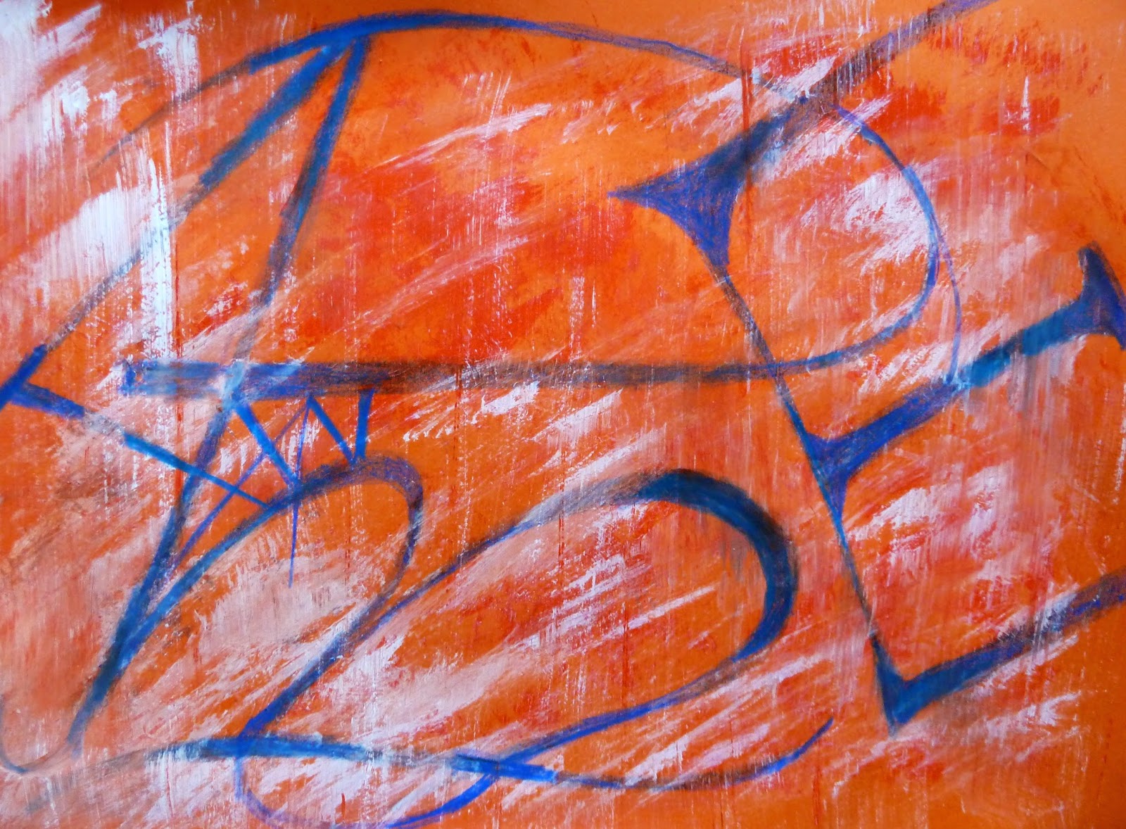
The piece below, which involved the human hand, is a little more engaging.  It actually includes all the letters of the alphabet and I tried to allow the oil stick to "walk" accross the page whilst at the same time elucidating the letters, albeit in different sizes and unconventional shapes. I thought the colours worked well, and the overall balance is acceptable.  There is the suggestion of texture with the white floating on top of the painting, sometimes obscuring, sometimes being obscured. It could be read as Abe, or Ame but "reading" the letters is not what it is about. If one wanted to elaborate it is the concept of the letters of the  Western Alphabet being the basis of  global communication over millenia.


The large painting in this group was equally hard to wrestle with and I am not sure that it was entirely successful but did have some redeeming features.  I used tissue paper from China as a background as I wanted to say something about the global influence of that country and its economic impact on the West - effectively the apparent reversal of fortunes,  with the West being pressed down and dominated by the East.  I felt happier because I was able to restore meaning to the  letters and because there was a message.  The Mondrian-like lines and boxes, came about as the result of looking at i-pads with their colourful blocked windows and I intended to colour them in that way but I felt it would break down the homogeneity of the picture if I did that. The arrangement of the lines gives the painting its main construct and balance.  Buddhism isn't the religion of China but it stands between East and West spreading the branches of enlightenment in all directions, almost mediating between the blocks of power. The letters have been re-assembled from the letter paintings (above) to form a slightly more co-ordinated picture. I chose yellow (it is the colour of the royal emporor) and also of the sun which rises in the East. The dragon, one of China's important symbols breathes fire on the West euphamistacally causing its destruction. Red lettering is politically the colour we think of for China, it is also a colour that can represent war and agression as in the red planet Mars the Roman god of war, as well as the dominant colour of the flag of China.


Thursday, 27 February 2014

Word Painting


The first word painting uses images of the old Red Fort that may or may not still exist off the East Coast of England.  It was certainly there when I sailed passed it as a young person with my father and sister; it was the most eerie thing one could come across at sea. I have used the internet to discover images of it so I assume it is still there.   I have used the words "red fort" and "red faught" to give meaning to the images not only by naming the constructions but to infer their purpose. As they decayed they certainly did become red. The  use of the colour has obvious connotations., not only of rust and decay but of blood and warring aggression.  I have used printed labels which is the nearest I can get to sinking the image into the paper, I would have preferred to have printed straight on to the paper but it is too thick for the printer.   However, by using the lables I can re-position them at random, and cut them up as necessary. Rauschenburg used silk screen printing to achieve the effect of an image appearing "in" the paper and it is his work that has inspired me.   I wanted to use the four holes on the left to imply the barrel of a weapon, punching out the letters "Fort".  The image for me is a recollection of happy times, yet in themselves they are fortifications for the protection of our island whilst at the same time being aggressive weapons in order to carry out that task.


My second image uses a similar technique to the above with the addition of printed swags using foam impressed into an object which had a raised surface, thereby making a printing "block". I liked this form of image making but it is rather precarious as I can't source the right magic foam in order to make the block, so it is a bit limited.  I have used an image I have used before which is of the multiple heads of a child.  Printed in black they have a sinister look which reminds me slightly of Richter's grey images of the Badermindoff gang.  I wanted to get a sense of the untoward, slightly mysterious, unsettling feel to the picture as it is meant to imply a victim of child abuse.  The text (EY)Escape utilizes the word Eye and Escape to invoke the feeling I am aiming for in the picture. The fractured black section on the right can be read as a man's face in semi profile.  The red eye represents anger but is also has other implications, the idea of a wild animal or of a mystical creature of the night.  The use of brightened eyes is used a lot in such programmes as Merlin and insights the unknown magical powers in the viewer.  In this case it might imply a resolve to Escape. The lips are blue, and are restrained i.e. without any emotion.  Whatever psychological/emotional activity going on is inside her head.


The third image is the Large Work (A2), and has the word Ambivalence. 

I had taken some photographs of my own shadow and decided to manipulate them, reproduce them in different colours then print on to newspaper.  The latter was risky as newspaper likes to  jam up printers!  However it worked in all but one case when I quit whilst ahead. It occurred to me that in philosophical terms one's shadow is both you and not you, this ambivalence I felt was interesting.  I also liked the fact that the image didn't look like a horizontal flat image but an image standing up, another ambivalence worth noting.

The idea of being there and not there occurred to me with regard to collapsed or collapsing buildings and I thought of the church at Covehythe, of which I also had images.  I decided to include the windows with the remains of tracery, and there are times when they look like church windows and, sometimes doors and sometimes buildings, more simultaneous contradictions.  The tracery in the middle window was made from Chinese writing, it may well say something quite inappropriate, but that in itself would represent a further uncertainty, or ambivalence.  I used some textured wallpaper on the right of the painting and although it doesn't show much from the photograph, the actual effect is like that of stained glass.  I enjoyed doing this as it involved many aspects of creativity, i.e. pc generated images, text, experimentation with newspaper printing, wallpaper texture as well as developing the concept.  I felt the colours worked well and I that the composition is a satisfactory and balanced one.  John Piper did paint Covehythe and I felt some of his style is influencing my work here probably more in terms of colour than mark making. I tried to use the slanted words to indicate light source from the windows.  The shape of the legs from the photographic image also formed an arch thereby echoing the Norman church window , effectively bringing both images together.


Found Text and Images


Using found text and images brings the artist into closer contact with the active world around him and in turn this world is projected on to the viewer, so that he/she gains a similar insight.  It is a novel way forward for the artist to explore and introduce a reality that is in direct touch with a world that is, at the same time, both familiar and out of the ordinary. Text defines in a way that a visual does not.   It is, of course, possible to be ambiguous with the written word but its explicit nature determines meaning more clearly and without going through a process of interpretation as with an image. They can be arranged as "banner headlines" or page text, reversed or turned so that they almost become images in themselves.

The nature of an image enables more interpretations to be speculated about. Just like text, images can be cropped, turned, flipped, mirrored or enhanced, even turned into 3D shapes. Both image and text can use colour or, like an old fashioned print, be more powerful in black and white.  Using both image and text can produce tautologies of meaning but can also affirm ideas or reintroduce new ideas, depending on the way the images and words and used and their juxtaposition. They can be skewed therefore not only to present fresh ideas but to reinforce a message or idea. Words and phrases can be stripped of their meanings by taking them out of context and re-introducing them into hostile placements.  Used in this way it is possible to play with the conventional means of perception and confuse the brain of the viewer, for example using the text "red" but colouring it in blue and so on.  By this method it is also possible to question conventionally received ideas about reality, and so cause the viewer to wonder about the apparent norms that direct his thinking, in other words to see the world in a different way.

"It could be argued that the heart of Conceptual art in the late 1960s was not, as is often stated, the notion of the artwork being essentially linguistic, but rather the notion that it was simultaneously linguistic and visual.  It is certainly true that the combination of text and photograph became increasingly its archetypal form" (Godfrey, pp.301-2)

The profusion of paintings, photography, digital graphics, pc generated texts in various fonts, appropriated text and images from magazines and books, advertisements, posters, etc., are  all valid sources in this genre.

Ed Fella uses found text in a minimal way just using a letter or part of a word. It enables him to deduce real parts of the city by photographing small elements of city life. Jessica Bakhaus works in much the same way. 

Saul Steinberg has a sense of humour in his art, intermixing real objects with hand drawn images, and uses text rather less than other artists.  His style is almost cartoon-like.

Saturday, 22 February 2014

Sainsbury Centre, Norwich - Art and East Anglia

The exhibition was a diverse collection of exhibits and objects with links, sometimes a bit tenuous, to East Anglia. There were sculptures ranging from Elizabeth Frink to ancient Romano-British, gold branks and bracelets from antiquity, silver gilt, the Concort's throne (it's link was through Houghton Hall where it is normally housed), beautiful Fabergé animals.

The exhibition was for me, very successful and included a number of disperate artists, ranging from Anselm Keifer, Mary Newcome, John Constable, Ivor Hitchens, Paul Nash, Colin Self, Cedric Morris, L S Lowrie, John Piper, Fabergé, Stubbs and Claude Lorraine, amongst many others.

The Centre also houses a permanent exhibition which included works by Francis Bacon and the wonderful sculpture of a running man by Boccioni.  The latter for me was the highlight of the day as it was unexpected, yet so familiar to me from illustrations.  It was a moment similar to the one I had in Russia when, in the Pushkin Museum I rounded a corner to be surprised by Degas' Blue Ballerinas, it was so breathtaking.

It was also a delight to see the Mary Newcomb works, The Apple pickers' feast, and Apple pickers going home. They were small pieces but so identifiable as her style.  I believe she worked canvas backgrounds initially storing them ready for use.  It highlights for me the importance of working backgrounds.

There was also work by Venessa Bell using distemper on paper mounted on to canvas, a technique apparently used by Thomas Gainsborough except that he would have used oil as a medium, not distemper.  Another of her works was printed on linen, and this enabled the image to sink into the linen.  A technique that I want to try to emulate using Silk Screen Printing in the same way that Rauschenburg printed his canvas.  This too has the effect of the actual canvas containing the image rather than it being applied on top.

A number of John Piper pieces adorned the walls, which I was pleased to see as I admire his work and feel he is very under-rated, not only for his paintings but for his stained glass too.

The Fabergé pieces was lent by Her Majesty the Queen, presumably from the Sandringham collection, and I particularly liked the Mouse with its delicately set tail in  exquisite small diamonds.

John Constable's Landscape with a double rainbow was on dispay and one oil on paper Study of a cart and horses with carter and dog, which was  sketchy in style and therefore free and more spontaneous.  There were also a number watercolours by John Sell Cotman including Storm on Yarmouth Beach.

A beautiful Keith Vaughan gouache was on display with its subtle colours and interesting composition.  I don't know much about this artist but will certainly look him up.  Likewise there was work by Martin Bloch, whose subtle palette I am now reading more about.

Altogether an inspiring exhbition which could easily be seen for a second time to discover other delights.