Thursday, 14 May 2015

Tutor Report MM Pt1


Open College of the Arts
Tutor report


Student name  
Sylvia Philpot
Student number         
503311
Course/Module 
Painting 2: Mixed Media
Assignment number    
1


Page 1 of 1

Dear Sylvia

Overall Comments:

Many thanks for your First Assignment work.


Overall Comments:


This is good start to the course with some paintings that are showing promise and potential. You seem to be very confident with construction and I am impressed with the amount of work you have produced in your sketchbooks and log book. There is already evidence of creativity and I like your open, experimental approach which is helping to develop your ideas and concepts – There are some issues with strength of design, use of colour and more critique rather than description in the logbook but I can only see that you have the potential to do well on this course.


Assessment


 I know that you are doing this course with the intention of aiming for the degree in Painting/Creative Arts. I am also aware that you are using the OCA website and hopefully contributing to the forums. It is also important that you occasionally post work on the site for comments by your student peers and gauge your work against that of other students on the same course.


Please also look at the summary of Assessment guidelines and ensure that you are aware of the standards expected. Also make full use of the student resources on the OCA website, look out for recommended exhibitions to visit and consider attending Study Days. The use of the resources and the attendance at Study days will help to improve your approach to your online blog and sketchbooks.


Assignment Presentation

Please can you ensure that your proposal includes your name and student number and that you include details of your blog address with your assignment. I had to trawl back to your student profile to find your blog address.


I would also request that you follow OCA advice and send your work in a plastic or polypropylene portfolio A2 that is lighter and save on postage. This can be sent without wrapping as long as you seal over the clips with strong parcel tape. Many students send their work to me now by this method and it works well. You can choose to send work by parcel post, signed delivery or parcel force as long as the weight is less than 2 kilos.


I will give you more feedback on your Assessment potential once I have seen you second Assignment to give you time to settle to the course.


Feedback on assignment


The work you have presented for this assignment demonstrates

Competent technical and visual skills, a competent realization of ideas, presented well showing judgment. There is a reasonably effective grasp of ideas and communication of visual concepts. There is also evidence of creativity and risk taking with imaginative and successful outcomes. (Assessment Criteria) – this description give you some idea of your standard based on this initial assignment.


If we then look at your physical texture piece, which is a very good start, we are given the message you intend –that of a distorted visage of a corpse that has been tortured and sacrificed. This has archeological connotations (context) which link back to not only the sacrificial images of Peru but also (closer to home), that of the peat bog sacrifices in Ireland and Denmark. You also mention the influence of Anselm Keifer in terms of the colour and texture, which is good.


However I would push you a little further in terms of context and suggest that you look at the work of Jean Fautrier – A now rather overlooked French painter and an exponent of Tachisme whose paintings and sculptures in the hostage series reflect the experience he had of being captured by the Gestapo and hearing the tortured cries of their victims


The design of the image works quite well in that the incline and twisted nature of the cloth and heavy impasto emphasize distortion and writhing pain.


The impact of the image in terms of the use of the colour of the materials, cloth/material tone and white impasto is good but rather obvious. I would therefore point out that Fautrier does not have to use blacks or obvious symbolism to convey the terror and intent in this hostage series which are varied in colour and are highly effective symbolist works.


Moving on to your second painting – the Red Bull collage – this collage has an impact on the viewer in terms of the colour, the use of text, lettering and numbering and the palimpsest nature of layering, which reveals and conceals. However much of the symbols employed are not really evident until we read your description and evaluation. I wonder therefore if some of the images of the bull should have been made more explicit for your viewer as a focal point or points – – Is there more concealing here than revealing here?  And this also raises a question about the thought behind the placing of the collage – is there a plan or purpose to the placing of letters, numbers or symbols?  I would also direct you to think about your support and the shape of your support. Why did you use a square board for this image? Is there an element of framing here or is the image part of something much larger? What would be the purpose of framing this image? Could you have made the whole support into the shape of a bull and how would that have affected the decisions about the placing of the collage? –Think about Picasso and Braque’s original intention when they invented collage – to break up or interrupt the picture plane – is your image doing this or is it just a synthesis of ideas that convey harmony rather than dystopia?


Sketchbook /Exercises


This is a very good book with a good range of textural experiments, collage, decoupage and photgraph-based images.

You have followed the exercises very well and your sense of colour, use of materials and design is improving with some exciting outcomes. This is very thorough background study and the variety of outcomes shows that you are questioning, researching and gathering influences from artist as diverse as Piper, Klein, Tapies and Schoolwerth. Please keep up this level of research and investigation.


Learning Logs/Critical essays:


 Please try to include more critique in your logbook/blog. You have understood that the logbook is partly a vital diary of your progress through the course, self -appraisal/practical understanding of the course projects. However the blog must also show evidence of continuous questioning and cognitive thought. You do this to some extent but your approach can also become too descriptive. The assessors want to know about process but they want to know more about your thought process, intent and evaluation. Look at what is working in your work and write notes about it and do the same for what is not working. Evaluate your work in terms of Concept – the message to your viewer –explicit or implicit – your intent – why are you doing this piece of work and what do you want to achieve by it? Unpack your thought process; Construction/composition – do the forms (figurative or abstract) look correct –is the design working? How do the decisions and restatements you are making improve or detract from your intent – e.g. the design emphasis and the message in the work Context – influences from primary sources (location, artifacts in galleries, artists work or objects, buildings etc), secondary sources – internet, books, artists, articles, journals/magazines; Also a conscious understanding of how these influences can be absorbed back into your work and finally do not forget to analyze the use of colour, tone, use of material ( including justification ) gesture, mark –how these help to change or express your character in your work – unpack your personal research, analysis and self –reflection.


Suggested reading/viewing

Go to the Tate Britain and look at the Painting Now exhibition, which includes the work of Tomma Abts, Gillian Carnegie, Simon Ling, Lucy McKenzie and Catherine Story.  Please also look at artists such as Richard Artschwager, Hughie O’Donohugh, Per Kirkeby, John Hoyland, Dorothea Rockburne and Elizabeth Murray.


I would also recommend reading a Thames & Hudson Book by Suzie Gablik called Progress in Art – this is a book from the 1970’s and you will find it on Abe books – this books helps you to understand perception and the cognitive thought processes of both artists and viewers.


Pointers for the next assignment

·        Think more about the wider concepts of your use of calligraphic marks and text in terms of design, message/meaning, supports used, framing


A good start to the course. Well done.


              Yours Sincerely,


              Richard Liley


Tutor name:
Richard Liley
Date
28/11/2013
Next assignment due
12/2/2014

MM Proposal Part 3


MIXED MEDIA
    PROPOSAL FOR Part 3

Appropriated and displaced Image


For me the idea of using my own photographic images which may or may not have been enhanced and incorporating them in my art work is an exciting way to approach art.  I therefore propose for one of my large paintings to pursue this idea and use such images in a fairly abstract way developing the quirkiness of the image rather than its reality.  This can be achieved by enhancing, cropping, reversing etc. in order to find images that cause one to be bemused by what they are or were part of.

I shall be drawing on work by Rauschenberg, Daniel Pitin and hopefully Richard Hamilton as I intend to go to his exhibition at the Tate.

When it comes to a message I will need to continue to think about that but I suspect it will either be political or something to do with the lives we lead and the journeys we make emotionally and physically or maybe a combination of the two.  Maybe even something on my mainly negative view of conceptual art, though that may not go down well, and who knows, perhaps I will slowly be won round.  If it changed to conceptual thinking instead of conceptual art, I might feel happier. 

I am continuing my course on Philosophy and Art and am hoping conceptual art as an exhibit might be discussed.  That would be very welcome.

 The fractured image looks interesting, I have never tried anything like that so will have to see how the exercises work out but I suspect it will be nearer to my way of thinking whereas creating a shaped painting would for me is too close to craft. I might use shredded paper, which has often seemed to me to offer potential as an art material. Recycling at its best!

Alternatively the Multi-part image appeals to me as it is reminiscent of Monet’s early paintings conceiving haystacks in different lights and moods, through to Warhol’s repeated images also Jasper John, and Sol le Witt and finally conceptual art, where the photography  Bernd and Hilla Bercher, photographed series buildings. A lot to think about.


My first large painting pretty well followed the idea of using found images as collage together with some overpainting.  My intention was to keep the images simple as this was something my tutor suggested.  I wanted to use the idea of journies and incorporated a reverse negative picture of someone driving with a passenger.  The curved shape top left hints as distant space with small moons, i.e. the sky is the limit.  I did like the idea of using black and white but with just a hint of colour.  The house has a gate and someone is about to enter it on the left, suggesting an unknown journey.   I also discovered a derelict house with blackberries actually growing inside with an old fridge and felt this represented a sort of psychological journey a place where someone lived and time has advanced and started to consume the space.  On the bottom left I used the sole of my grandson’s shoe to represent walking. The grilled bottom right represents the unknown journey that we all make through life. The process worked well and I didn’t encounter any problems - if something is going to work I find this often happens. 


My first medium sized painting represents the two hanged teenagers from Pakistan.  The background is a collage of ladies in saris.  I remember being impressed by the beautiful colours worn by ladies in India despite the squalor of their surroundings.  These images represent the way women dress to look attractive, yet in this case it was a secondary cause of their demise. However, the painting did not go well, the tree was too strong initially, I toned it down but then the painting lost something, finally I emphasized some of the collage shapes.  I am not sure that it worked even then.


I was pleased with the mixed images i.e. with the bird on the tree which is also the hair of the woman behind, and using the eye to represent the head of the hanged girl on the right. My intention was to show their innocent downfall which was only caused because they attracted someone whom they fell in fell with, but not chosen by their families. Every woman wants to look attractive as the colourful saris infer.I also included hand painting which is done for legitimate weddings, but in this case I added the stigmata.


My second medium sized painting used multi-imaging, which I originally thought I might explore.  I liked the image I had created in Fireworks with the woman on a background of sea creatures and waves.   I felt her hair was like foam and decided to create a wave type painting.  I had been reading a book on Blue by Michel Pastoureau which featured the Wilton Diptych and I felt my women in the picture had a degree of similarity with that image.  I included the butterfly because whilst I was painting this a butterfly got trapped in the lantern roof of my studio and I felt sure it would die The following day I could see its antennae high in the roof but I couldn’t reach it;  eventually I decided to get some stepladders and fortunately was able finally to release it, so it had to appear in the painting!  It also provides a nice contrast to the blue. I did not have to struggle with this as I did with the previous painting.


I used a background of various blues in acrylic paint, applied pure alcohol to get the paint to make watery shapes, then stuck the images on the board, I tore parts of the images off then over-painted using acrylic paint and oil pastels.  I think I have captured the turbulence of the water beneath a wave and am happy with the final result. I did wonder about painting the halos of the lady gold, but decided against it as I think it would conflict the watery nature of the piece.


Sylvia Philpot 503311

Friday, 13 February 2015

Final Reflections Mixed Media Part 5

I said in my Proposal for this Assignment that I felt way out of my depth because of the practical/craft skills required.  I felt I did not have a non-visual skill set and felt inadequate for a long time, but I knew I had to "bite the bullet" so I reflected for a considerable while on possible projects.  I didn't know if they were silly and a waste of time, or if I thought they may have plausibility and if they did, whether I could be successful in their rendition. 

However, the first exercise gave me a smidgen of encouragement, as I felt I had pulled together the concept and the expression of it together with subject matter that was relevant to it.  It was influenced by the Jean Tinguely work illustrated in the project notes, and I was concerned that it might not look as though I had given much thought to the project because I drew upon an illustration that appeared in the notes.  That would have been my only reservation.

The tableaux or Diorama was interesting for me because I expanded it slightly to include text and illustration by way of a Conceptual piece, which I felt added to it as a Tableaux/Diorama. It was also light-hearted, which is something I don't often get to do in my art.  It therefore offered an opportunity to create a multifaceted object with crafted apple cores; a found object in the processor and a tableaux incorporating a real life situation.  I was happy with the references to Marcel Duchamp, and the Womanhouse by Robin Weltch which I felt worked really well.  The idea of Work in Progress was twofold, it referenced the male/female inequalities, which are still not addressed  as well as to the piece itself and I felt this was equally effective. 

It would have been nice to do the bottle bank idea but I don't have a vice and workshop so wouldn't  have been able to put together a frame of the sort I was planning.

The limitations I professed at the outset were considerations I had to overcome by the choice of work, so my options were somewhat limited by my ability to undertake work outside of my inadequate skillset and facilities.

As far as Witches Wood is concerned, I had this project in mind sometime ago so had been taking photographs in various weather conditions.  It would have been nice to have uncovered some local history, even if it had only been anecdotal, but my research didn't come up with anything.  However, with the link to the Witch-finder General it begs the question and leaves it to the viewer to speculate the existence of the wood.

The final project didn't quite end up as my proposal but metal was the material that persuaded me to pursue the Final Project.  I had been reading some Philosophy on the subject of the cosmological argument, which is always very interesting hence the subject matter.

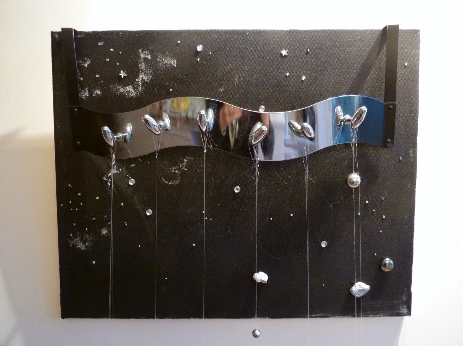
The tying of various pieces of metal with micro thin line was a test in itself and the small pieces of rock were the most difficult.  I had to glue the line to them before tying them as the line kept slipping off.  I was also slightly uncomfortable with defacing the wall of my studio with the graffiti, it was similar to how I felt when painting the frame in an earlier project.

I think there is a lot of scope with 'objects' that I hadn't previously realized.  Indeed the whole idea was completely alien to me, but with the right tools and facilities I can see that this would merit further exploration.  Scale is one of the things that is difficult to achieve for the same reasons, and I feel the success of a work is dependent on or constrained by matters relating to this issue. For example one can imagine Space and Time being exhibited in a gallery space with much larger elements but pragmatically up-scaling equals commercial support both financially and with appropriate equipment and labour.  Such up-scaling would give the piece more gravitas which may be missing in my attempt.

I could have tried to sculpt Einstein's equation from polystyrene but it would have required a hot knife.  I tried with an ordinary blade but I could see it would not work, then I thought that using the wall itself in a graffiti style would add to the piece, by bringing it into the modern world of art.  Using spray cans on a large wall would be great.  I am thinking of a space similar to that used in John Ahearn's Homage to the People of S. Bronx.

I am still hoping to get some hands for my 'Time-piece', and will have to see what might be available at a car boot sale.

Despite the trepidation with which I started this assignment I feel I have achieved more than I expected.

Critical Review - The Creative Process


INTRODUCTION


I find myself pondering how it is that what I consider to be the decline through the 50s and 60s of the visual arts has come about.   The tendency is to apply:  philosophical, political and social definitions and concepts to a non-symbiotic world or discipline.  These concepts are not irrelevant but in my view are peripheral.  In order to arrive at a different, more accessible interpretation of the art world I consider that not only must the language change but different perspectives are needed to add more pertinent weight and depth to the understanding of the creative process.

 CONCEPTUAL/TRADITIONAL

The Conceptual creative process is almost the reverse of the traditional aesthetic approach.  A concept is conceived almost as a textual document and this equals the art, moving away from authorial ownership towards self-reflexivity so that a work reveals the process of its own making in order to avoid the illusion of art.  Yet, it seems to me, it is the illusory nature of art (artifice) that opens doors to emotional reaction, thoughts and ultimately an understanding of the work before us. Without that imaginary veil I wonder if access to our hidden/subconscious perceptions is limited.  Would we merely perceive in a direct retinal, or optical way minimising the artist’s psychological motivations? In the case of conceptual art would the viewer look, see, then move on, without being beguiled or inspired? Conceptualism appears a cold methodical way of working that has little in common with the ethos of art as an emotionally rewarding activity for the spectator, or does it offers more, a ‘mind mapped’ view of our world? Greenberg says  “The essence of Modernism lies ...in the use of characteristic methods of a discipline to criticize the discipline itself – not in order to subvert it, but to entrench it more firmly in its area of competence”[1]  Is it that the engagement of the viewer is no longer important, or does the viewer need to become more informed?  Conceptual artistic value is difficult to interpret and award; the hard work has to be done by the spectator from very little by way of visual clues. 

To compare the thought process between these two approaches would be interesting but I am insufficiently familiar with the conceptual approach. However, I will do my best to outline my personal method and try to assess where the conceptual artist might digress.


CREATIVE PROCESS

How does the creative process begin?  This is my brief, speculative interpretation and is probably far from the truth. Benjamin and Adorno viewed artwork “as the space in which the experience of thought can be exposed to its own potentialities, contradictions, and conditions of possibility”[2]  I would venture to say that is a pretty good description of the brain.

It seems to me that an initial “idea” a sort of spark is triggered in the brain probably by some electro-chemical mechanism, possibly called a neuron, which lights up like a small starburst – a “flash” of inspiration.  It is interesting here to compare a starburst with similar images, explosions, the big bang, starlight, cancer cells, nuclear fission, sparks; they all have some sort of nucleus with emanations leading off in diverse directions, and are associated with creation or destruction. 


THE CREATIVE THOUGHT (IDEA)

However, returning to the “idea” -  pathways whiz off to various other networks triggering all sorts of related ideas.  For the sake of clarity, the example “idea” is that of the bull (which has featured in a recent painting).  So “bull” has lit up somewhere in my cerebral cortex (?) That thought triggers all sorts of other ideas and now sparks are firing in all directions: Spain, Picasso, bull fights, birth sign, strength, stamina, black, horns, smell, danger, bulk, death;  the neural pathways are alive with activations that are spreading further and further a field, colour – red, black, texture, Guernica, fear.  Yet this all takes place in split seconds, and is not defined by any language easily transmitted.  The conceptual artist is probably stimulated by different things at this stage, probably from his left brain.

Wittgenstein[3] says that Expression depends on idea of intention to express a meaning, this will or intent comes before verbal or visual consolidation and is therefore internal and private to ourselves but unknown to others.  He goes on to say that a word’s meaning is established in its use and that words become a sort of language game, they are learned and practiced interpersonally and gain credence and meaning in that way.  He therefore asserts that private expressions make no sense as they cannot be articulated.  In semantic terms, I feel he conflates “words” with” ideas” in the term ‘expression’.  Ideas can be expressed visually even without a meaningful linguistic vocabulary to express these private thoughts. It is through the process of shared visual symbols that the viewer might experience mutual understanding. The Jungian subconscious springs to mind.

I assume conceptual artists will experience academic and linguistic thoughts relating to his project.  Back to my “idea” lighting up the circuitry of my brain.  This thought has to be realized in some way so I invent the simulacrum of a canvas support in my brain where I might attach the “idea” of a bull.  The move towards actual realization is probably occurring in a different part of my brain, it feels different, it feels more substantive, less shadowy.  I am still being bombarded with distant links, I recall witnessing a bullfight, I think of my Spanish holidays, and I am reminded that Taurus is my birth sign. My thoughts are going off-piste, I have to control and guide them towards the prospect of creating a painting. With these sub-thoughts appended to the main “idea” I have to find a way of making choices, or will my brain do that for me?  Will the low light starbursts disappear off the radar leaving a manageable number of selections from which to choose or am I focusing on the more interesting/relevant elements?  I don’t know.  However, my library, which will be unique to me, will have similarities by way of Platonic “forms” (for want of a better description) in other people’s minds, and this, I conjecture, is why generic symbols are ubiquitous. The conceptual approach might be similar though the personal library could be quite different.

 
BUILDING BLOCKS (Referential Hooks)

There are timeless conventional building blocks used in the creation of a painting, and regardless of the desire by some contemporary artists to shun their worthiness, they remain valid, i.e. colour, composition, texture, media, support, perspective (?), certainly in terms of a painting, maybe not so much for an installation and conceptual art.  These are inevitable functions of the creative process, which at least Francois Morellet[4], painting in the 50s did acknowledge.   But I am ignoring chance and probability.  Is this something that needs to go into the mix or by its intrinsic nature will it occur anyway? I think the latter, as one can never have total control over one’s work and neither would it be desirable.  So this part of the process is relatively easy, colour I know should be red.  I have been studying Klein’s monochromes so that confirms my decision.  The bull happens to be my star sign and now I am thinking of my birth-date and rendering letters and numbers, texture has to be relatively flat but interesting.  Another lot of starbursts as further possibilities come to mind.  I also think about the Guernica bull and how I might incorporate that and the photograph of a bull taken in Spain.

These ideas are now cohering on my mental canvas and are arranging themselves but they are still in a state of flux.  How do I achieve a balance (i.e. composition), is it desirable?  If not, what attribute replaces it?  Indeed, is an alternative necessary?  I find it difficult to grasp the idea of something being cogent and mindfully constructed yet relying on effects engendered entirely by random chance.  My thoughts vacillate, as random elements have an appeal, much as automatism appealed to the Surrealists, and Abstract artists relied on its magic too.  These thoughts I sense will only become manifest when I begin work.  Shall I use collage?  I want the look of torn posters and I have a photograph of some worn, torn posters of Queen on a wall in Spain, I’ll print those and use them as collage.  For the support, I will use hardboard, without gesso and I’ll scribe it with a knife to add texture, the blade that kills the bull.  My thoughts are emerging, coalescing into the visual realization of my initial “idea”.  I am nearly in clear air where the actual work can begin.

PRACTICAL IMPLEMENTATION

I have done the mind work, the real work will involve taking decisions but most will be instinctive rather than worked out pragmatically, because for me that is where the creative energy takes over, working both internally and externally, which is what I believe Jackson Pollock and others have meant by being “in” the painting.[5] The “idea” is conceived in the mind and is shuffled off the simulacrum canvas only to emerge on to the real canvas yet somehow the mental thought processes continue to inhabit it, so that the two canvases seem to converge in an indefinable way. The eventual outcome evolves in unpredictable ways, because the control mechanisms of the mind are somehow sublimated to the creative process itself.

The real empty support is in front of me. I now have to assimilate some sort of order to my thoughts.  First, I scribe the hardboard with a knife.  Fontana, left it there and submitted slashed canvases for his artwork.  I will go further. I will use little texture but need to sink some colour into the surface as it will be very absorbent without gesso.  I apply red acrylic paint and texture it with a brush, cling film and impasto.  It’s good enough as a monochrome right now, interesting surface on which to work. I think about the collage element:  photos of some red peppers (implying intestines), photos of Freddie Mercury,  a photo of a bull construction.  I work freely, the bull will dominate and I add collage that will work as a Bull’s eye.  I stencil my birthday in individual letters and mix them up creating “I am” Descarte’s expression, as well as “i bull”.  I continue staining the collage and adding black to give more contrast.  I make marks with oil pastel, and add pastel powder for texture.  Once “in the zone” or “in the painting” ideas keep coming and I am balancing the painting, adding collage, paint and texture gradually building up the whole thing until it becomes a harmonious coherent piece of work.

 
BETTER FUTURE UNDERSTANDING

If a discussion of the creative process leads to better understanding then we will have an improved experience of the art world. It will enliven and deepen our interpretation of works of art hopefully encouraging a wider, younger audience. Process Art reveals rather than conceals, but does it ‘throw the baby out with the bath water’ by eliminating artifice?

With artists like Grayson Perry http://www.bbc.co.uk/programmes/b03969vt  we are being introduced to more interesting exhibits that amuse as well as excite the viewer, and through his Reith Lectures during October 2013, it is clear he is in the vanguard of a more positive validation of art appreciation.

Perhaps the timeless “building blocks “ are back, and with them the creative process, works that give appeal to the eye and the mind - we may no longer be corralled into black corridors looking and listening to digits and text, mirrors and sounds,  thinking: what am I supposed to be thinking?


Source and Reference material:

Art since 1900, Hal Foster et al, Thames and Hudson, published 2004

Shock of the New, Robert Hughes, published 1980, Thames and Hudson

Aesthetics, Alessandro Giovannelli, published 2012, Continuum

New Art in the 60s and 70s, Anne Rorimer, published 2004, Thames and Hudson


[1] P.11 Clement Greenberg, New Art in the 60s and 70s, Anne Rorimer, Published 2001, Thames and Hudson
[2] P 147 Walter Benjamin and Theodor Adorno by Gerhard Richter -  Aesthtics edited by Alessandro Giovanelli,  published 2012 by Continuum
[3] Source and Reference material: Art since 1900, Hal Foster et al, Thames and Hudson, 2004, Johns and Stella, p.407 Ludwig Wittgenstein
[4] Source and Reference material: Art since 1900, Hal Foster et al, Thames and Hudson, 2004, French Conceptualist painting, p517
[5] P 313  Shock of the New, Robert Hughes, published 1980, Thames and Hudson

Final Project

My final project is influenced by Cornelia Parker, Anselm Kiefer and Jessica Stockholder, and combines objects, images and graffiti.

The work represents time and space and can be read as a diptych, triptych or as individual pieces.

Taking the piece on Space,  I am connecting not only the subject matter within a spacial area but the concept  of traditional painting by relating it back to the wall by  following the conventional practice of  hanging paintings on the wall.  At the same time I am  projecting it forward into observable space, suggesting the idea of making art part of the gallery space not merely adhered or appended to it.

The canvas takes the idea of Kiefer's work on space using real diamonds to depict the planets and stars.  In this case I have represented stars and planets by rhinestones, glitter and painted pieces of rock to represent meteors. 


The metal bar from which the metal objects are suspended looks like Orion's belt and might be interpreted as such, its shiny surface reflects the viewer much like a mirror, suggesting self reflection, and self reflexivity.  The objects are a direct inspiration from Cornelia Parker.

Sorry I can't turn this photo


The next element E = mc² joins both objects i.e. Time and Space.  It is painted directly on to the wall conflicting with the traditional idea of easel art, suggesting not only progress in art but progress in the space time continuum.  It is presented as graffiti street art, because space is ubiquitous, and because street art is also.  It hints at the fact that sadly some people populating the streets do not even have their own space.  It not only connects the two main elements but could be the central motive of a triptych, its importance is worthy in its own right and philosophically would question its relevance (or relativity) in connection with religion, by being presented as a triptych.


The third element Time could be read separately -  a 'Time-piece' showing the explosion or deconstruction of time, or taken in conjunction with Space when it would become an integral part of the whole. I would like to have added some hands but I haven't been able to get an old clock and as they are mostly battery operated these days so it wasn't possible to find any innards. 


(Sorry I can't turn this photos)


Throughout this particular Assignment I have consciously tried to minimalize the piece  as I have a tendency to clutter.  However, I want to say a lot and maybe now conceptually it has become too encumbered with conflicting meanings.  But in a sense it is not for me to interpret the piece for the viewer but for the viewer to find these things or re-interpret them.

Witches Wood - Non-Art Space

I have used the space known as Witches Wood in my village as my non-art space and have set up a Blog to cover this work.  I still  have to introduce the object I propose into the wood, namely a black polystyrene bag weighted at the head and feet to represent a hanging body.  Once complete I will photograph it and add it to my site.  At the moment access is limited to my tutor but the site name is http://witcheswoodcsm.blogspot.co.uk/