Friday, 28 February 2014

Collage Letter Painting

I felt rather at sea with this exercise as the letters are foreboding in the sense that they are cold and non visual.  In an odd sort of way the letters themselves were preventing me from being creative, they are so unforgiving and seemed to almost force themselves into my final large painting but not terribly well, and I had a block for a while.

I think you never enjoy what you are not good at, and I am no good at collage, particularly letters, perhaps it has something to do with learning to form them at primary school!


In a way I feel about these as I do about some conceptual art - what is there to say? It's not art (in my view), hardly creative and not purposeful.  Does it have any value? not that I can see.  An event maybe that may be intellectually stimulating but not visually so.  This exercise is an arrangement of various letters set in a meaningless way, robbing them of any sense almost turning them into objects in their own right.  It may be argued that some letters are beautiful in their form.  Certainly Far Eastern and Middle Eastern writing looks attractive, but perhaps the 'beautiful' is irrelevant in which case what replaces that?  What is the relevance of pasting individual letters on to the page?  I am struggling here but still willing.  I know what it is not but I don't know what it is. When analysing or appreciating a painting one thinks in terms of composition, colour, texture, perspective (if relevant), narrative, and finally emotional response.  I cannot apply these to these images so it is difficult to comprehend their meaning, they just are, a Cartesian thought.  It might be argued that Abstract Expressionism cannot be thought of enitrely within those parameters but is perceived as art because one senses the artists "hand".  I suspect that is where I find the difficulty with conceptual art using text. The pieces which I do appreciate are those which make the viewer consider his own relationship to the work.  I have read New Art in the 60s and 70s from cover to cover and considered the work of many of the artists but seem unable to find the value.  I am currently attending an Art and Philosophy class which may help me to appreciate these concepts more. 
 
I am finding with letters and found words etc., that I  am thinking as a graphic designer might think to produce a poster or advertirement.  I have produced the odd brochure on my pc and I find I am using the same value judgements and not strictly speaking artistic judgements and I can't quite define the difference, except to say one partakes slightly of craft (pre-determined ideals), whilst the other partakes of an open ended projection  of ideas.
 
Only two of the pieces above have a narrative and therefore give meaning to the letters.
The first is the one with the word "end".  I am interested in cosmology and understand that black holes consume matter, they are almost the dustbins of the universe.  But because they do not conform to physical ideas relating to the rest of the universe their gravitational pull prevents everything, including light from  escaping and therefore being observed.  I can't pretend to even begin to understand the science behind it but that very fact, as a lay person, enables me to visualize the possibility of black holes being the respository for lost souls, hence my picture.
 
The other piece is crator, or creator. It is almost too big a subject to be re-presented in such a minimal way. However, it is supposed that life on earth may have been started by a comet primed with particles in the form of  chemicals and trace elements from inter-stellar space crashing into the earth, thereby introducing the necessary elements for possibilities of life forms developing. Some of the essential "ingredients" required for this to happen linked with the right environmental conditions to promote growth and the sequence of life's chain from the primordial soup to the present day therefore occurred.  It is also interesting to note the similarities with the process of procreation in animals, the ripe egg being fertilized from a another source. It still doesn't quite answer the question of the "spark" of life, which is another matter, possibly requiring different premises and a whole bucket load of science to pursue the answer. What interests me is the progression in science which makes these contentious topics possible to comprehend, even if the science behind them is a bit of a mystery.
 
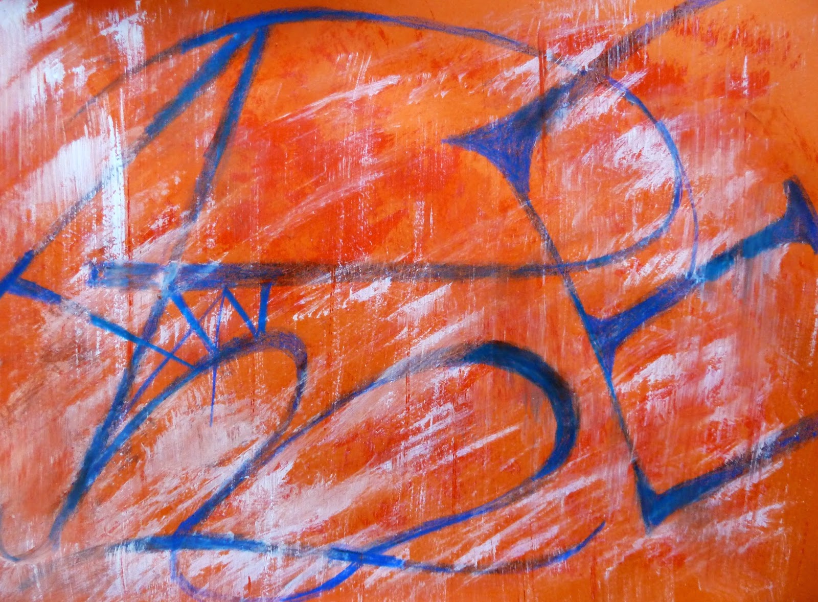
The piece below, which involved the human hand, is a little more engaging.  It actually includes all the letters of the alphabet and I tried to allow the oil stick to "walk" accross the page whilst at the same time elucidating the letters, albeit in different sizes and unconventional shapes. I thought the colours worked well, and the overall balance is acceptable.  There is the suggestion of texture with the white floating on top of the painting, sometimes obscuring, sometimes being obscured. It could be read as Abe, or Ame but "reading" the letters is not what it is about. If one wanted to elaborate it is the concept of the letters of the  Western Alphabet being the basis of  global communication over millenia.


The large painting in this group was equally hard to wrestle with and I am not sure that it was entirely successful but did have some redeeming features.  I used tissue paper from China as a background as I wanted to say something about the global influence of that country and its economic impact on the West - effectively the apparent reversal of fortunes,  with the West being pressed down and dominated by the East.  I felt happier because I was able to restore meaning to the  letters and because there was a message.  The Mondrian-like lines and boxes, came about as the result of looking at i-pads with their colourful blocked windows and I intended to colour them in that way but I felt it would break down the homogeneity of the picture if I did that. The arrangement of the lines gives the painting its main construct and balance.  Buddhism isn't the religion of China but it stands between East and West spreading the branches of enlightenment in all directions, almost mediating between the blocks of power. The letters have been re-assembled from the letter paintings (above) to form a slightly more co-ordinated picture. I chose yellow (it is the colour of the royal emporor) and also of the sun which rises in the East. The dragon, one of China's important symbols breathes fire on the West euphamistacally causing its destruction. Red lettering is politically the colour we think of for China, it is also a colour that can represent war and agression as in the red planet Mars the Roman god of war, as well as the dominant colour of the flag of China.


Thursday, 27 February 2014

Word Painting


The first word painting uses images of the old Red Fort that may or may not still exist off the East Coast of England.  It was certainly there when I sailed passed it as a young person with my father and sister; it was the most eerie thing one could come across at sea. I have used the internet to discover images of it so I assume it is still there.   I have used the words "red fort" and "red faught" to give meaning to the images not only by naming the constructions but to infer their purpose. As they decayed they certainly did become red. The  use of the colour has obvious connotations., not only of rust and decay but of blood and warring aggression.  I have used printed labels which is the nearest I can get to sinking the image into the paper, I would have preferred to have printed straight on to the paper but it is too thick for the printer.   However, by using the lables I can re-position them at random, and cut them up as necessary. Rauschenburg used silk screen printing to achieve the effect of an image appearing "in" the paper and it is his work that has inspired me.   I wanted to use the four holes on the left to imply the barrel of a weapon, punching out the letters "Fort".  The image for me is a recollection of happy times, yet in themselves they are fortifications for the protection of our island whilst at the same time being aggressive weapons in order to carry out that task.


My second image uses a similar technique to the above with the addition of printed swags using foam impressed into an object which had a raised surface, thereby making a printing "block". I liked this form of image making but it is rather precarious as I can't source the right magic foam in order to make the block, so it is a bit limited.  I have used an image I have used before which is of the multiple heads of a child.  Printed in black they have a sinister look which reminds me slightly of Richter's grey images of the Badermindoff gang.  I wanted to get a sense of the untoward, slightly mysterious, unsettling feel to the picture as it is meant to imply a victim of child abuse.  The text (EY)Escape utilizes the word Eye and Escape to invoke the feeling I am aiming for in the picture. The fractured black section on the right can be read as a man's face in semi profile.  The red eye represents anger but is also has other implications, the idea of a wild animal or of a mystical creature of the night.  The use of brightened eyes is used a lot in such programmes as Merlin and insights the unknown magical powers in the viewer.  In this case it might imply a resolve to Escape. The lips are blue, and are restrained i.e. without any emotion.  Whatever psychological/emotional activity going on is inside her head.


The third image is the Large Work (A2), and has the word Ambivalence. 

I had taken some photographs of my own shadow and decided to manipulate them, reproduce them in different colours then print on to newspaper.  The latter was risky as newspaper likes to  jam up printers!  However it worked in all but one case when I quit whilst ahead. It occurred to me that in philosophical terms one's shadow is both you and not you, this ambivalence I felt was interesting.  I also liked the fact that the image didn't look like a horizontal flat image but an image standing up, another ambivalence worth noting.

The idea of being there and not there occurred to me with regard to collapsed or collapsing buildings and I thought of the church at Covehythe, of which I also had images.  I decided to include the windows with the remains of tracery, and there are times when they look like church windows and, sometimes doors and sometimes buildings, more simultaneous contradictions.  The tracery in the middle window was made from Chinese writing, it may well say something quite inappropriate, but that in itself would represent a further uncertainty, or ambivalence.  I used some textured wallpaper on the right of the painting and although it doesn't show much from the photograph, the actual effect is like that of stained glass.  I enjoyed doing this as it involved many aspects of creativity, i.e. pc generated images, text, experimentation with newspaper printing, wallpaper texture as well as developing the concept.  I felt the colours worked well and I that the composition is a satisfactory and balanced one.  John Piper did paint Covehythe and I felt some of his style is influencing my work here probably more in terms of colour than mark making. I tried to use the slanted words to indicate light source from the windows.  The shape of the legs from the photographic image also formed an arch thereby echoing the Norman church window , effectively bringing both images together.


Found Text and Images


Using found text and images brings the artist into closer contact with the active world around him and in turn this world is projected on to the viewer, so that he/she gains a similar insight.  It is a novel way forward for the artist to explore and introduce a reality that is in direct touch with a world that is, at the same time, both familiar and out of the ordinary. Text defines in a way that a visual does not.   It is, of course, possible to be ambiguous with the written word but its explicit nature determines meaning more clearly and without going through a process of interpretation as with an image. They can be arranged as "banner headlines" or page text, reversed or turned so that they almost become images in themselves.

The nature of an image enables more interpretations to be speculated about. Just like text, images can be cropped, turned, flipped, mirrored or enhanced, even turned into 3D shapes. Both image and text can use colour or, like an old fashioned print, be more powerful in black and white.  Using both image and text can produce tautologies of meaning but can also affirm ideas or reintroduce new ideas, depending on the way the images and words and used and their juxtaposition. They can be skewed therefore not only to present fresh ideas but to reinforce a message or idea. Words and phrases can be stripped of their meanings by taking them out of context and re-introducing them into hostile placements.  Used in this way it is possible to play with the conventional means of perception and confuse the brain of the viewer, for example using the text "red" but colouring it in blue and so on.  By this method it is also possible to question conventionally received ideas about reality, and so cause the viewer to wonder about the apparent norms that direct his thinking, in other words to see the world in a different way.

"It could be argued that the heart of Conceptual art in the late 1960s was not, as is often stated, the notion of the artwork being essentially linguistic, but rather the notion that it was simultaneously linguistic and visual.  It is certainly true that the combination of text and photograph became increasingly its archetypal form" (Godfrey, pp.301-2)

The profusion of paintings, photography, digital graphics, pc generated texts in various fonts, appropriated text and images from magazines and books, advertisements, posters, etc., are  all valid sources in this genre.

Ed Fella uses found text in a minimal way just using a letter or part of a word. It enables him to deduce real parts of the city by photographing small elements of city life. Jessica Bakhaus works in much the same way. 

Saul Steinberg has a sense of humour in his art, intermixing real objects with hand drawn images, and uses text rather less than other artists.  His style is almost cartoon-like.

Saturday, 22 February 2014

Sainsbury Centre, Norwich - Art and East Anglia

The exhibition was a diverse collection of exhibits and objects with links, sometimes a bit tenuous, to East Anglia. There were sculptures ranging from Elizabeth Frink to ancient Romano-British, gold branks and bracelets from antiquity, silver gilt, the Concort's throne (it's link was through Houghton Hall where it is normally housed), beautiful Fabergé animals.

The exhibition was for me, very successful and included a number of disperate artists, ranging from Anselm Keifer, Mary Newcome, John Constable, Ivor Hitchens, Paul Nash, Colin Self, Cedric Morris, L S Lowrie, John Piper, Fabergé, Stubbs and Claude Lorraine, amongst many others.

The Centre also houses a permanent exhibition which included works by Francis Bacon and the wonderful sculpture of a running man by Boccioni.  The latter for me was the highlight of the day as it was unexpected, yet so familiar to me from illustrations.  It was a moment similar to the one I had in Russia when, in the Pushkin Museum I rounded a corner to be surprised by Degas' Blue Ballerinas, it was so breathtaking.

It was also a delight to see the Mary Newcomb works, The Apple pickers' feast, and Apple pickers going home. They were small pieces but so identifiable as her style.  I believe she worked canvas backgrounds initially storing them ready for use.  It highlights for me the importance of working backgrounds.

There was also work by Venessa Bell using distemper on paper mounted on to canvas, a technique apparently used by Thomas Gainsborough except that he would have used oil as a medium, not distemper.  Another of her works was printed on linen, and this enabled the image to sink into the linen.  A technique that I want to try to emulate using Silk Screen Printing in the same way that Rauschenburg printed his canvas.  This too has the effect of the actual canvas containing the image rather than it being applied on top.

A number of John Piper pieces adorned the walls, which I was pleased to see as I admire his work and feel he is very under-rated, not only for his paintings but for his stained glass too.

The Fabergé pieces was lent by Her Majesty the Queen, presumably from the Sandringham collection, and I particularly liked the Mouse with its delicately set tail in  exquisite small diamonds.

John Constable's Landscape with a double rainbow was on dispay and one oil on paper Study of a cart and horses with carter and dog, which was  sketchy in style and therefore free and more spontaneous.  There were also a number watercolours by John Sell Cotman including Storm on Yarmouth Beach.

A beautiful Keith Vaughan gouache was on display with its subtle colours and interesting composition.  I don't know much about this artist but will certainly look him up.  Likewise there was work by Martin Bloch, whose subtle palette I am now reading more about.

Altogether an inspiring exhbition which could easily be seen for a second time to discover other delights.


Thursday, 12 December 2013

Calligraphic Marks 2


After allowing the first layers of paint to dry the second layer of paint enabled me to create pathways in the paint.  This was something I had discovered prior to this exercise when using spray paint that had dried then applying acrylic paint on top.  The "pathways" add another dimension which allows depth to appear as well as interesting marks on the surface. It is like scribing into the surface, painting by ablation. As well as the word "essence" I experimented a litle with the combed effect on the paint and could see from this that there is a lot of potential in this method of working for producing interesting marks on the surface.

Calligraphic Marks 1


I wanted to use this exercise to explore different styles of text from various languages that I have seen on the page and to invent something that looked like it.  The idea that there might be accidental letters or even words was quite exciting.  My text is therefore a mixture and is almost like a hidden unknown language and that idea was quite romantic and had some appeal.  So the first one is sort of middle eastern, with hints of Greek. I also wanted to include some "print" marks which I got by pressing fun foam into articles like an african pot, and any other items that might reveal something interesting. I used Indian ink for the lettering.


The textural marks in my secont painting are more inventive and show no inclination to any known language, as far as I know. Vaguely Far Eastern. Having created an interesting surface, using contrasting blue and orange,  I used red oil pastel for the text.


It struck me when reading some art books that everything is so dependent on the new and latest trends and movements, just as it is in marketing, so my words reflected this.  Somehow it doesn't work though, it probably needs some overpainting or underpainting but as the exercise was about exploring the mark making process I didn't think that was appropriate.


Chinese or indeed any language that uses symbolism that does not involve the Western alphabet, has great appeal.  I decided to use one of the symbols as an abstract shape, filling the whole page, floating on a background resembling water, giving some depth. 


I thought about Paul Klee's comment about taking a line for a walk with this last piece and tried to include all the letters of the alphabet in it.  I tried not to worry about the size and exact shape of the letters keeping the line fairly fluid but varying the thickness of the line and taking the lettering beyond the edge of the paper. When I look back at my work I realize it is not something that I do in my work generally, but a technique I should consider more frequently perhaps.

Thursday, 14 November 2013

Facing the Modern Exhibition - National Gallery

The interest in this exhibition for me was to see portraits by Gustave Klimt and Egon Scheile, although the thrust of the exhibition was to explore portraiture in the light of the historic background of the Austro-Hungarian empire, focusing on Vienna.  Through the portraits it is possible to gauge the impact of social economic changes during the period up to the First World War, when ideologies were see-sawing, from relative equality and liberalism in the late 1800s to the collapse of the Empire after the First World War, when Makart was producing traditional portraiture.

The fortunes of new immigrants led to the desire for family portraits.  These were initially painted in the traditional style.  As tensions started to display themselves with the move away from modern multi-culturalism, families were confined to their homes and the portraits of the time displayed some of those tensions, particularly through the portraits of artists like Egon Schiele.  Some artists used themselves, their family and friends as models in order to explore new ways of painting.

There is a typical 'Victorian' macabre interest in death and deathbed portraiture which coincided with the increasing pessimism felt by dispossessed. At this period the mood was echoed by the loss of Klimt and Schiele, the latter died as a consequence of the worldwide Spanish 'Flu epidemic. Some of the work by artists was therefore unfinished or abandoned, suggesting the failure of the Empire.  Nonetheless, the innovative art that was explored at the time sets a regenerative tone to the historic context.

The work of Schiele, for me stood out and I was impressed by the beauty of the subtle colour and  bold brushwork.  Klimt had produced two in memorium paintings of a young girl, the first was rejected by the family who commissioned a second which depicts the girl as living and smiling.  The original remained more moving though less colourful.  It was also interesting to see a Klimt worked in a very traditional David/Ingres style.

The Kokoshka portraits displayed the style that would eventually mark him out as an Expressionist painter reminiscent of The Tempest.