Friday 18 February 2011

Van Gogh Style

Parallel Project 6 - Spring
Sponteneity

As part of Parallel Project 6, I decided to paint a picture in Van Gogh's style.  He falls neither in Expressionism, Symbolism nor Impressionism, his style is unique, although I tend to think of his style as closer to the Fauves, merely because of his great understanding of colour.  I am lucky enough to have inherited an old Phaidon publication with beautiful illustrations of his work including drawings and have always been very impressed by his work.  Despite the unhappiness and mental trauma he experienced his work is vibrant and joyous, it is also produced at a rapid rate, which is why the sponteneity is so evident.

The Merzbacher Collection, founded by Bernhard Mayer, is concerned with colour with its emphasis on Impressionism, Fauvism, German Expressionism and the early Russian Constructivists, and Van Gogh's work is naturally included in the Collection.

The painting I had beside me as inspiration was The Plain of La Crau with an Orchard, painted in 1889.  It is remarkable that his houses are presented in minimal fashion and are mostly outlined with dark lines yet they do not become boxy or rigid but remain fluid.  The fluidity of his expressionistic style is what marks Van Gogh out.  His use of colour is never strident or garish because it is always carefully modulated with either a contrasting or related colour, depending on the tonal effect he wants to create.  His brother Theo whilst supporting his older brother financially and emotionally, did not always have confidence in Van Gogh's work. It was such a departure even from the Impressionists, who struggled enough to become accepted, that it is not surprising that the general public did not know what to make of his work.  For me, his most skillful portrait (next to his own self-portrait  of 1889)  is that of Camille Roulin painted in 1888 whilst the artist was at Arles.

 I tend to fiddle when painting and am fairly bogged down in representational work, which is why I decided to come on this course as I want to loosen up and feel the unfettered joy when liberated from the traditional school of painting.  I felt when I painted this, crumbs can it be regarded as a finished work, being so hastily created.  The result I felt was much freer than my usual work and I think it shows.

I used the vibrant pthalo blue for the sky with broken brush marks and explored the use of various mixed greens as well as some used straight from the tube, hints of viridian, cadmium yellow mixed with cerulian, ultramarine or pthalo blue, yellow ochre, olive green.  Van Gogh appears to use viridian and cerulian or viridian with a little white and ultramarine quite a lot in his work, he always contrasts it with orange, red or yellow.  The composition I chose was of the cottages at Shelley in Suffolk, where it is slightly hilly.  The lane is very narrow so it was difficult to park, but I did a quick sketch in a passing space and took photos. Because I wanted to emulate Van Gogh's trees, they developed foliage so the scene probably looks more like summer than spring. However he didn't allow reality to interfere with his compositions and it didn't with my own.  I was pleased with the light effect of the painting, there is air to breathe.


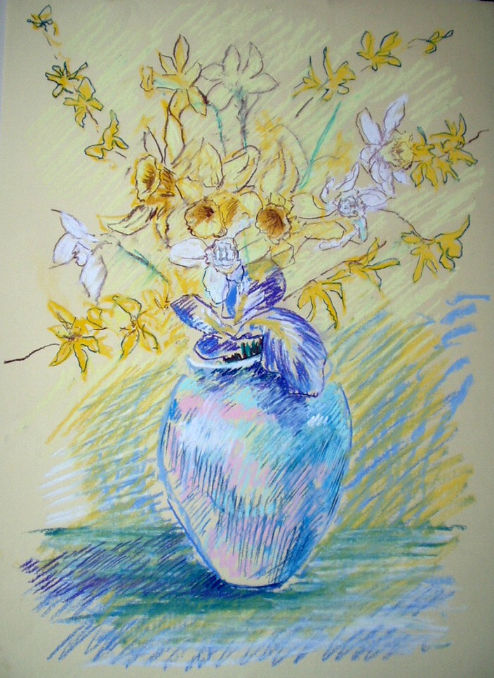
In addition to the above I did an A2 drawing in pastel on paper, but found it a bit unwealdy.  I used a canvas board to clip the paper to but it wasn't terribly satisfactory. I don't think pastel was the best medium to use for this project as Van Gogh was very exuberant with his paint.  I tried to be so with the pastels but I am not sure it comes across.


Thursday 17 February 2011

Pointillism

Exploring Concepts

Part 6 – Parallel Projects

Project: Spring

Exercise 1: Pointillism


I found the Pointillist exercise hard on the old knuckles!  I enjoyed it more than I thought I would because having done it years ago the result then turned out to be rather an airless method of painting.  I think the Impressionists also found this to be the case, as many tried it but reverted to their Impressionist style afterwards.  Pissarro painted Woman in an enclosure in 1887 and Apple Trees in Blossom, 1885-1890 but soon reverted to his original style.  Seurat, continued to paint in the style, making almost a scientific study of the method, when one thinks of Pointillism it is his work that comes to mind, Paul Signac was a contemporary practicing the same style.  I believe Gercault’s Raft of the Medusa uses a similar technique on a bead of water painted red on one side, green on the other and white in the middle. Interestingly, Delacroix was a model for the painting.

The Fauves, which included artists such as Henri Matisse, André Derain, Maurice de Vlaminck and George Braque, developed a unique style of painting which explored the use of colour in a way not really seen since Van Gogh.  They took his style and that of Pointillism and explored pure colour in a semi-abstract way. Vlaminck's Potato Pickers, enabled the artist to explore the lighter brighter side of his painting style away from the rather dark paintings that he was also known for.  Andre Derain's Boats in the Port of Collioure shows the effect of Pointillism. Even Kandinsky in his Autumn Landscape with boats, shows the influence of the technique on his early realistic style, before he moved into Abstraction.


My Spring Hedgerow painting uses a similar technique.  I have used pastel inreds and blues to create purple in the shadows, and greens and reds to bring the sparkle out in the trees.  The optical effect of this method helps with pastel which can sometimes be rather flat.  Using small strokes of contrasting colours brings the light into the picture.  The disadvantage is that some areas, branches, for example, really do need to be expressed in line.  Foliage would probably be rendered in a similar fashion regardless of “style”.  One can add highlights much as Constable added his famous white dots or “snow” to replicate the sparkle of sunlight.

Using this method does enable you to create tone and depth but it is important that the size of the dots are modulated in the distance.  I found that one considered colour combinations much more, and had to find intense darker pastels in order to render tone effectively, and from this point of view the range of pastels available with varying degrees of hardness and softness were essential.  Regrettably I only have the tiniest piece of a really good soft white which I use for highlights in eyes for portraits and have not been able to find a replacement.  Unlike paints in tubes once the wrapper has gone from a pastel, you have no idea who made it and what it is called.

I also did an oil pastel picture of daffodils in a vase.  I was frustrated with progress of this painting at the outset, but once it began to materialize I felt happier.  This, I found, was one of the problems with Pointillism, as I do not like to include an under-drawing, preferring to draw direct.


Nonetheless, I felt that the Daffodil picture did work, and I liked the diffusion that this technique produced.  The vase, in particular is rendered quite three-dimensional despite the limitations of the process.  As with the previous landscape the hues selected to suggest form were important.  Oil pastels are not terribly forgiving so there was no room for error.  I liked the central area of interest at the top of the vase where the flowers seem to erupt into bloom.

Check and Log


  • Have you created an effective image using these techniques?
I am satisfied with the picture I have created but probably wouldn’t do something similar by choice as it is a slow process which is not rewarding until the work is finished.  It is a bit like filling in the dots.

  • How can you use these techniques in your own work?
Whilst I would not wish to embark on a full-scale pointillist work, the method did provide reminders of contrasting colours and the importance of scale in the distance as well as awareness of the hardness/softness  qualities of various pastels.

  • How can you continue the experimentation with this technique?
Because I used pastel and not oil or acrylic, I would not need to give consideration to brush size.  Colour considerations are important and I would want to use these ideas in other paintings.  It would be interesting to use quite bold colours together to effectively create optical shimmer on a grander scale.

Thursday 10 February 2011

Glasgow Boys

I managed to catch the BBC programme repeat of the Glasgow Boys presented by Muriel Gray recently.  I had seen the programme before but it was good to see their work again.  The programme was made when their work was appearing in the Kelvin Grove Art Gallery in Glasgow, and these are some brief notes I took during the programme.

William MacGregor had been the father of the movement, and his painting The Vegetable Stall, painted in 1884  reflects earlier French and Flemish painting.  It did originally have a figure on the right hand side but he was brave enough to paint over her which left him with just the vegetables, which for a painting of this size was unusual. His main genre was historic painting.

However, the movement was interested in painting outside and visited the nearby loch and the Rosneath Peninsula to do so.

Sir James Guthrie was influenced by Jules Bastian Lepage, for example, Rural Love, as one can see in the painting A Hind’s Daughter. http://www.nationalgalleries.org/collection/online_az/4:322/result/0/5001?initial=G&artistId=3500&artistName=Sir%20James%20Guthrie&submit=1

His painting of a Highland Funeral breaks away from the traditional composition and the colouring is sombre, but he is probably best known for his Goose Girl painted in 1883, which was a fairly revolutionary composition at the time.

Their attempts to be accepted by the Glasgow School of Art was problematic because of their patronizing attitude to their art.  They had turned their backs on the traditional highland landscape.  Guthrie began painting modern social life, including ladies playing tennis. Some of Glasgow Boys went to Paris, John Lavery of Irish descent was one, because of the difficulties of being accepted.  “Under the Cherry Tree”, shows the influence of Lepage in his work.  He also went to Tangiers and explored the Middle Eastern light.


                                Rural Love, 1882 Bastien-Lepage, Jules © Bridgeman Education.

I also think the painting by Sir Samuel Llewelyn, of an unknown date, is an interesting comparison. It must have been painted at about the same time, and has a similar lightness of touch.


                                Llewelyn, Sir Samuel Henry William (1858-1941)  © Bridgeman Education


                              Under the Cherry Tree, John Lavery 1884 © Bridgeman Education


The painting which was used to advertise the Exhibition was the joint effort by Edward Hornel and George Henry “The Druids Bringing in the Mistletoe”. The work introduced gold, as Klimt used it, and is an interesting collaboration. The composition and colours are striking and there is a mystical quality to it.


 The Druids - Bringing in the Mistletoe, 1890 (oil on canvas)
Artist:

  
Arthur Melville, an excellent watercolourist was also enticed by the light of southern Spain and North Africa, capturing the elusive quality of heat and light in “A Byway in Granada”


                                      Arthur Melville, “A Byway in Granada” © Bridgeman Education

Eileen Cooper

I picked up on the OCA introduction to Eileen Cooper's work.  I hadn't seen her work before.  It is primitive modern expressionism dealing with human form and life. Her use of colour and form are modern and explore themes of water and drowning, amongst other things. If one needed to see how to represent the human form in a non-representational way, this would be a good place to start. Her work can be seen at http://www.eileencooper.co.uk/

Monday 7 February 2011

Photorealism Research


PAINTING 2: Exploring Concepts
Part 1 – Painting in Detail

Project: Surrealism

Exercise . Photorealism Research


Once the “art scene” changed to America after the last World War, the development of Surrealism and after that action painting had chance to develop where there was no real evidence of strong art movements as there had been in Europe in general, Paris in particular.

This provided fertile ground for innovation and there were plenty of wealthy Americans willing to invest in new styles of art which were indicative of the promise of a new world, reminiscent of the “American Dream”. 

Abstract Expressionism developed and from that people like Jackson Pollock discovered “action painting”.  There were no bounds with this type of immediacy in painting, often going against public taste.  The idea of the artist expressing some mystical internal idea meant that subsequent generations wanted to effectively de-mystify objects and possibly helped by Josef Albers experiments in juxtapositions of colour and tone, artists like Jasper Johns and Andy Warhol began to re-introduce realism back into art, and Pop Art came on to the scene, it was a natural progression from there for Photorealism or Hyper-realism to come into being.  The camera obscura could be said to be the first instrument to be used to illustrate an image back in the 18th Century when artists used it for that purpose, although mention is made of the pinhole camera back in 470BCE in China, referred to then as a “locked treasure room”!

 In the 1960s and 70s artists like Richard Estes, who was considered the leading artist of the genre at the time, began painting from photographs focusing on reflections of metal and glass, particularly with shop fronts and city life.  His Big Diamond is a typical example of his work.  He frequently used acrylic as well as oil as a medium.


Richard Estes   Big Diamond, 1978 Acrylic on board (copywright Bridgeman Library)

Malcolm Morley is another artist exploring Photorealism and his painting Wall Jumpers http://www.speronewestwater.com/cgi-bin/iowa/works/record.html?record=1593
painted in 2002 in oil is typical of his bold use of colour and hard outlines.  He also did many paintings of race-horses and jockeys, as well as motorbikes and cars, and aeroplanes.

Lucian Freud’s studies are analytical like Sigmund Freud’s psychoanalytical work.  It is interesting that he paints his mother as frequently as he does.  Mothers and their sons are always interesting.

Likewise John Wonnacott is more of a realist painter than a photorealist painter.

I particularly enjoyed the variety of subject matter in Max Ferguson’s work


                        Katz’s II, 1998 (oil on canvas) Max Ferguson (copywright Bridgeman Library)


                         Forward 1996 (oil on canvas), Max Ferguson copywright Bridgeman Library

I am not sure to what extent he alters the  photograph, but the composition, is particularly well balanced, and frequently using muted colours.

Another artist whose work is more what I would call Hyper-realism is  that of Ben Schonzeit.  His flower paintings are exquisitely detailed, and again the composition is meticulous.


         Clear Caribe, 1990 (acrylic on canvas), Ben Schonzeit, copywright Bridgeman Library


    White Roses on Black, 2000 (acrylic on linen) Ben Schonzeit, copywright Bridgeman Library

I also enjoy the way he introduces humour, as in Clear Corot, where he paradies the oarsman from Bridges of Mantes (Camille Corot) with a typical distant Corot background.

I think used in this way photorealism doesn’t have to be clinical, and I would like to explore the idea of transposing some of the colours.  I had in mind painting the Arum Lily in black with orange leaves and a yellow background and other similar transformations.

One other artist who impressed me was Yang Ming Yue, “Chinese Ladies”. Refreshingly calm and elegant, some might say sentimental, in a world full of harrowing images.

An Exhibition “The Painting of Modern Life 1960s to now” caused confusion amongst critics,’why would anyone want to paint a photograph?’  That question for me is apposite because it is one I have asked myself.

The convergence of painting and the photographic image has never been closer.  We can enhance photos to have the look of a painting, line drawing, charcoal, pastel whatever, and in art we can reproduce the photograph with amazing closeness, so why do we choose to do it?  I think the magic word is “edit”.  On the OCA blog recently a musician mentioned “interpretation” in music and rather ignorantly I said I had always thought of music as being played as the composer intended with the conductor ensuring this.  It seems the ability to interpret/edit is the human faculty that comes into play to make something individual, to turn a photo into art or vice versa.  The limitations are only related to the trend itself.  How long will the genre remain popular before a new, in fact the “latest” development comes along, and therein lies its potential, can it re-invent itself?  I think there is still some mileage because we are obsessive about images, we are bombarded with them through the media so in order to see through the image to understand the message behind it is becoming ever more important if we are not to be saturated by over-exposure. 

Even the 3D image is back and that too, with computer visualizaton and virtual worlds will open up completely new ideas. Maybe corner shaped canvases, ovoids, with layers of glass over them to add dimension of a different kind.  What the canvas can never compete with is the lit image on a screen, so maybe the art image has to have a screen to be appreciated in this modern world, after all one can “hang” photos in a viewer these days, so why not enhanced artworks in the same format?


Reference and Source material:

The Shock of the New, Robert Hughes, Thames & Hudson, 1980, 1991, 1993

Art made Modern, Roger Fry, Merrell Holberton, 1999
The Century of Change, British Painting since 1900 Richard Shone, Phaidon Press, 1977
The World of Marcel Duchamp, Time Life Books 1966

Photorealism Using a Grid


PAINTING 2: Exploring Concepts
Part 1 – Painting in Detail

Project: Surrealism

Exercise . Photorealism Using a Grid

I found making the grid proportionally correct was the difficult bit, because I could not create a proportion equivalent to my canvas size for the photograph.  In the end I was about an inch short at the bottom which I had to adlib.  The customize proportions did not permit you to put in the length and width without defaulting one of the measurements.

Maths or anything involving figure work always makes me cringe!

Eventually, I managed to set up the canvas board and once the drawing was complete and I got on to using the brush I felt much happier. I used oil for this picture.  At first it was a novel process for me because I had never copied a photo before. However, I felt it was a somewhat stultifying process and it felt very mechanical until the final details were required, then I began to feel pleased with what I had done, but in terms of creativity, there really was none.

I think if I did the process again I would alter the colours in more imaginative ways and that would bring some creative input from me into the process.

Check and Log

  • How did you decide which detail to include or leave out?
I think I pretty well included everything, except may some deeper layers of the evergreen Lleylandi branches; the detailed was getting somewhat tangled at that stage.

  • Were you happy with the image you and chosen to copy?
I felt I might struggle with the Lleylandi branches but the overall strength of the image appealed.

  • What aspects of your copy are you satisfied with and which are less satisfactory?
I was pleased with the overall colour, perhaps the tone here and there could be amended but I was not dissatisfied with the result.

  • Is the scaling up technique one you could use in other aspects of your work?
I hated getting the proportions right, and anything involving measurement and a rule is an anathema to me but to be sure of getting an accurate image the scaling up process is one I might choose again, perhaps next time I would be more confident, especially after seeing other Artists’ work.


Tuesday 1 February 2011

Surrealism, Photomontage

PAINTING 2: Exploring Concepts
Part 1 – Painting in Detail

Project: Surrealism

Exercise . Photomontage

The work by Richard Hammond was interesting; I particularly liked “I’m Dreaming of a White Christmas”, which was a screen print.   It reminded me of some of the enhanced photographic processes I have played around with and which I am hoping at some stage to incorporate into my work. The work by Malcolm Morley, an etching, “French Legionnaires being eaten by a lion” shows similar effects.  “My Marilyn” by Richard Hamilton used photographs of Marilyn Munroe which had been rejected and therefore crossed through by her, he then augmented and enhanced the images, during the screen-printing process. So in both cases the images have been played around with.  Photomontage is a similar process of image manipulation that allows the juxtaposition of colours shapes and icons to be altered in new and interesting ways.  I can see that by doing this, one ends up with a final image that is surreal.   The image itself remains representational but the collage becomes an invention that distorts reality.  I had not considered this process very much in the past but it is a creative way of developing ideas, with surprisingly few cut out images.  I created two images which I would like to have used  together to create the words of a song “The temperature’s rising, we’re having a heat wave”.  The implication is that of global warming causing tsunamis, not the temperature “heat wave”, in the accepted sense.

Surrealism Check Log

  • How did you decide what to include in your images?
It was fortunate that I had the images that I did as the overall background to both pictures. The Iceberg immediately got me thinking about global warming and from there it wasn’t difficult to find obtuse images that might reinforce this idea.

  • Has your style adapted to this subject matter?
I didn’t think I would adapt so easily but the photomontage appealed to me in the sense of design, integrating colour and compositional elements, and I think I will develop my own enhance photographs in this way too, something I have wanted to do but haven’t quite known how I might go about it, now I have a clearer idea.

  • What aspects of the surreal approach can you bring to the rest of your work? 
As mentioned above, this will encourage the use of my own enhanced photographs compiled with an approach that is original, dynamic and hopefully artistic. Juxtaposition is the watchword and it has made me even more aware of pure design and balance in an inspirational way.