Wednesday 18 April 2012

Vivaldi Winter Music Study

Project: Winter Study to Music


I played Vivaldi’s Winter music but it was so short relative to the amount of time required for painting, but it did sort of set the scene but no more.  I am not someone who requires that sort of stimulus once I start to attack the canvas.


The painting is Acrylic and Ink on canvas as uses Acrylic both as a watery paint and also as impasto for the texture.  I tried to develop as many marks as possible and wanted to introduce some movement into the picture as well as areas of mystery and calm.  I find that the difficulty with abstraction is knowing when to stop.  This is a gradual learning process and I would rather err on the side of stopping sooner rather than later.  Doubtless, however, one could go a lot further but it takes confidence to do it because you don’t want to spoil what is already there in front of you.

I hope the paint explores the sharp wintery aspects against the softer contrasts, which for me is what winter is about, with soft skies and blanketed snow as well as hoare frosts and sharp twigs and branches.  I had in mind the fall of a snowflake as it gradually distorts and melts as well as combining the mythical snow queen image in a sort of underworld.


Sunday 15 April 2012

Winter Trees

Part 6 – Parallel Projects


Project: Winter Trees


I decided to try to do an Abstract in my own way of the winter tree outside my window, it has the feel of a fifties picture on the right hand side, but I adopted the leaves as I used them in my Summer Seasonal painting.

I used Caran D’Ache Neocolor II watersoluble wax pastels, but didn’t apply any water, as the cartridge paper would have buckled.


Whilst a thin covering of snow was on the ground I did this water colour sketch showing the skeleton shapes of trees near my house.  I used Bockingford rough paper.  I used white oil pastel on the trunks.


Again using Bockingford rough I painted this slightly freer group of willow trees with their gnarled trunks and flowing branches, and applied some wax pastel for the hint of white snow on the trunks.

Winter Studies from Photographs

Project: Winter Studies from Photographs


This was from a photograph of the Norman countryside with a road and a ford in the dip.  It is oil pastel on grey pastel paper.


Again in France this was a watercolour through glass at an old Norman church.


Suffolk countryside this time, watercolour on Bockingford with White oil pastel on branches.


I got a bit carried away with this one allowing my imagination to produce the evening sky.  It does, I feel have a cold wintry feel about it.


Check and Log

  • Have you achieved a convincing sense of winter in your studies?

I believe I have, although deep snow is always more convincing.

  • Which techniques from these studies will you use in your longer piece of work?

I did not use any, but had already decided to paint in a semi-abstract style which I haven’t really used here.

  • How can you develop or restrict your colour palette for this assignment

Winter scenes are naturally less colourful, but the colours become more subtle and cooler so it was a question of eliminating the very warm bright colours.

Seasonal Painting - Winter

Part 6 – Parallel Projects

Project: Winter ‘Seasonal Series’


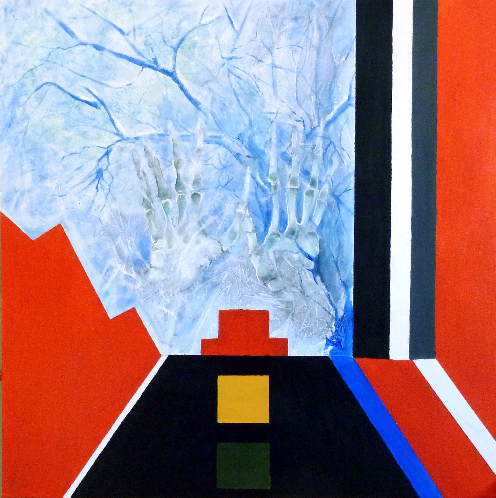
This seasonal painting follows the same concept of earlier pictures in the series by imitating the life cycle.  Having just finished the Abstract section and knowing that I wanted to complete this picture in that style, I decided to use some straight edge to indicate a room in the warm with Winter outside.  Death is also scratching at the window, so the hands are again featured. I wasn’t sure whether or not the combination of styles would work but I think it does.  The traffic light theme is indicated with the cup and saucer (red) and below it yellow and green beneath.  As well as imitating Malevich’s use of red I included black as this echoed (for me) Stendhal’s La rouge et le noir, which are themes in life, i.e. passion and propriety. In my painting red could be taken for life, black for death. There are other things to read in the painting too.

The blue line (life blood) runs parallel with the ‘road of life’ and ebbs into the hands and trees to form veins and branches at the same time in the area through the window which is beyond death. This area could be interpreted as some kind of afterlife or a place for decay and regeneration.

The winged chair on the left is looking both inward to the room and outward through the glass panel at the same time, and I liked the shape for that reason.

Unusually for me I did a number of sketches in my sketchbook before deciding on the eventual composition.

 
I don't know if one is required to give an explanation of paintings, I suppose they should speak for themselves. but I felt this did require some narrative.  I used the technique learned for the straight edge exercise and was pleased with the result, the canvas, as I expected did not have the same problem of "picking up".  Using two styles in a painting is something that might be heeded but in this particular painting I felt it was the only solution to the problem of indicating a winter theme which also doubled as something "beyond", i.e. beyond the glass and a place beyond understanding.  I have spoken to other students on Google Hangout and the painting was received with some trepidation and sense of chill.  This of course pleased me. 


Check and Log


  • When you have completed your winter painting, compare it with the other paintings you have done as part of this parallel assignment.  Do the paintings you did previous look better or worse than you remember?

To be honest about the same.

  • Are there things about the paintings that might help you with the next Season’s painting?

I feel I have learned a lot from this series because I have used different styles and techniques for each one. Surrealism for the first, semi Cubism for the second, Expressionism for the third and Abstraction for the final painting of the series. Each continued the theme without each painting necessarily looking like part of a series, which I consider would be rather dull.

  • Are you pleased with your interpretation of winter? If not what would you do differently if you were starting again?

I am pleased with what I have done, I could have chosen various ways of tackling it and might have chosen heavy impasto using a large brush with angular brushwork to indicate the harshness of the subject matter.


Abstraction Seascape

Assignment 4 – Abstraction


Townscape or Seascape


I was remembering the picture in my head of my grandson whilst he was in the swimming pool during our Spanish holiday last year and had previously incorporated a similar motif in one of my sketches at that time.  I decided to try to re-invent it only this time using a similar style to John Hoyland’s “Black Something”  I used black paper and acrylic using pva glue mixed in occasionally. 


Conscious that I should be trying to learn from Patrick Heron and Terry Frost I did another picture which is more the influence of Patrick Heron’s style only instead of blocking in various shapes I have overlaid them in the sea and then contrasted that with the rugged cliffs on the right.  I was particularly attracted to the organic and random shapes that Heron uses and the startling but homogenous colours used, but couldn’t quite achieve those myself.  I must say that despite being semi abstract, the view over the cliff at the bottom of the picture is quite vertiginous.


Hard Edge Painting

Assignment 4 – Abstraction


Hard-edge and abstract Expressionism


I enjoyed doing this exercise but had difficulty removing the masking tape without pulling up the acrylic paper.  I can see that it would work a lot better on board and will certainly bear this technique in mind when considering abstract motifs that require clear cut lines with no brush mark painting.


In this painting I decided to use red and black as my theme colours much as Malevich did.  It echoes the Stendhalian La rouge et le Noir involving themes of death and passion.  The sharp corners signifying weapons.  The stabilizing influence of the triangle or pyramid helps the painting to be grounded.

This was supposed to have been used as the basis of hard-edge abstract expressionism with the use of oil pastels and graphite, but I felt it worked best as it is.  The work has the influence of Franz Kline and Clifford Still.  I did not therefore want to introduce other marks as I felt the composition worked as it is.

I used cut out triangles and rectangles and set them randomly on the paper which had been washed fairly crudely with yellow paint.  I then painted black in the negative shapes left between the cut-outs and masking tape.  I felt the slightly lose edge worked best.