Wednesday 7 March 2012

Tutor Report following Assignment 3


Tutor Report Form


Student name:
Sylvia Philpot
Student number:
503311
Course/Module title:
Painting 2: Exploring Concepts
Assignment number:
3


Overall Comments

Thank you for forwarding the work for your third assignment, together with the preliminary work, your work for the exercises and your sketchbook pages.  I still cannot access your blog via the link you provided in your profile, but was able to get into it through the OCA site this time to allow me to read your learning log notes and research.  

Feedback on assignment

You carried out a great deal of work for the section dealing with working outdoors.  Your first representational painting of a landscape does not have the spontaneity of the sketches and perhaps you were thinking too much rather than responding to your memories of the scene.  Do you think that your selection of media, i.e. ink line and watercolour, influenced your approach to the painting and made you concentrate on detail?  The second painting from outdoor studies is painted more freely and the palette works well.  You have captured the aerial perspective to give a real feeling of distance in the view, although your painting does not have the dark dramatic tone which makes the foreground broken tree the focal point of the charcoal study.  I think that the third painting in this series is the most successful, taking the small pencil sketch into a more developed painting.  The palette works well to create a landscape which is full of life and movement. 

Your finished painting of a different view is darker in tone than in the studies and I see from your notes that the sky was becoming overcast as you completed your outdoor session.  Did you take photographs of the darkening clouds as you were leaving or did you paint this from memory?

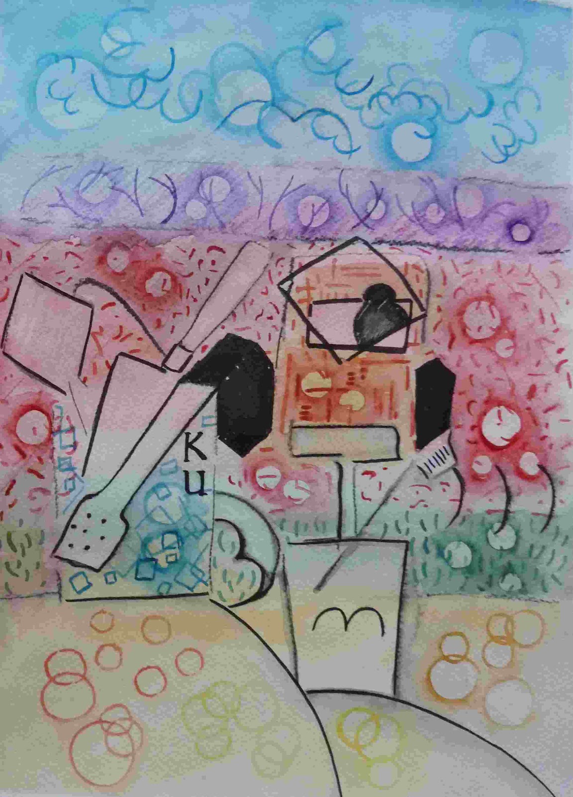
The separate studies you made have been combined together well to create your imaginary landscape and I am glad that you enjoyed this project more than you expected.  There is a contrast between the way in which the foreground trees have been simplified, with a drawn line around the shapes of the foliage, and the textured brushwork of the background and sky. 

This seems to separate the painting into two, apart from the area on the right of the foreground and it is important that you consider how to make the painting work as a whole.   Look at some of the later surrealist work of Paul Nash, such as ‘Event on the Downs’ to see how he achieved this. 

You have a lot of experience in using oils and acrylics together and your painting of the church in Normandy shows successful use of acrylic under painting with oils used over this in selected areas and in glazes.  In your painting on the spot, you have been able to capture the sense of mystery in looking through the mist across the water.  The charcoal sketch provided the tonal information required with a feeling of the drama.  I agree that it was a good idea to work on the foreground water from direct observation and then complete the rest of the painting back in the studio.  The reflections of the diagonal trees help to make this composition work well and I particularly like your handling of colour in the water.

In your urban landscape of the Spanish street influenced by John Piper, it was a good idea to amalgamate two photographs to set up tension between the two figures and the suggestion of the figures, without too much detail, is enough to create this.  Your painting has a good interpretation of the light, which shows that this is clearly a sunny Mediterranean scene, although the colour of the painting is more muted in reality than in your blog photograph which is why it is important for me to see the actual work.  The layering of colour, together with scratching into the surface to add different textures, is successful and can be appreciated by seeing the painting rather than the photograph and this is something to consider when selecting which work you will submit for assessment. 

For the extended landscape painting, the cropped photograph of the colour study in your blog looks quite different from the actual study, as the colour appears much brighter and you have removed the large area of brown paper around the edge of the drawing, which changes the balance of colour.  The final painting is also darker in tone than the photograph, which means that your intended lack of detail underneath the trees in the foreground is seen more clearly.  I agree that the background could have been treated in the same way and the dribble painted sky adds interest and texture without being too representational.  The oil pastels worked well over the acrylic painting and I hope that you will continue to explore this use of mixed media in your work.

In your preliminary work for autumn, I am glad that you enjoyed making the monoprints to investigate the random effects which can be found by accident and then exploited to develop an image.  It has also been worthwhile for you to experiment with sacking over hardboard as a support, although as you discovered this can create texture where you don’t want it. 

Have you considered using sacking or scrim as collage shapes to add texture in selected areas of the canvas rather than over the whole surface, as in this untitled abstract work by Sandra Blow?  I can see that your preliminary study for autumn has been influenced by John Piper to create a semi abstract work.  I think that the final painting is the most successful of your ‘Seasons’ series so far, as it tries to convey the life cycle in a more expressive way.  The relevance of the traffic lights will be more visible when all of the paintings are viewed together and you will have to give considerable thought as to how this will be represented in your abstract painting for ‘Winter’. 

I could not find any preliminary studies for this work and note that you used earlier sketches of the apple tree as a starting point.  Although you are developing ideas in a semi abstract way, it is still important to have evidence of your studies to show how your ideas came together.

Sketchbooks

The photographs of your sketchbook work on your blog are enough to let me see that this element of your work continues to develop into a good visual diary which will help to inform your paintings.

Learning logs/critical essays

Your research continues to be carried out thoroughly with plenty of evidence of study and your personal comments on the work you have researched.   You also provide plenty of notes in response to the ‘Check and Log’ questions, to show constructive analysis of your own work.


Suggested reading/viewing

For the next assignment introducing abstraction, I know that your interest in this subject means that you will carry out a great deal of research.  Please let me know about any particular artists of interest you may have, to enable me to suggest other similar artists for your research.


Pointers for the next assignment

You have reduced the weight of your parcel significantly and your work on prepared paper can be easily mounted if you wish to include these in your assessment submission.  For the next assignment you should send the final ‘Seasons’ painting of ‘Winter’, with at least one final piece from the exercises in this section. I will suggest a target date of 30th April for Assignment 4, but if you have any difficulty with this suggested timetable, please let me know. 

Tutor name:
Jane Mitchell
Date
29th January 2012
Next assignment due
30th April 2012


Tuesday 6 March 2012

Abstracting from Form

                                            Scanned photograph with negative shapes outlined

                                                           Reverse of negative shapes

I did two paintings from this idea, which I found a useful technique for exploring abstract ideas.


The pictures are quite different, one using curvilinear abstraction the other rectilinear.  I have also changed the colours.  The latter picture works particularly well as a portrait picture when the three black marks become people.

Abstracting from Near and Far

I did various sketches in my sketch book, and wanted my still life to be against a flat background split into various coloured horizontal areas representing sky, hedge, field, hedge and window ledge.  I also thought it would be fund to include the “Kub” which was stylized from Cubist work.  In this case taking the K and  U from Kitchen Utensil jar and implying the B with the spaghetti tongs.  The first picture is in oil pastels, the other in watercolour and ink.


Progress in Art

Research

Progress in Art – Suzi Gablik

In order to clarify my thoughts on reading this book I am paraphrasing the contents and adding my own thoughts (in red)

There are three basic stages in Development:

Elective ( medieval including Greek, Egyptian and Oriental) Static images
Iconic (Renaissance) Perspective
Symbolic – Post Cubist Modern art

During the Renaissance in order to improve form through perception, perspective was developed. In this way truth and reality change with cognitive understanding; it being a revolutionary process.  Michael Foucault thought that ‘Episteme’ represented the so called spirit of the age – the order of things.  However why or how Epistemes change from one stylistic movement to the next is not explained.  He asserts that they follow on, but not from the previous Episteme.

Gablik believes stylistic changes are not a jumble, but part of a pattern of development reflecting cognitive systems and historical development of conceptual frameworks (paradigms)

When artists see plurality of perspectives it is both pre-operational (enactive) and formel-operational (symbolic).  In the medieval period artists did not understand the single viewpoint so their groupings of people may have had multi-perspectives.  The same is true of the cubists.

Cubism destroyed Euclidian space by introducing different viewpoints.  Cezanne turned perspective inside out (literally) so that the pyramid comes forward, therefore no distance or space is implied. Whole picture is of equal value.  This leads to Pollock’s field painting.  Volume over void is dispensed with. This advance occurred at the same time as the development of the Hydrogen atom, and although it was unknown to the proponents of Cubism it involved the same qualities of time and space.  So was this just a coincidence or is there a pattern emerging?  Jung thinks coincidence is meaningful involving processes in the unconscious (collective) and there is a mathematical formula for the coincidence phenomena. Suzi Gablik thinks it concerns the unfolding of “laws of development” within the cognitive processes. The Cern LHC experiments do not appear to have impacted on the global consciousness and likewise this “development” is showing signs of not being achieved, the Higgs Boson can now only appear in a relatively small segment of the graphic data, around 120 – 140.

Cubism released art from descriptive line and colour as well as from perspective so in terms of Foucault’s Episteme which parallels the paradigm, the twentieth century begins a new framework.  New styles according to him resemble but do not derive from each other.  Through this new apprehension of things, new visions of time, space, logic and chance are possible. 

De Stijl in Holland (Mondrian Van Doesburge) move to Neoplasticism.  Pollock moves to field painting eliminating line as the border of a plane.  Malevich in Russia paints the Black Square in 1914 and explores Suprematism where white ground equals infinite space.  Rodchenko and Lissitzky also develop ideas along this line.  Kandinsky in 1910(sic) paints his first non-objective picture, though real elements still appear.  Kupka paints The First Step in 1909 and in my view is the first artist to explore abstraction contrary to popular belief in Kandinsky. Nonetheless the principles of balance, harmony order and regularity still apply.

Gablik questions how ancient decorative rings appearing on pottery in the Elective period vary from Jasper John’s “Target”.  Many other apparently abstract motifs appear in Roman, Christian and Oriental art, so how is this progress? Answer: in modern art it is a thing on its own, not a decoration.  The intention is entirely abstract without purpose and distinct from craft. (but isn’t all art without purpose, it is only the object the decoration appears upon that has purpose, what distinguishes it from craft?)

Abstraction: the development of cognitive processes and conceptual modes dominate and transcend perception, moving from reality to possibility.  (Kandinsky and Malevich did not always paint in abstract ways, does that mean they progress sometimes but not at others, or move from one paradigm to another)  Malevich explores distortion with warped rectangles, then there is Dibbet’s Perspective correction and Mangold’s incomplete circle as well as Barry La Va’s points.  Theory and logic are now artistic motivators.  Arp’s free forms.

Spills, heaps or piles differ from organized lines and columns, representing relationships in a state of flux.

In science too there is a shift from surface appearances to underlying structure and pattern (CERN HC – pattern inferring predictability, but not yet achieved) Morris and Serra explore the effect of gravity on matter i.e. leaning, hanging and balancing.  Vorticists – latent or potential energy.  Futurists – movement, speed.

Art contains, like language, inner principle of proliferation.  Art’s conceptual possibilities are like evolution with ever increasing diversity and complexity with mutations and blind alleys, an infinite process, but I would argue that representational art is equally infinite.  I cannot see the need to accept abstraction at the expense of realism, surely they co-exist when both still have infinite potential.  If the two are not mutually exclusive it does not mean art history does not progress, one can influence the other.  I also think “progress” in art is a misleading term. Dynamic would be better, as Gablik concedes aesthetic improvement is not implied, indeed some may be regarded as regressive.  Photo-realism suggests representation is still alive.  New media – wax, oil pastels, cake pastels, interactive acrylics; different supports: computer graphics, 3D, holograms, virtual reality.  All these technical developments offer new techniques for the development of art, is this what causes progress? For example the development of tube oil paints and the feruled brush made en plein air painting possible for the Imressionists.

Internal v External Histories of Art

Social conditions which are external cause change – Gombrich.  Inner logic – Wolfflin and Riegl, according to inner laws of development (again this polarized thought promotes one at the expense of the other, why not both, one stimulated by the other?)

Wolfflin – inward necessity unfolding a psychological process.  Perception develops independent of external influences.

Gombrich – Symbols developed from a common stock will have a certain family likeness. (If by this he is referring to ubiquitous motifs then these could be both interal (collective subconscious according to Jung), and external observed in nature.  But how or whether they can be invoked at specific periods in history is another matter)

Wolfflin and Riegl suggest an irresistible engine driving history with recurring cycles, linear, painterly, planar, recessive.  Gablik: assumed intervals of mental growth, producing historical/cultural change.  A state of knowledge makes history move.  These limit the range of possibilities at a specific stage in history, influencing and intervening in artist’s achievements.

I have a slight problem with this as I think that ideas and styles are disseminated throughout the artworld either because of direct contact with other artists or through exhibitions.  These states of knowledge or not a global phenomena.  These so called paradigms didn’t exist at one specific time even in the Western world.  Why don’t these trends apply in other intellectually adept places at the same time, i.e. Far East, South America, because ideas are communicated and geography is a factor, which surely affects progress.

Piaget had present day understanding of development theory, Wolfflin did not. The transition to higher organization results in cumulative (not cyclical) changes that are irreversible therefore change has a continuous direction – progression through re-organization, culminating in the qualitatively new. What of Photo-realism, and Pop Art both of which use representational art and indeed collage initially used by Cubists, decades before.

Wolfllin unsure if internal or external influences caused change.  Reigl: Change in style was a re-orientation of artistic intentions.  Such change in form comes from the forms themselves, a ‘will to form’ seeking to realize itself. Reigl sees all styles as having equal value.  He believed in a divine plan towards a transcendental end. It was a spontaneous process towards realisation of next stage.  Gombrich sought empirical elucidation rather than general trends. Reigl’s idea of a ‘will to form’ was unscientific.  The emergence of new concepts, for Gombrich were not the result of supernatural agencies.

Popper asserts an evolutionary process not something “inside” it. Organic growth, according to Popper results from free behaviour not determined by laws of history.  If pre-determined historical forces at work, no power could alter them in the light of experience.  Gombrich wants only to look at how things happen, not why.  Change is connected to attitude, interests and conditions in the environment; also social factors, as does Arnold Hauser, therefore change is dependent on external factors.

Gablik: Wolfflins ‘the apparatus of apprehension fulfilling itself’ and Reigl’s ‘will to form’ become explicable with the ‘cognitive’ approach to development.  Only pre-determined by thought forms but not goal-oriented.  It leads to more complex functions not necessarily improved ones. (This seems to leave the door open to those who see abstraction and modern art in a negative, regressive way). Outward expressions of internal cognitive changes respond to external pressures and demands.  (So history is both internally and externally stimulated as I thought) Some environments stimulate perceptual and representational strategies. Gablik concedes internal and external influences can co-exist and are interdependent. (Hooray)

Perspective follows sequential character she says but later developments are not necessarily so.  Increasing integration through stages of development.  Karl Popper science can only be proven false.  Art cannot be falsified.  Scientific knowledge proceeds by “conjecture and refutation”.  Gombrich’s “schema and correction” or “making and matching”

This works for representational perspective which had scientific testable outcomes.  Is the finished article like the real thing?  Abstract art is not subject to test in the same way.

Abstraction offers no standards because there is no measurable criteria, no visual truth.  So is it a loose end?

Initially artists used ‘memory-pictures’ to produce objects, just as a child produces a picture based on his level of comprehension, regardless of the fact that the model is in front of him.  Such a way of thinking about art doesn’t work with non representational art. I believe it does, the concept is conceived in the mind it is insubstantial but there all the same and is part of the cognitive process which I feel needs further explanation before one can make explicit deductions. Duchamp naming the urinal as a work of art eliminated any “work” in the art. So that art becomes something else. (wasn’t this just a regressive blind alley?)

The art object is a by-product of the artwork.  This is the only explanation that holds, it is a philosophical enquiry rather than a creative piece of art. (I am not sure I agree, as even with Abstract art this is determined by the artist and therefore involves the creative process) The idea of something “fitting the facts” no longer exists, no criteria for measurement, no rules for progress.  Thomas Kuhn suggests an open-ended paradigm.  Searching for the unknown.

Definition of paradigm: “A paradigm is a unifying ground of pre-suppositions that influences and makes possible certain ideas and practices and provides model problems and solutions”

Kuhn asserts it is a new way of seeing.  Similar to Foucault’s episteme.  Kuhn suggests such frameworks (paradigms) fit systems together rather than discovering the truth.  Gombrich says truth is pursued by successive approximations.  Kuhn’s idea may not lead to truth and this appals Popperians, as Kuhn thinks any match between a theory (theory provides a “technique” which may not match reality but can approximate it or present a possible facet of it which is true) and ‘reality’ (I think it was Bertrand Russell who said if I stub my toe against a table leg it seems real enough to me, although theory would have it consist of molecules)  may be illusory, that science may not evolve towards anything.  Popperians say this would lead to scientific breakdown.  Without a goal-oriented process what does developmental progress mean?  When one paradigm simply replaces another, how can that be deemed progress?  Do things change by discussing alternatives, as Popper does, or do processes defy rational analysis as Kuhn suggests?  Is truth ‘out there’ complete and invariable or is it transitory, relative only to certain periods? (even Einstein’s theory is having to be amended and that was not considered in doubt, until recently)

Piaget sees laws of universe relating to our interaction with it.  Knowledge not truth or reality but interaction between knower and known, depending on culture, linguistics and biology. In the child’s fit with reality he uses his system of reference, by heeding the child’s explanation it is possible to determine subjectivity and the influence of the object, “objects as we now conceive them to be”, according to the scientific norm (?) and this may be just a stage among other stages, the true nature of external reality is left open. (it is unknowable)

The individual’s perception is like a road-map changing through time just as the collective history changes through time.  So progress is not made through the accumulation of knowledge, but made by leaps into new systems.  Abstract or modern Art not descriptive but offers a different possibility. Issues are resolved within a framework then a new paradigm is explored and resolved and in this way progress is made. Why did this radical overthrow of perspective/representation occur and a move made towards innovation?

Cognitive growth doesn’t imply epistemological growth according to Marx Wartofsky.  So later stages do not necessarily imply greater truth. (Higgs boson)

Outcome of abstraction unforeseen ( infinite and not goal-oriented) unlike representational art. Presumably a new paradigm shift will enable change, but I would like to argue that subsequent paradigms render previous ones dormant not irreversible as Piaget does,  so that elements from them can be resurrected and used in new ways.  I can’t see that this would affect progress.

Therefore Gombrich ‘schema and correction’ bring change, until by such ‘making and matching’ the form is realized.  Both Popper and Gombrich see historical change as evolutionary, a process of natural selection where the best “fit” wins.

Kuhn suggests novelty comes about through a paradigm shift, but asks where do they come from, how does science decide which paradigm to choose?  He believes there is no right or wrong, it is part accident, personal and historic, but this undermines progress.  To overcome this there must be something underlying change or history is neither integrated nor continuous, but advances through ‘jumps’.  This would undermine the developmental process where concepts are reconstructed with new insights evolving from previous gains, thus forming integrated structures.  Kuhn does not unravel sudden insight versus slow development so the problem of emergence of new forms in unresolved.

Popper suggests no evolution nor succession only change.  The idea of a law determining evolutionary change is misguided.  Piaget suggests cognitive growth influenced by both biological (?) and environmental input as individuals interact with their environment.

Gombrich and Popper see variation and selection as diversity and complexity of forms, whereas it serves only to eliminate forms. Gombrich doesn’t identify development and therefore progress in his ‘schema and correction’, thereby reducing earning to a succession of changes.

For Piaget a ‘schema’ is a way of seeing, for Gombrich it is a technique for expressing what is already seen.  It cannot account for responses nor new levels of competence of learning.  It is trial and error (groping).

Jean Piaget states: either groping is directed by relating to external situation, so that groping isn’t pure or there’s pure groping taking place by chance with selection, after the event, of favourable steps.  Empiricists take the view that external reality is already there so only new for the discoverer.

Cognitive structures need to mediate between artists activities and external data.  There need to be sequential laws of cognitive development if history is to be effective.

Piaget has shown that sudden re-organizations are the result of successive long-range cognitive activity which is a continuous process, though there may be spurts and plateaux.  Gombrich assumes that the real world is the manifestation of many perceptions and viewpoints merged into a single objective whole, i.e. perspective, though concedes what we see is coloured by our own concepts. There is not one thing that we always see, therefore if there is no consistency to what we see, there is no consistency to what is depicted.  Gombrich doesn’t associate changes in ways of seeing with changes in cognitive development but an interaction between knowing subject and known object. He wants to assume there is an independent world which our senses take in.

Piaget argues that knowledge is neither subject nor object, but a subject/object relation constructed by the subject.  The mind never copies reality but organises it according to individual structures.  Stimulus doesn’t impose meaning, but is ‘read’ by assimilating into known patterns.  Gombrich conceded subjective element can’t be eliminated.  Art interprets and doesn’t record. He presumes an existence for object independent of act of knowing thus a disjunction between inner and outer experiences between the mind and the world, thereby assuming an independent world from the one we perceive.

Piaget maintains our awareness of the world can only function as perception of it, reality being unknowable.  Gombrich is somewhere in between asserting undeniable subjectivity of vision doesn’t preclude objective standards of representational accuracy. So he still insists on separation of mind and reality. 

Piaget’s research suggests knowledge doesn’t arise through senses therefore what we perceive cannot be a product of pressure exerted then and there by physical environment, but is built up by intelligence – a collaboration of mind and world, an assimilation. So reality is incorporated into subjects mental structures implying a transformation both of subject and object.  Experience alone insufficient for creating knowledge of reality if mental structures unavailable to incorporate results of experience.  What we see depends on what we learn. Conception is a step by step accrual of change going slightly beyond previous knowledge.   Piaget says object only exists relative to subject, the object is the result of a construction.

Gombrich sees the artist as being reactive rather than active, he doesn’t see the subject as capable of constructing it into an object of knowledge  (I think the artist merely interprets the object using whichever technique he feels will best express it, which will only ever be subjective)

J L Austin – ‘see’ and ‘reality’ are hard to define. In Gombrich what is ‘given’ is interaction between subject of object, so to understand reality one would have to study reciprocal modifications of subject and object. Gablik suggests we don’t see the same thing then interpret it differently, we see something different. (I tend to disagree, we interpret things differently according to cognitive ideas) She seems to contradict this by saying what is seen can’t be distinguished from subject’s interpretation.  Kant says to change one’s concepts is to change what one experiences and so one’s world.  (this assumes permanent change of concept, whereas I believe there are choices of concept which means that reality is rendered differently according to the conception.) To maintain a stable reality means keeping the given/interpretation distinction, so the subject is both passive receiver and active interpreter.  If this distinction is dispensed with our concepts cannot shape neutral material, as there is nothing to serve as the material. What we see is mediated by cognitive process that determines what we see.  Any shift in cognitive network causes us to see the world differently.


Conceptualizations are not only imbedded in, they transform perceptual reality.  What we consider reality appears because of our point of view.


Therefore an artistic style must describe how style is a call for and consequence of our way of seeing. (is it a call for an innovation or indeed a coincidence? A ‘call for’ suggests a prior necessity a control mechanism from where and decided when?)


Piaget’s research suggests the way the mind represents reality and organizes experiences pass through various phases individually and collectively directed by cognitive processes.


Paul Feyerabend agrees.  Nothing is fixed in nature, though change may occur over long time spans. (There has to be some kind of consensus about reality or the world is
 chaos)  Gablik supports Piaget’s view in that she believes changes are not random but given direction by organizing mechanisms which determine reality by problem solving or concept learning.  Cognitive processes intervene in formation of styles providing knowledge and limiting scope  An evolution of through processes providing indefinite array of possibilities.

Colour Theory

Exploring Concepts

Assignment 4 - Abstract

Research

Colour Theory


Understanding colour in relation to Abstraction is an important element of the genre. Because abstraction minimizes or eliminates objects in a painting the fundamental question of colour in terms not only of its physical properties but emotional ones too, becomes much more important.

I read Joseph Albers Interaction of Colour and whilst I found it interesting it was difficult to relate directly to the painting process.  I have found this frequently with many books which tend to involve themselves as in this case either in technical principals or intellectual and historical rhetoric.  Nonetheless, some of the examples illustrated interesting facts about colour.  Andrew Howe, a fellow OCA student has done a lot of research on colour and recommended Edith Feisner’s Colour, to me and I found this direct and relative to painting as well as photography. I would recommend the book to students. I was amazed at the varying and numerous Colour Wheels dating back to Leonardo da Vinci.  But Feisner recommended the Munsell colour wheel which had been achieved by studying the actual after-imaging effects to establish complementary colours.  This has meant acclimatizing to 5 primary colours (yellow, red, violet, blue, green) and five secondary colours (orange, red-violet, blue-violet, blue-green, yellow-green).   It is interesting in that I have always felt that the yellow’s complementary should be nearer to blue than violet and this is exactly what his system identifies. 

However, I do not wish to dwell on the technical aspect too much because it is evident that one can sift information relative to need rather than reiterating much of the detail.  I therefore list below some of the things which I have discovered which may well apply to my work, and these are generalizations:

Primaries should appear at of a composition in relatively small areas.

Secondaries should be placed lower down and these are compatible with most other colours.

If Primaries are placed at the middle or bottom then they are seen first before any linear imagery.

Compositions with fewer hues are more pleasing than one of many.


Broken Hues add richness to a painting.  These are made up of a mixture of 3 primaries in unequal proportions, the largest proportion of which will indicate the parent hue.  For example 8 portions of red with 3 portions of blue and 1 portion of yellow will have a red parent.


Tertiary colours are the least stable.  These consist of a primary mixed with the two closest adjoining secondaries, i.e. green and orange with yellow, violet and orange with red, violet and green with blue.  Tertiaries can be made stable by using them in greater proportion to primaries or by dulling primaries.  It is preferable to use them in large masses.

Broken Tints are Broken Hues with white or black added in varying quantities producing paler or darker earth colours.

Discords are hues with white or black added which changes the natural value i.e. black to yellow, white to violet etc.  They should not be used too much in pastel work but used in small amounts they reduce monotony.

Highlights


Discords which are lighter than the natural value of a hue and closest to the primary colour of an object should be used for the highlight.

i.e. Orange is closest to red and yellow, therefore pale red should be used as the highlight on orange (yellow can only be discorded by adding black so is no good for a highlight)

Green is closest to blue and yellow, therefore pale blue should be used.

Purple is closest to red and blue therefore pale blue or pale red should be used as a highlight.

If however, the object is a primary colour then choose discord of closest primary

            i.e.        red used pale blue

                         blue uses pale red

                         yellow uses pale violet

Light Discords, i.e. those using white to discord them must be accompanied by tints of hues which are naturally lighter

Lavender requires pale red, pale orange or pale yellow

Pale Blue requires, pale red, pale orange, pale green or pale yellow.

Dark discords must be accompanied by darker tints of hues that are naturally darker on the pigment wheel. 

Dark orange (which is a discord) needs darker red, darker violet or darker blue (which are not discords).


Value

When using hues of the same value they tend to merge, making distances difficult to read. Therefore proportion is important.  When analogous hues (adjacent hues on colourwheel) of similar value are placed next to each other boundaries disappear.  When equal value broken related hues are combined boundaries dissolve. Therefore to achieve this hues must be adjacent or nearly adjacent and of the same value.

A composition with few hues but a wide range of values is appealing. Use an ordered sequence

Middle values are relaxing – seen last

Dark values, subdued or imply fear, enclosing – Seen second

Light values – clarity optimism, active, distance, space  - Seen first

Eye movement more fluid when light values are placed on the right.  Also darks at the bottom, light at the top.

Natural sequence of values, Glack, Grey, White, or White, Grey Black.

Adding two complimentary hues makes a duller shade, similar to broken hues as they go with other colours.  Also changes values.

Intensity

Pure red mot intense in dark compositions, pure yellow most intense in light compositions.

Balance large amount of dull red with small amount of pure hue.  It is the same with all dull colours, i.e. dull yellow enhanced with pure yellow.

Luminosity

Turner used a combination of mainly light values and small amounts of black to achieve luminous effects.

El Greco used a range of dark values to small amounts of white for a more subdued luminous effect.

Pure hues with light-value hues and white gives the glowing impression of glowing light.

Object Shade, Shadows and Reflected light

Reflected shadow is lighter than cast shadow but darker than form shadow .

If an orange object is on a green table:

The shaded area needs black and blue (opposite of orange using Munsell wheel)

Reflected colour dull green plus complement red.

Cast Shadow – green and orange.


Raindrops – denser bottom of drop is thicker and closer to light source so receives light first, therefore shadow is at the top, not at the bottom.

When white is added to hues to retain their value where they are naturally the same value
                    
                        Violet and blue plus white
                        Blue-green and red plus white
                        Red-orange and yellow green plus white
                        Blue-green and red violet plus white

 Vibration

Equal value complementaries cause vibration.

High intensity hues push forward, i.e. yellow.

Low intensity reduces the size of an object and recedes.

Use white and warm colours in small area

Dark and cool ones in larger areas.

Large amounts of complementary hue compliments its counterpart.  Smaller amounts are neutral.

Equal amounts give grey/brown results.  Therefore proportions affect intensity.


Proportions

In accordance with Goethe’s table colour can be assigned a ratio number.

White          10
Yellow         9
Orange        8
Y-Green      7
Green         6
Red            6
Magenta      6
Blue Grn     5
Blue            4
Cyan           4
Violet          3
Black          0

Therefore Yellow/Blue ratio = 9/4

Red and Green 6/6 and so on.

Therefore a large amount of green to a small amount of red would make red active.

When a stronger hue is used in lesser proportions it becomes vivid.

Invert proportions to achieve balance. I.e. Yellow/Blue use 4 parts yellow to 9 parts blue

TRIADIC (Goodwin)
Balance between sunlight and shadow.  3 parts yellow, 5 parts red, 8 parts blue, i.e. cool should equal warm.
To give a hue more vibrancy use in unequal proportions, i.e. 3 red, not 2.

Temperature
Adding black to pure hue            - warmer
Adding white                             - cooler
Adding analogous warm hue       - warmer
Adding                 cool hue        - cooler
Warm hues soften edges
Cool hues on white have strong outlines
Blue-grey gives distance
One hue should predominate


Autumn: rust, dull yellow-frn, yellow, gold, orange
Add Yellow to blue sky to give tonality
Warm colours heavyweight, therefore lower in picture
Cool colours lighter therefore higher in picture

Gold metal Lit side yellow/grn, side warmer, bottom red tone
Outline metallics in black to prevent “spread”
Warm greys – organic objects
Cool greys – manmade objects.


COMPOSITION AND COLOUR (Rhythm, balance, proportion, scale)
Rhythm – repeat hues create motion, as do contrasts in value and colour choice.
Rest – progressive shades become lighter
Hues in progression warm to cool. 
Repeat foreground colours in background.
Background should repeat or echo one or more of the hues used in the work.


Balance

Value, intensity and temperature all contribute, but if the background doesn’t incorporate other hues used, it will be flat. Values give dimension.

Flatness is also achieved by using hue changes.

Symmetrical balance using mirror image of forms, including colour, producing static feel. If colours are arranged asymmetrically it creates more activity.

Asymmetrical, when components are not mirrored.  This is an active arrangement, but activity can be slowed by balancing the colours.

If more than two pure hues are repeated they need to be calmed by darkening them.

Proportion 
Remember to use Goethe system of inversions.

Scale
Larger the area the duller it becomes.

Emphasis
Identify focal points, using golden section.

Film Colour
When light shines on a flat surface forming a shadow with an object. In example the light is pale orange so colour on blue floor surface takes orange and some compliment blue plus black to dull it as light enters building. Shadow fades as it lengthens.


Albers, Joseph: Interaction of Color, Yale University Press, 1963 revised 1975
 
Feisner, Edith Anderson:  Colour, How to use colour in Art and Design, Laurence King Publishing, 2006