
Edward Burra (1905-1976)
Born in Rye to family that was relatively financially comfortable, Edward Burra was unfortunate to have been born with crippling rheumatoid arthritis as well as a congenital disease which caused anaemia and therefore tiredness. Despite his poor health Burra went on to exploit his artistic potential to great acclaim although he himself may not have seen it like that. He was indifferent to his painting success although the act of painting for him was a life changing experience which took him to places he would not have reach. He did a poignant drawing at the age of about 17 years of age through a grilled glass window with a figure on this side of the window and children playing on the other side, a position that reflected the view of his own life. He sought out the darker seedier side of life, although for a brief period during a visit to the United States his work was more joyful and fun. He also visited Spain and at first enjoyed the freedom but then came the Franco/Prussian war and his paintings take on a more melancholic menacing tone, with hints that similar events might happen in his home country. Prophetically, this happened of course with the start of the second World War. His use of colour is reminiscent of Max Ernst 1891‑1976 as well as his stylized depiction of things, and through him the work of Dorothea Tanning(1910‑2012), Ernst's fourth wife, who had the same preoccupation with unsettling subject matter. The floor tile and wall designs in Burra's work is similar to the elements in Fernand Léger(1881‑1955) paintings which are rectilinear designs influenced by cubism. The influence surrealism, therefore as well as cubism is clear in Burra's paintings. His human figures are painted flat reminiscent of the style of Sir Stanley Spencer 1891‑1959. However the Burra figures display insight into the human condition in a more captivating way, through sheer expression, body and hand movement. Most of Burra's work is in watercolour because he found it difficult to use a heavier brush and medium with his arthritic hands. One is reminded of Monet who eventually had to strap a brush to his wrist in order to paint. It is clear that the introduction of collage during the 20th Century also influenced Burra's work and this method of working may have realized the use of disconnected shapes forming a coherent picture, although Burra did use pencil line drawing attached to his cutouts.
http://www.tate.org.uk/art/artists/edward-burra-837
http://www.tate.org.uk/art/artworks/burra-harlem-n05004
http://www.tate.org.uk/art/artworks/ernst-pieta-or-revolution-by-night-t03252
http://www.tate.org.uk/art/artworks/tanning-a-mi-voix-t00298
http://www.tate.org.uk/art/artworks/leger-the-acrobat-and-his-partner-t03118
http://www.tate.org.uk/whats-on/tate-britain/exhibition/stanley-spencer/stanley-spencer-room-4-those-couple-things
Tuesday 27 May 2014
Tuesday 6 May 2014
Conveying a Message
I was determined to have a go at collaging a face having seen many of Richard Hamilton's images. I didn't expect it to quite turn out like this. It is a bit of fun and humour doesn't often feature in my work so I hope it is enjoyed. I took an image of a Limur from the Sunday Times keeping the strap line but altering the image. It amused me and amused my Grandson, but then he is only 7. It is not only a blatant message but is unambiguous as it includes text making the message clear. It also identifies itself as Art Pop, in the place where the artist might sign a picture.


I struggled with the idea of relaying a message and had to come back to this exercise after completing most of the others. I am happy enough with the image for its own sake but in trying to transmit a message, I found that difficult. So my second image, Dreaming Don walks away from Spires, is perhaps a bit more obscure. I liked the idea of overpainting the collage but in colour. Also, creating a scene was again satisfying using different shots for each side of the street and the view straight ahead.
Adding Line
I thought I might just end up effectively scribbling over my images but surprisingly the image itself began to resonate back into my mind quite literally with another layer of meaning, which I found somewhat bizarre. The images certainly were not taken with other possibilities in mind, they were just interesting images.
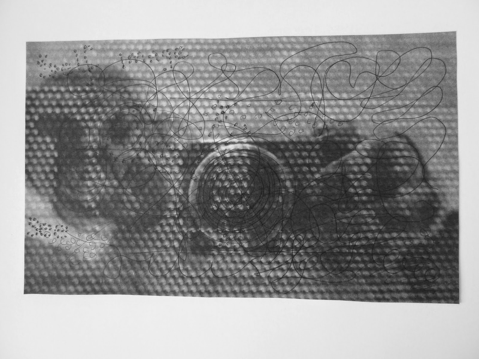
This image worked well as it was and the added scribble did nothing for it. I think that was because of the mesh effect anyway. In addition to the upside down word "artist", I added, self image and see in sort of benday dots to match the mesh. Because this exercise asked for lines, I did not add an eye in the lense of the camera which I think would have worked well so that the lense itself confronts the spectator as a sort of cyclops.
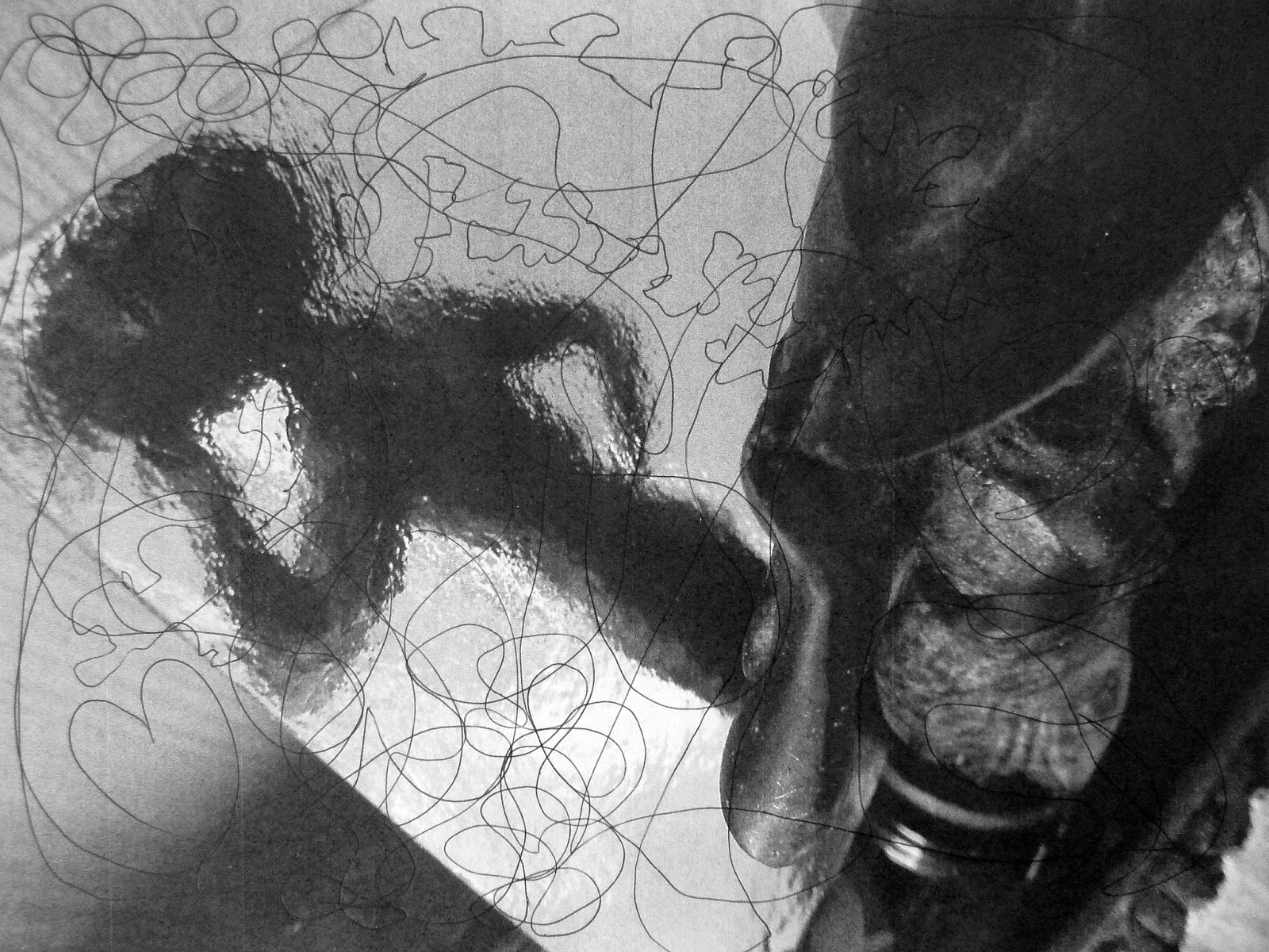
This image seemed to stir the romantic spirit in me and I imagined the lady meeting her lover so the heart symbol appeared with flowers and a line representing a frisson, slightly jerky. This photo for some reason only represents the line as dots, as do the others. It was strange that an image can invoke feelings such as these.
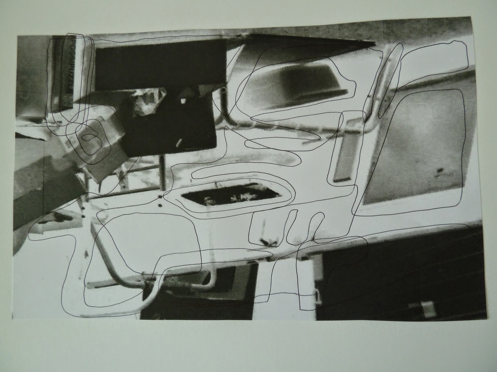
The image taken was of a lot of dumped rubbish, but it made a nice shape, especially when inverted. I merely outlined the objects and it produced a semi abstract picture. I was pleased with the general balance of the picture, and this was an occasion when the lines did add to the original image and augment the shapes.
Black and White
It is difficult to avoid overwhelming a picture with images, particularly as it is to be overworked later. I thought I had avoided the problem with the picture below and liked it more or less as it was. I suspect with the addition of gestural marks it has become rather busy. Although now that I can view them together on the page, perhaps not.

This work was influenced by Daniel Pitin, who uses architectural space as a background for his narrative. I have tried to use my collage in a similar way. My intention was to create a scene using architecture but that involved people in a dynamic way. The person jumping is unseen and ignored by everyone around. The fate of one person is immaterial in the business world, the church crumbling in the background echoes the sentiment of lost concern. Time, on the other hand, is of the essence. It was interesting to build the structure of the picture using various pieces of architectural pictures and creating a space that might almost be real but can't be. This element of collage I find very interesting. I also enjoy working in black and white as colour can often distract. I did wonder about the different shades of grey, I could have re-printed them to make them homogenous but decided in the end I quite liked the variation.
My second Black and White image was again using architecture but this time in a slightly more sinister way. I wanted to hint at the chaos, fear and terror of the first World War as it is the centenary of the breakout of that campaign. My intention was again to use architecture in a dark and threatening way. I wanted to introduce fear and this came to me in the form of an image I had produced for the Nurburgring. I had enhanced it and it ended up looking vaguely like a spider or piece of tumbleweed. I thought it would introduce something into my picture that would represent, terror and insidious fear.
I was nervous about overpainting the image which seemed to work fairly well but for it to be more sinister I felt I had to introduce more black, I think the whole thing works quite well now with the addition of gestural marks and the addition of black paint in a couple of areas. I decided to leave Nurburgring as it is fairly close to Nurenburg which is where trials were held in the second world war, so that the image transforms into a more general image of war and the fear of it.
The following was a picture of Al Hambra and I used the theatrical space to create a narrative about seeing into the past. I used oil pastel acrylic and Indian ink.

Friday 2 May 2014
COLLAGE ARTISTS
ROBERT RAUSCHENBERG, MIMMO ROTELLA, ROMARE BEARDEN
RAYMOND HAINS, TIM SHEPARD, DANIEL PITIN, DAVID MACH
Rauschenberg’s collages are
extremely varied in their look and incorporate silk screen printing at a lower
level of the painting with collage and sometimes paint on top. His compositions therefore are interesting
therefore not only because of their variety of style but method also. His
subject matter is more political and global.
By contrast Rotella is
mainly fixated on Marilyn Monroe in particular and the film world in general so
his works become rather monotonous. He
uses torn strips and displays the look of old posters. He doesn’t appear to use
paint, if he does, it is minimal. As far as Rotella's Marilyn Monroe pictures are concerned a similarity can be drawn between his collages and Andy Warhol's screen printing, the medium is different but the image as an icon is the same.
Another artist who uses a
similar old poster look but in my view more cleverly than Rotella, is Raymond
Hains. His collage is often torn right
back to almost nothing and he uses very little additional paint. The way he tears his strips is often very
different, sometimes thin, sometimes blocks, but the finished works are visually
appealing.
Romare Bearden features Jazz
and the black community in his collages they are represented in a much more
realistic/narrative way than the previous artists. He is literally picture making with collage. The colours he uses for the musical scenes are bright
and suggestive of jazz. He probably uses paint as a background but doesn’t seem
to use paint on the top surface over the collage, unless it is used very
subtlety.
Tim Shepard’s work has great appeal for me, I like his densely packed collages as well as his landscape work, Spitalfields for example. I also think he is right that memory is collage. We only retain fragments of memories and, for me at least, my memory doesn’t run like a cine camera. It is a collection of fragments stitched together in my memory to almost give the appearance of film frames and that is what Tim Shepard’s work is like it includes misplaced or incomplete scraps of memory, so in that sense his work is more realistic than Realism with a capital ‘R’.
Tim Shepard’s work has great appeal for me, I like his densely packed collages as well as his landscape work, Spitalfields for example. I also think he is right that memory is collage. We only retain fragments of memories and, for me at least, my memory doesn’t run like a cine camera. It is a collection of fragments stitched together in my memory to almost give the appearance of film frames and that is what Tim Shepard’s work is like it includes misplaced or incomplete scraps of memory, so in that sense his work is more realistic than Realism with a capital ‘R’.
Daniel Pitin is a collage
artist who incorporates figurative art into his work and he creates haunting
images, which, because of his background can seem dark and occasionally
threatening. Like Shepard his work has
narrative and has the look of a real space until you look more closely and you
realize the impossibility of some of the architecture.
I feel the difference, if
there is one, between today’s collage artists and earlier work is the element
of semi realism, particularly using architecture. David Mach, is another who uses this method. The use of computers has also appeared more
in contemporary work, if not to create the image then to help with the layout.
Appropriated Images
Barbara Kruger, Mark Wallinger
Ed Ruscha, Tim Shepard
Kruger’s work echoes her
previous employment in advertising and design and this very much carries over
into her work as an artist. Her
familiarity with layout and use of strap lines appear second nature to her and
enables her to appropriate familiar phrases with a slight twist, i.e. “I shop
therefore I am.” Because of their
familiarity they appeal to a majority and need no explanation so from that
point of view I see them as being rather trite. Like an advertisement they get their message across in seconds
using ‘telegraphic’ speak and are probably forgotten just as quickly, because
they frequently represent rather hackneyed views. They have an “American”
quality to them that is unmistakable.
Their style is also distinctive and carry not only the message but the
signature of the author, which is established by the use of imperative or
pronoun expletive style of speech and by employing black, red and white text,
mostly in the same font.
By contrast Edward Ruscha’s
work for me is more artistic, particularly his garage sequences. He has more of
the graphic designer in him, though he too was employed as a layout designer
early on. As well as collage and use of
text he also paints his images. He was influenced by Duchamp, Rauschenberg and
Jasper Johns. His minimal empty spaces
are reminiscent of Edward Hopper’s work.
The wide open spaces of Western America are also prevalent in his work.
His messages are usually more thought provoking than Kruger’s.
Mark Wallinger produces
traditional art in the sense that his ecce homo sculpture of Christ which
occupied the blank plinth is almost classical.
Likewise his white horse which sadly has not received the funding for
the Ebbsfleet Landmark Project, perhaps one day it will. But in addition his work can also be
challenging as in State Britain which was a recreation of the peace campaigner
Brian Haw’s protest outside the Houses of Parliament. His work therefore is
very varied. He says: “I like to think
that my interests and preoccupations range fairly widely, and I think as an
artist one should, kind of, be an explorer.
I don’t think I was a person who wanted to light upon a signature style
and then hone that. There’s a
temptation to being an artist as a small business but I don’t really turn out
commodities as such”. He is a thinking
artist.
Tim Shepard’s work has great
appeal for me, I like his densely packed collages as well as his landscape
work, Spitalfields for example. I also
think he is right that memory is collage.
We only retain fragments of memories and, for me at least, my memory
doesn’t run like a cine camera. It is a
collection of fragments stitched together in my memory to almost give the
appearance of film frames and that is what Tim Shepard’s work is like it
includes misplaced or incomplete scraps of memory, so in that sense his work is
more realistic than Realism with a
capital ‘R’.
Subscribe to:
Posts (Atom)