Showing posts with label Assignment 5. Show all posts

Monday, 10 June 2013

Excersises - Abstract Expressionism

Applying marks through Physical Actions
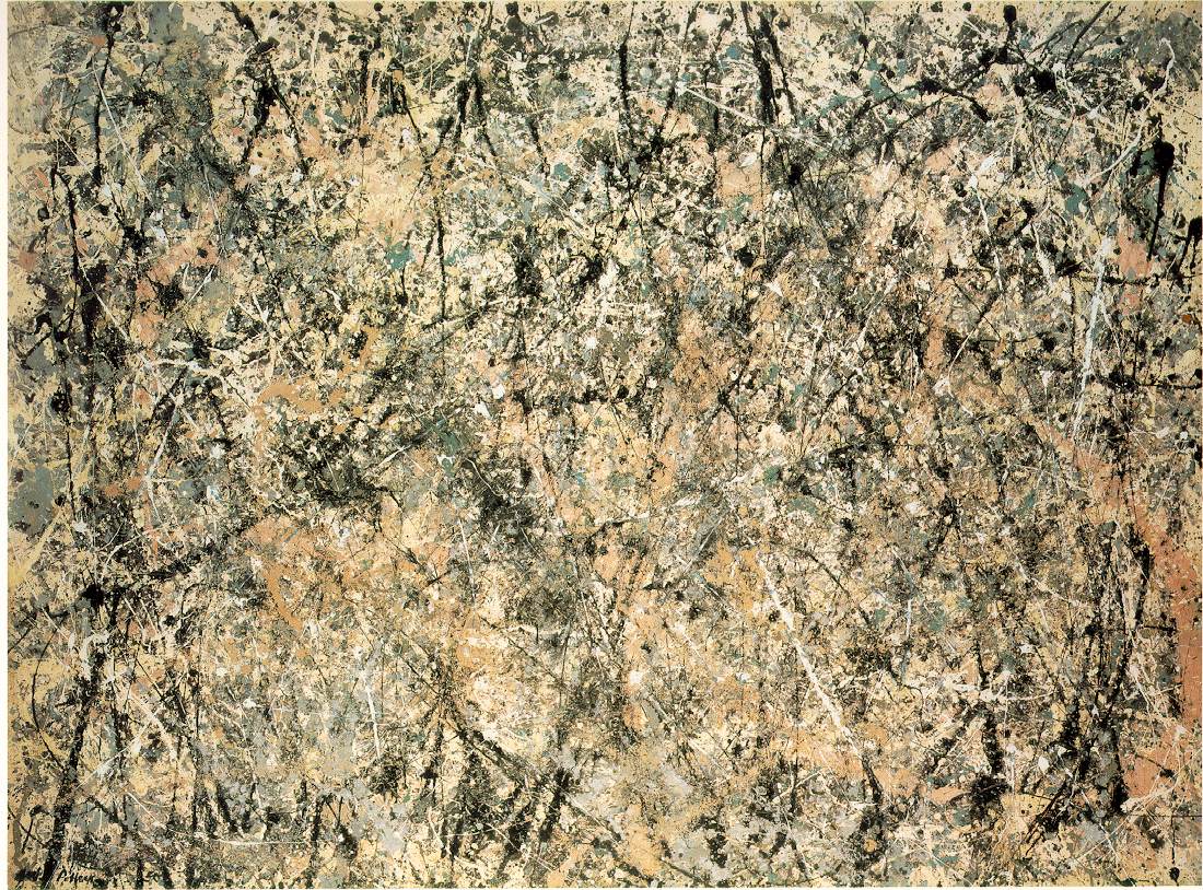
I enjoyed this exercise but would have liked the process even more if I had been able to use a really large canvas like Pollock, the flicks, and splatters would have used the whole arm which would have been liberating. Despite trying several concotions with the Acrylic paint I could not get the degree of "thread" that I wanted.  I knew that Pollock used household paint which is referred to as enamel paint.  I think the nearest we would have today would be gloss (not the non-drip).  I did have some emulsion paint and that did have the effect I wanted.  If I were going to use this technique I would invest in sample pots of different colours as I think it would work better than acrylic.  Exactly what the life expectancy would be I have no idea but it last on a wall well enough so I can't see there would be a problem.  Incidentally the colour in question is the almost beige colour.  It was very satisfying when the skein of paint lasted well so that I could do different things with it.  I would rather not have been confined to primary colours though. It has to be remembered that Pollock put holes in tins and poured the paint that way as well as pouring the paint down a stick. Working on a larger scale would afford this method.


Aplying Gestural marks with a variety of tools
The semi figurative element was what interested me here.  It was going to be a challenge to do that using a fairly uncontrollable technique so it was going to be informing as to how it would work.  I decided to use drafting tape as it appeared Richard Liley's example used it so I guessed it was acceptable.  I decided to outline stick figures and the title of the picture is "Hello".  The large figure in the foreground is waving to the one appproaching.  I echoed this with blue figures more or less doing the same thing.  It seemed reasonably dynamic and I used a comb as the final tool to give a feeling of movement. It was a very useful exercise in the erradication of detail which has always been something I want to aspire to. 
 
 
Taking Out
 
I have "taken out" but have also covered up by using the previous two techniques i.e. to include something figurative.  I have called it "Circus".  I could have developed it even more but one is wary of making a mess. To destroy and re-work a picture is always a possibility but one hopes to avoid it if possible.  The colours I used were not my usual pallet so I found that in itself, different.  I think the painting has an explosive glittering feel of a circus, but I could have scraped some more vertical in the top right.  I like the patina of this technique, it would be good for old walls and the like.
Textural Marks
This exercise didn't feel so proscriptive so I felt able to experiment much more.  I used a plaster of paris bandage, sand and cardboard, as well as bits of plaster.  I have called it Homage to Hokusai and am reasonably happpy with the result.  It was fun to do and enabled me to use some of the techniques I have learned in the previous exercises.


Colour Fields
 
I didn't enjoy this exercise, mainly because despite using the flow enhancer the acrylics didn't seem to be brush free.  Also I felt it was something elementary that might have been tackled in year one.


Adding Collage


I decided to stick to the red and green and leave a reasonable amount of suface area green and relatively untouched with just a few newspaper cuttings.  Then did some scrapes and drips in contrasting red and feel the result is quite satisfying.


Encaustic wax over Collage

This technique could definitely become addictive!  'Experiment and have fun', the exercise said, which I did and I could have gone on discovering new things for some time.  I was not sure if though about the fumes and didn't have a mask, but the door was wide open.  I used textured paper of different kinds as well as tissue paper.  I feel I would like to go out and buy lots more colours as I only had a box of about 10 colours, but it was enough for the picture I ended up with. I think with this sort of picture is as well to leave it untitled so that people viewing it can make of it what they will.


Transferring Images from Newspaper

I decided to use a rough watercolour paper as I didn't want the image to be strong.  I chose a nightclub photograph and am pleased with the result as I have emphasized one window and some doors which gives it a slightly chilling look.  I reminded me for some reason of Peter Doig's work, of the building through the trees. I was pleased with the way I made the cutting part of the building itself.


Transferring photos on to board


This didn't work well.  I ironed on max heat for quite a long time but the image didn't transfer properly.  Nonetheless I feel it has created something a bit different, even with a partial transfer, so I am submitting it as my attempt.  This was done on a canvasboard I tried another on cartridge paper which worked well enough but only by transferring the ink not the whole vinyl image. The image I used for the transfer was a black and white of an old abstract drawing I did several years ago.


After Jasper Johns

I based this picture on the French road symbol to give way to traffic at a junction.  I enjoyed the exercise as it took me to another style and another place.  I painted it on hard board which had score marks in it which I was able to use with the hot wax, and scraping method to add texture. I decided to do try to introduce something of the Franz Kline bridge pictures by accentuating the top right border. The use of tissue ppaper with the black hot wax made flowery shapes for the feminine La Belle France. Using texture in paintings is very particularly interesting.  I wanted to add the sign to a white background so I added a little yellow ochre to the white of the symbol which made the white ground appear slightly blueish. 

After Rauschenberg (Combining Transfer processes with gestural painting)

Transferring using T-shirt paper didn't work at all well.  If the original type of transfers were available (i.e. not vinyl) it would have worked better, I think.  which I suspect  is what Rauschenberg would have used.  I managed to do two but the others are pasted newspaper cuttings. I don't know if it is the type of transfer paper I used, but it was almost impossible to transfer, as can be seen in the earlier exercise. In terms of the picture and the design I enjoyed creating a "Rauschenberg" and must confess he is not an artist I would have taken very seriously before.  However, I find there is a lot more in his work than a cursory glance might suggest. The influence of Duchamp's Readymades become Rauschenberg's Collectables. 

The board was textured from a previous painting and I applied gesso over it, creating a textured surface.  I like working on that sort of board as it offers opportunities to create textures with the paint applied later.  I used Acrylics.  I stuck some blobs which collect round the lids of acrylics for the coloured dots. The square format seemed ideal because I didn't want to copy "Manuscript", but came near to it. I really enjoyed this exercise. The reversal of images between black and white or white and black has also taken place, which has the effect of disorientating the spectator for a split second.


Sunday, 9 June 2013

Towards Pop Art


Jasper Johns
Robert Rauschenberg

Bridging the gap between Abstract Expressionism and Pop Art were Jasper Johns and Robert Rauschenberg.  They developed from a "field" painting style to constructors of objects.  Rauschenberg made his "Bed" painting of 1955 from real bed clothes with paint dripped on them. http://www.google.co.uk/imgres?imgurl=http://www.moma.org/collection_images/resized/763/w500h420/CRI_80763.jpg&imgrefurl=http://www.moma.org/collection/object.php?object_id%3D78712&h=420&w=198&sz=19&tbnid=WY0-x-C8EQmX_M:&tbnh=90&tbnw=42&zoom=1&usg=__gwe2-hzPTvhsG-4nVZcGJU7CdV0=&docid=O16YOxyd0spsMM&sa=X&ei=M4K0UaTcKoXHPLiZgfgL&ved=0CDQQ9QEwAg&dur=2496  Marcel Duchamp might be considered the fore-runner of their style. In developing this technique the painting or object became part of the real world.  Rauschenberg also made three dimensional objects incorporating objects such as Coca-cola bottles, which he called 'combines'.  So pop art became a sort of expression of life itself.

Jasper Johns used the familiar objects too, in the form of the US flag, http://www.google.co.uk/imgres?imgurl=https://blogger.googleusercontent.com/img/b/R29vZ2xl/AVvXsEhtXAe1FUpNbyQIE1Pu37QrfFiyyZtFcJKwqJepI9wqpBwF0_c4Cjb6dYtF8-Kncdowjf8Hs2cJW0BYIH70SjFWcSfvCpZJ_E_07AcAjXhiDuI-2yfNI4lEb83Uos8R63FCrZoa5_Z_kns/s1600/jasper-johns-flag.jpg&imgrefurl=http://hollysartcorner.blogspot.com/2011/05/2010-project-3-jasper-johns.html&h=404&w=587&sz=54&tbnid=k6wFQ5PMMrY2lM:&tbnh=83&tbnw=120&zoom=1&usg=__uQfOxJurxPbDVD0Z8jh9xEwGrGc=&docid=5-LZdmeMYdk5wM&sa=X&ei=OIG0UcOlMoPv0gXyv4H4Ag&ved=0CDQQ9QEwAQ&dur=3523 he said because it was simple and visually striking. The design almost becomes abstract and Johns take the design to the very edge of the painting.  He sculpted Ballantyne Ale cans in Bronze then hand painted the labels. 
http://www.google.co.uk/imgres?imgurl=https://blogger.googleusercontent.com/img/b/R29vZ2xl/AVvXsEgNabMAMtJLhE2w8heBwBoCaaTEQzgZDT76mLgDY3Wp7nJeFQ0E7W9VblqP0uVDnNjM_Qusj0LyhNeIK-h_Pf3Iy_XllmaaOj-3Klhdq-1qeCoGrXY47GJYXWX2jw6TS7CNS6NxQayEVtE/s1600/Johns-Jasper_painted-bronze.jpg&imgrefurl=http://theseeyesockets.blogspot.com/2010/11/jasper-johns-painted-bronze-ale-cans.html&h=360&w=460&sz=34&tbnid=H_3ZJqxWOitRpM:&tbnh=93&tbnw=119&zoom=1&usg=__UKRRVozDeTZvN9oyi6rT6AFZbb0=&docid=pkq3v3YAtKnSXM&sa=X&ei=-IG0UbfbDcSJPavdgYAJ&ved=0CDcQ9QEwAw&dur=1Art was effectively a reaction against Abstract Expressionism which Roy Lichtenstein thought had become unrealistic, utopian and less to do with the world as it looked inwards. There was also a reaction against the commercialism of art but inevitably pop art too succumbed to the investors, regardless of attempts to be despicable enough not to be regarded as worthy of hanging.


Everitt, Anthony: Abstract Expressionism, Modern Art edited by David Britt, Thames & Hudson 1974, reprinted 2007

Abstract Expressionism

The post–war period in the US marked a distinct change as far as the art world was concerned.  The artists who helped to bring about this change were: Jackson Pollock, Mark Rothko, Franz Kline, Willem de Kooning, Barnett Newman, Arshile Gorky, Philip Guston, Robert Motherwell, Adolph Gotlieb, Clyfford Still.  Their work was and remains as controversial as Cubism in its early days.


The label Abstract Expressionism though applying loosely to these artists does not refer to a specific style of painting due to the variety of work from Pollock’s vigorous drip paintings to Rothko’s almost minimal approach.  To use the word “original” to describe their work is fraught with controversy.  For me the label Abstract Expressionism is more appealing particularly when considered in conjunction with Henry James’  quote.  “Experience is never limited; and it is never complete; it is an immense sensibility, a kind of huge spider’s web of the finest silken threads suspended in the chamber of consciousness, and catching every airborne particle in its tissue.” Polemical statements relating art to philosophical movements such as Existentialism is far too broad a perspective in which to enshrine an art movement.  Art for me is a productive creative process which uses cerebral processes and hinges on the experimental and innovative. Yes, there is a “leap of faith” but questions of 'authenticity' in the Existentialist sense, are too constraining to encompass the boundless enthusiasms which drove these artists’ creative impulses in an exploration of man’s inner being, his subconscious.
 
Abstract Expressionism seeks to provide a new language which draws upon previous methods, styles and artists and distils a new  dynamic which tries to explore the essence of a thing or sub conscious state using diverse applications of pigment and materials to achieve this.  It is this freedom to explore materials and methods of application that opens up endless possibilities. Drawing upon Marcel Duchamp's Readymades, for example, Rauschenberg develops his style using Collectables.
 
The environment and landscape in the US also influenced Clyfford Still, Franz Kline and Jackson Pollock.  The vastness and remoteness of the land itself almost required arm movement rather than wrist movement, so canvases were big to accommodate this.

Clyfford Still’s ‘Houses at Nespelem’ 
http://www.google.co.uk/imgres?imgurl=http://p2.la-img.com/750/12942/3760380_1_l.jpg&imgrefurl=http://www.liveauctioneers.com/item/3760380&h=459&w=600&sz=59&tbnid=-n7toHntKhZFJM:&tbnh=92&tbnw=120&zoom=1&usg=__2GHd68eTSneMmwA9qkJJbIVNUfQ=&docid=_ZAyY9WM4xv4ZM&sa=X&ei=Gke0UfeyFI7MPYnBgLAI&ved=0CHQQ9QEwCA&dur=2640   reminds me of Cezanne’s House of the Hanged Man  http://images.worldgallery.co.uk/highres_images/worldgallery/3/5/354164.jpgin its desolation and rendition, presenting the buildings almost like a stage set, as well as the obvious comparison with Charles Burchfield’s Black Houses of the same year, 1936.
 
The new immigrant population including, Guston, Rothko, de Kooning, and Siskind brought an accumulation of knowledge regarding menace, political unrest, torture and oppression.  Philip Guston’s Martial Memory  draws on Surrealism and the Draper after the Neo-Classical style, and there is again an element of stage, a sort of cold unreality similar to that felt in Still’s Houses of Nespelem, and indeed Kline’s Palmerton Pa, http://www.google.co.uk/imgres?imgurl=http://www.reproduction-gallery.com/oil_painting_reproduction_gallery/Franz-Kline-Palmerton-PA-1941-large-1100168313.jpg&imgrefurl=http://www.reproduction-gallery.com/oil_painting/details/copy_artist/1100168313/masterpiece/Franz_Kline/museum_quality/Palmerton_PA_1941.xhtml&h=233&w=300&sz=59&tbnid=IwWTNX9J2rgUwM:&tbnh=93&tbnw=120&zoom=1&usg=__1jciDcesV_j-qf3Qtzgjp6eT8uA=&docid=MRCgIhqhdHT-5M&sa=X&ei=ZUq0UbX0LILJOZ_mgFg&ved=0CDcQ9QEwAw and Pollock’s Going across the Track  

They convey a bleakness and timeless quality reminiscent of the stage set.  Interestingly, Guston had sometimes been a bit part actor in Hollywood, and had been a scene painter. De Kooning painted mannequin faces and again one can see the influence of the wide-eyed stare in his work.  This bleakness and sense of inertia and hopelessness was doubtless a manifestation of the times, remembering that this was the period of the Great Depression and later of course, World War II, and Hiroshima.

Abstract Expressionists, faced with the momentous events leading to Hiroshima and Auschwitz sought some kind of imagery that might explore the psychology which unleached such terrible consequences, rather than trying to define the events themselves.  Artists taking refuge in America, Andre Breton, Andre Masson and Max Ernst looked again at automatism as a means of divining unconscious thought.
 
Photography also features at this time through the work of Paul Strand, Aaron Siskind and Walker Evans.
Hans Hofmann, another immigrant who fled Nazi Germany, had known Picasso, Matisse and Braque and started an art school in New York in 1933 recommending the synthesis of Fauvism, Cubism and German Expressionism.  With the use of colour he explored the ‘push and pull’ (recession and advance) of objects, which he felt was more tangible than drawing alone.

To understand the work of Pollock one can do no better than quote Henry James: “Experience is never limited; and it is never complete; it is an immense sensibility, a kind of huge spider’s web of the finest silken threads suspended in the chamber of consciousness, and catching every airborne particle in its tissue.” He is influenced early on by Mexican Amerindian legends and was influenced by muralists Rivera and Siqueiros as well as Orozco.  One senses the ancient work of the Inca and Aztec nations percolating through his work. He said he wanted to be "in the painting" and by working on the floor he felt he almost achieved this.


For me Jackson Pollock's early work and Willem de Kooning are effectively visceral paintings.  They are strong and gutsy in the application of paint and in their compositions which remain figurative yet almost primitive.  Later, Pollock's drip paintings or action paintings, which herald the idea of an overall "field", become less intense in that raw gestural sense.  Indeed "Lavender Mist " http://www.ibiblio.org/wm/paint/auth/pollock/lavender-mist/pollock.lavender-mist.jpg  and "Cathedral" are soft by comparison, something picked up on by the photographer who used these, and other paintings of the period,  as a background proclaiming the "new soft look" in "Vogue" (March 1951 edition).  Interestingly, Pollock had been alcohol free during the period 1946 to 1950, when these were painted, whether or not that influenced  his output, who knows? Later he becomes doubtful of his own abilities and feels his style has run its course.  An exhibition of new  black and white paintings is unsuccessful so he returns to colour with "Blue Poles" http://nga.gov.au/international/catalogue/Detail.cfm?IRN=36334but the doubts remain. He has an affair with Ruth Kligman and is unsure of the relationship with his wife Lee Krasner, and he effectively stops painting. He is not prepared to produce a 'Pollock 'for the sake of it.  His work is not "accidental" but controlled and he has something in mind as he works.  When someone said his work needed to call on nature for its inspiration or he would run out of ideas,  he said: "I am nature".  He felt that art came from the subconscious, and he used Jungian ideas in his work. Presumably his mind was in such turmoil that he could not longer tap into the subconscious energies, hence his lack of work. Other artists of the period suffered with depression, Guston, Rothko as well as Gorky who committed suicide in 1948.
 
Peggy Guggenheim, who also fled from Nazi Occupation, suppported immigres such as Kandinsky, Miro, Klee, Arp and Masson.  This influx of talent led to America becoming the centre of art, as opposed to France. Peggy Guggenheim had been Pollock's patron too and supported him financially, and along with Clement Greenberg,  did a lot to promote his work.   Pollock, along with others in the artistic community which grew up around him, goes to psychiatrists in New York and eventually, having returned to drinking he has a tragic car accident in 1956 in which he is killed, the result of which meant that his paintings were sought after, and the financial magazine "Fortune" which had recommended buying his paintings just a year before his death as an investment, became a self fulfilling prophecy. It was the period of James Dean, the actor,  who also died young in tragic circumstances, which caused him to become immortalized, Pollock was to be revered in much the same way.
 

De Kooning almost proceeds along the opposite route with rather softer more figurative paintings initially, with "Seated Woman"    "Pink Angel" http://arthistory.about.com/od/from_exhibitions/ig/de-Kooning--A-Retrospective/03-Willem-de-Kooning-Pink-Angels-1945.htm  the latter  uses biomorphic  forms, or pictograms whereas Woman series paintings http://www.friendsofart.net/en/art/willem-de-kooning/woman-v are much more aggressive in the application of paint, and overall effect. The sexual element is epitomized in a video still of Paul McCarthy's of de Kooning supposedly at work. De Kooning himself regards himself as an eclectic artist and his painting, "Excavation" (1950) https://blogger.googleusercontent.com/img/b/R29vZ2xl/AVvXsEgLDpSF4mTIS20m92WtfMXy7OlzcLwHfqSzAU1JHiiQFdDQ4Bi1z5dgl70zlnfpjf3_1aqdHiIItK8-F0w2EgUBAqG3kEZ4V_niFhjWMCGLgsKLqRTqrOxN9ZcPDdCmecmJ5FyrlI46AIHo/s1600/IMG_0720.JPG certainly appears to be influenced by Picasso's "Guernica". I particularly liked his minimal use of colour in this painting, making the faces and eyes appear ghostly. de Kooning takes part in a husband and wife exhibition as his own wife Elaine de Kooning is an artist.  Like most wives in those days, their work was side-lined and their paintings were seen as secondary to their husband's work.  In 1955 he returns to semi-abstraction using, landscappe and highways as his motivation and painted "Door to the river". This is much more broadly painted than 'Women' paintings and almost looks like a cropped element from a larger painting.  He is a "field" painter to a lesser extent than Pollock, and his style without a foreground or background and a highly charged gestural motif puts him in that category.

The term Abstract Expressionism is difficult to define as the artists are very individual.  Mark Rothko can be regarded as an exponent of field painting, but his style is quite different in that it is not gestural. In 1939/40 Rothko painted motifs which he reproduced as a sort of freeze which explored abstract biomorphic shapes, in a Surrealist style similar to those of Matta, Gorky and Tanguy.  It is interesting to look through these numerous paintings and watch the development process where the shapes decline and the rectangle takes precedent together with the reduction of colours. A book entitled Mark Rothko Entombment displays the process. Robert Motherwell also explores these pictograms but ends up producing them almost as symbols in Chinese writing. Just as artists were trying to suggest globally relevant ideas through abstraction, so Rothko was trying to do the same thing by using colour.  Some colours excited the senses, others dulled them. The idea of art being universally accepted and understood through symbolism and colour were ripe for exploration.

Frank Stella's work explores colour with geometric shapes, and moves towards more biomorphic shapes in his later paintings, but like Rothko, it is colour that captivates him. What I find interesting is the mention of various mediums, included in the title: Hockenheim, 1982 (oil stick, urethane enamel, fluorescent alkyd & magna on etched magnesium), which shows the increasing use of new and different tools to be exploited in the interests of art. His exploration  of geometry takes him towards three dimensional space and architectural motifs. He saw his work not as a window into a different space but as an object in itself. His work seems to pre-empt that of Bridget Riley.  Stella got to the stage where painting alone was not enough to fuurther his interests in exploring three dimensional space and he embarks on developing architectural ideas including one for what would have been an iconic Bridge over the  river Seine.  Whilst Ove Arup, Consultants helped to  develop drawings, the bridge was never realized.


Anfam, David: Abstract Expressionism, Thames and Hudson, 1990, 1994 1999
Britt, David: Modern Art, Thames and Hudson1974, 1975, 1989, reprinted 2007
Elger, Dietmar: Abstract Art, Taschen GmbH, 2008
Everitt, Anthony: Abstract Exressionism, Modern Art, edited by David Britt, Thames and Hudson1974, 1975, 1989, reprinted 2007
Gooding, Mel: Abstract Art, University Press, 2001
Hess, Barbara: Abstract Expressionism, Taschen GmbH, 2005
Hughes, Robert: The Shcok of The New, Thames and Hudson 1980 and 1991, repprinted 1993