
I said in my Proposal for this Assignment that I felt way out of my depth because of the practical/craft skills required. I felt I did not have a non-visual skill set and felt inadequate for a long time, but I knew I had to "bite the bullet" so I reflected for a considerable while on possible projects. I didn't know if they were silly and a waste of time, or if I thought they may have plausibility and if they did, whether I could be successful in their rendition.
However, the first exercise gave me a smidgen of encouragement, as I felt I had pulled together the concept and the expression of it together with subject matter that was relevant to it. It was influenced by the Jean Tinguely work illustrated in the project notes, and I was concerned that it might not look as though I had given much thought to the project because I drew upon an illustration that appeared in the notes. That would have been my only reservation.
The tableaux or Diorama was interesting for me because I expanded it slightly to include text and illustration by way of a Conceptual piece, which I felt added to it as a Tableaux/Diorama. It was also light-hearted, which is something I don't often get to do in my art. It therefore offered an opportunity to create a multifaceted object with crafted apple cores; a found object in the processor and a tableaux incorporating a real life situation. I was happy with the references to Marcel Duchamp, and the Womanhouse by Robin Weltch which I felt worked really well. The idea of Work in Progress was twofold, it referenced the male/female inequalities, which are still not addressed as well as to the piece itself and I felt this was equally effective.
It would have been nice to do the bottle bank idea but I don't have a vice and workshop so wouldn't have been able to put together a frame of the sort I was planning.
The limitations I professed at the outset were considerations I had to overcome by the choice of work, so my options were somewhat limited by my ability to undertake work outside of my inadequate skillset and facilities.
As far as Witches Wood is concerned, I had this project in mind sometime ago so had been taking photographs in various weather conditions. It would have been nice to have uncovered some local history, even if it had only been anecdotal, but my research didn't come up with anything. However, with the link to the Witch-finder General it begs the question and leaves it to the viewer to speculate the existence of the wood.
The final project didn't quite end up as my proposal but metal was the material that persuaded me to pursue the Final Project. I had been reading some Philosophy on the subject of the cosmological argument, which is always very interesting hence the subject matter.
The tying of various pieces of metal with micro thin line was a test in itself and the small pieces of rock were the most difficult. I had to glue the line to them before tying them as the line kept slipping off. I was also slightly uncomfortable with defacing the wall of my studio with the graffiti, it was similar to how I felt when painting the frame in an earlier project.
I think there is a lot of scope with 'objects' that I hadn't previously realized. Indeed the whole idea was completely alien to me, but with the right tools and facilities I can see that this would merit further exploration. Scale is one of the things that is difficult to achieve for the same reasons, and I feel the success of a work is dependent on or constrained by matters relating to this issue. For example one can imagine Space and Time being exhibited in a gallery space with much larger elements but pragmatically up-scaling equals commercial support both financially and with appropriate equipment and labour. Such up-scaling would give the piece more gravitas which may be missing in my attempt.
I could have tried to sculpt Einstein's equation from polystyrene but it would have required a hot knife. I tried with an ordinary blade but I could see it would not work, then I thought that using the wall itself in a graffiti style would add to the piece, by bringing it into the modern world of art. Using spray cans on a large wall would be great. I am thinking of a space similar to that used in John Ahearn's Homage to the People of S. Bronx.
I am still hoping to get some hands for my 'Time-piece', and will have to see what might be available at a car boot sale.
Despite the trepidation with which I started this assignment I feel I have achieved more than I expected.
Showing posts with label Exercise. Show all posts
Showing posts with label Exercise. Show all posts
Friday, 13 February 2015
Final Project
My final project is influenced by Cornelia Parker, Anselm Kiefer and Jessica Stockholder, and combines objects, images and graffiti.
The work represents time and space and can be read as a diptych, triptych or as individual pieces.
Taking the piece on Space, I am connecting not only the subject matter within a spacial area but the concept of traditional painting by relating it back to the wall by following the conventional practice of hanging paintings on the wall. At the same time I am projecting it forward into observable space, suggesting the idea of making art part of the gallery space not merely adhered or appended to it.
The canvas takes the idea of Kiefer's work on space using real diamonds to depict the planets and stars. In this case I have represented stars and planets by rhinestones, glitter and painted pieces of rock to represent meteors.

The metal bar from which the metal objects are suspended looks like Orion's belt and might be interpreted as such, its shiny surface reflects the viewer much like a mirror, suggesting self reflection, and self reflexivity. The objects are a direct inspiration from Cornelia Parker.

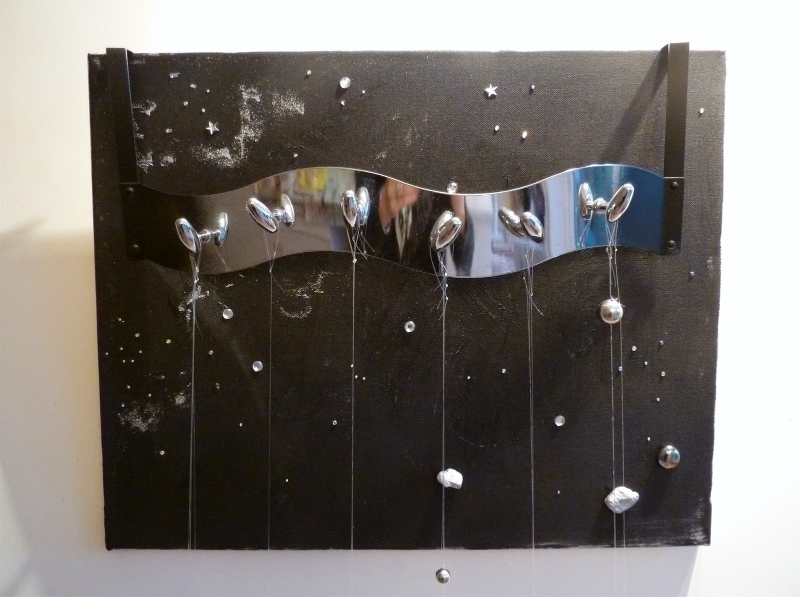

The next element E = mc² joins both objects i.e. Time and Space. It is painted directly on to the wall conflicting with the traditional idea of easel art, suggesting not only progress in art but progress in the space time continuum. It is presented as graffiti street art, because space is ubiquitous, and because street art is also. It hints at the fact that sadly some people populating the streets do not even have their own space. It not only connects the two main elements but could be the central motive of a triptych, its importance is worthy in its own right and philosophically would question its relevance (or relativity) in connection with religion, by being presented as a triptych.


The third element Time could be read separately - a 'Time-piece' showing the explosion or deconstruction of time, or taken in conjunction with Space when it would become an integral part of the whole. I would like to have added some hands but I haven't been able to get an old clock and as they are mostly battery operated these days so it wasn't possible to find any innards.


Throughout this particular Assignment I have consciously tried to minimalize the piece as I have a tendency to clutter. However, I want to say a lot and maybe now conceptually it has become too encumbered with conflicting meanings. But in a sense it is not for me to interpret the piece for the viewer but for the viewer to find these things or re-interpret them.
The work represents time and space and can be read as a diptych, triptych or as individual pieces.
Taking the piece on Space, I am connecting not only the subject matter within a spacial area but the concept of traditional painting by relating it back to the wall by following the conventional practice of hanging paintings on the wall. At the same time I am projecting it forward into observable space, suggesting the idea of making art part of the gallery space not merely adhered or appended to it.
The canvas takes the idea of Kiefer's work on space using real diamonds to depict the planets and stars. In this case I have represented stars and planets by rhinestones, glitter and painted pieces of rock to represent meteors.
The metal bar from which the metal objects are suspended looks like Orion's belt and might be interpreted as such, its shiny surface reflects the viewer much like a mirror, suggesting self reflection, and self reflexivity. The objects are a direct inspiration from Cornelia Parker.
Sorry I can't turn this photo
The next element E = mc² joins both objects i.e. Time and Space. It is painted directly on to the wall conflicting with the traditional idea of easel art, suggesting not only progress in art but progress in the space time continuum. It is presented as graffiti street art, because space is ubiquitous, and because street art is also. It hints at the fact that sadly some people populating the streets do not even have their own space. It not only connects the two main elements but could be the central motive of a triptych, its importance is worthy in its own right and philosophically would question its relevance (or relativity) in connection with religion, by being presented as a triptych.
The third element Time could be read separately - a 'Time-piece' showing the explosion or deconstruction of time, or taken in conjunction with Space when it would become an integral part of the whole. I would like to have added some hands but I haven't been able to get an old clock and as they are mostly battery operated these days so it wasn't possible to find any innards.
(Sorry I can't turn this photos)
Throughout this particular Assignment I have consciously tried to minimalize the piece as I have a tendency to clutter. However, I want to say a lot and maybe now conceptually it has become too encumbered with conflicting meanings. But in a sense it is not for me to interpret the piece for the viewer but for the viewer to find these things or re-interpret them.
Witches Wood - Non-Art Space
I have used the space known as Witches Wood in my village as my non-art space and have set up a Blog to cover this work. I still have to introduce the object I propose into the wood, namely a black polystyrene bag weighted at the head and feet to represent a hanging body. Once complete I will photograph it and add it to my site. At the moment access is limited to my tutor but the site name is http://witcheswoodcsm.blogspot.co.uk/
Friday, 6 February 2015
Diorama/Tableaux
My diorama has many influences and could be regarded as a piece of conceptual art, as it involves text, image and object to reveal the concept.
I have drawn upon the mid 20th century scope of Feminine art, which depicts the female artist as precluded from the art scene in many ways and also emphasizes the so called 'accepted role' of women in society. I do not regard myself as a feminist but I think it is true to say that things have changed very little since then. Women predominately still play the role of housewife except it is now combined with career woman or wage earner. I think she still prepares the evening meal and is prime operator of kitchen gadgets.
My Diorama is based in the home, the kitchen to be precise. The reference to work in progress is threefold: the artwork is not finished; the changing role of women in society is ongoing; the use of the objects for a supposed recipe is incomplete. Hence the kitchen worktop is the appropriate place to display my object and forms part of the diorama. It is influenced by Robin Weltch's Womanhouse.
The cores themselves are also symbolic of the core of the home; the core design of the artwork, i.e. its conceptual/process nature relating to the 4 core processor; the female, who tempted Adam with an apple, and the artist, who effectively is the core processor.
In fact the piece does not relate to a recipe in terms of the artwork, but to a spurious machine called a Logic Busting Image Decoder and Visualizer. It is a take on Marcel Duchamp's Large Glass and is supported by an image and text explaining its purpose. (Purpose, philosophy tells us, gives meaning to life!). The illustration is influenced by Surrealism.
The sculptural quality of the apple cores is influenced by Claes Oldenburg and the overall idea to various conceptual artists including Martha Rosler, Cindy Sherman and Jeff Koons
LOGIC BUSTING IMAGE DECODER AND VISUALIZER (Small Paper)
(Influenced by Marcel Duchamp’s Large Glass)
The known nutritional properties of beans are incomparable
to their mind enhancing capabilities and it is the latter which are exploited
in this revolutionary process. The beans
provide the “wind of change” which in turn has a astonishing affect, bringing
about a mind altering state after being filtered through white coral (now dead)
representing the cerebral four core processor running at 10,000 Mhz with a
capacity of approximately 500 Terrabites.
The mollusc (of Divine Proportions) which lies beneath is
sited next to the unseen “Pits” or Pituitary Gland (to give it is correct
term), which like many glands occasionally “weeps” or “swells” depending on the
ambient air temperature. The position of
the mollusc is therefore somewhat unstable as a consequence but due to its
delicate nature cannot be affixed to the Cerebellem (white coral) due to the
metallic third harmonic thrige resonances
and resistances of the crown wheel and pinion appended to it.
A fly wheel mechanism obviates any major dislocations but no
device has yet been introduced to prevent shells from dropping. Passers by are therefore recommended to wear
protective clothing as the blast capabilities may well surpass the design
parameters specified for the “wind of change” for which the mollusc was
intended.
This briefly outlines the initial Logic Busting Mechanism,
which, as can be seen ensures that any prevaricating logic or skeptisim about obscure
and difficult images is easily irradicated by its employment. The viewer is
immediately transported by the fly wheel into a different world of engagement.
The process is not without hazard, as already mentioned
above, and one can see that the fly wheel itself is a precarious travel process
who’s only recovery modes (in the event of accident) are the’ Identified
Floating Saucers’ and’ Box Under the Sea’ (IFs and BUTs) which shadow its
progress. By their very nature these are not secure Thought Recovery Vehicles,
so caution is advised before reading the above.
PS The fly wheel is occasionally “honeyed” by a bee to keep
it sweet (as seen in the eye of the beholder).
Further details of the Image Decoder and Visualizer will
appear later, this resumé merely outlines the Logic Buster.
Combining Objects and Images
Bridgit Riley developed a style of painting that explored the visual image for its qualities affecting sight, the visual disorientation of movement and dynamic interference and shimmer achieved by her black and white as well as her coloured paintings exemplifies this style.


My piece of artwork draws on the idea of "interference." The context of my work relates to the social context of the television screen and how it invades our personal space; growing ever larger until we become viewers in a cinema space, no longer 'loungers' on a sofa. This "interference" therefore alters the social dynamic space of the home.
The dual meaning of "interference" in the visual sense, as perceived on old black and white transmissions, is also indicated. The idea of a wider space, that of the universe, is hinted at through this interference which is the sound of the hiss of the Big Bang 4.8 billion years ago, and would be played as part of a sound art with the object.
I have represented the screen with a Bridget Riley type print to give an indication of the visual distortion and the hiss, and crackle is represented by the metalic swarf which comes out of the screen and down on to the floor, interposing itself on the surrounding space.
It is therefore a visual and sculptural object combine but alludes to a pedestal in the form of a tv base support, which was the traditional way of presenting a sculpture.
I gave a great deal of thought to this object/combine and have tried to give a context to my work. It is also influenced by Jean Tinguely's "Turning of Friendship of American and France." as well as Robert Rauschenburg and to a limited extend Cornelia Parker.
I am aware that my work sometimes becomes rather cluttered, so I am making a conscious effort not to include too much, i.e. less is more.
Sunday, 30 November 2014
Magic Door
I started off with high hopes with this picture. I wanted originally to include a door that would close on to the picture on the right then when opened close on to the picture on the left. I don't have the skills to make such a door and without it the picture is unsuccessful. Also I tried to create the ball on the left as a 3D image but it just doesn't work. I was inspired by Anselm Keifer's work and wanted to include that heavy texture and some rhinestones, but the whole effect is clumsy.
The painting is meant to illustrate the following poem:
When life's horizon was hidden in haze
And no limits had been defined,
I lived in a haven I thought was a maze,
So I searched until I did find.
When an exit I saw,
With exuberance of youth
I ran through that magic door;
Only to find when I turned around
The door wasn't there anymore.
I envisaged using Picasso's Dove painting to illustrate innocent youth with the dove of peace, except that the background was hinting at a maze, to illustrate the poem. The handle on the door has the look of an LED, therefore something slightly magical. The future of the person on the right is unknown, but there is an horizon, so she is aware of mortality and life's limited span. Her path is picked out in rhinestones indicating hope of better things to come.
Thursday, 23 October 2014
OBJECT PAINTING
The object painting I decided on eventually involved abstract and geometric shapes. The inspiration was multi-layered going back to Ben Nicholson and Barbara Hepworth to the present day with sculptural work by the late Sir Anthony Caro, Michael Buhrer, and particularly Charles Hinman whose work I particularly admire. The precision reminds me of the stones laid in Peruvian temples and the use of hard edges echoes the hard edge styling in motor car design.

 My own object painting doesn't have that kind of precision but it alludes to it. The concept was to use some of the abstract patterns from my Malevich inspired sketches drawn for the initial exercise.


I found it difficult to turn these designs into three dimensional pieces and became particularly hung up trying to make a pyramid, it was easy enough making a 3 sided pyramid but not as easy to do a 3-D four sided pyramid. I did become a bit preoccupied with this.

For the final piece I knew I wanted to include pyramids as a sort of aerial view of the desert. But playfully I wanted them to either infer Madonna's boobs or a face with protruding eyes. I also knew that I wanted to hint at Hinman's arrangements, with the close proximity of geometric shapes. Having been to see the pyramids in Cairo one is very conscious of the ancient and modern co-existing and I wanted to imply this by the mass of road and/or rail lines in the painting. I worked the original maquettes with artex, which is fast becoming one of my favourite mediums. Once dry I felt I wanted to leave the object white much as Nicholson did but when looking at the finished object against the wall I realized that the shapes would be interesting to coat in liquid paint and to see how it would fall over the various elements and what paths it would take amongst the various textures. So I dropped liquid acrylic paint down from the top to see how it would look. Thinking of it as a desert scene I decided to use yellow ochre. However, I now wonder whether other colours could be added.


My own object painting doesn't have that kind of precision but it alludes to it. The concept was to use some of the abstract patterns from my Malevich inspired sketches drawn for the initial exercise. I found it difficult to turn these designs into three dimensional pieces and became particularly hung up trying to make a pyramid, it was easy enough making a 3 sided pyramid but not as easy to do a 3-D four sided pyramid. I did become a bit preoccupied with this.
For the final piece I knew I wanted to include pyramids as a sort of aerial view of the desert. But playfully I wanted them to either infer Madonna's boobs or a face with protruding eyes. I also knew that I wanted to hint at Hinman's arrangements, with the close proximity of geometric shapes. Having been to see the pyramids in Cairo one is very conscious of the ancient and modern co-existing and I wanted to imply this by the mass of road and/or rail lines in the painting. I worked the original maquettes with artex, which is fast becoming one of my favourite mediums. Once dry I felt I wanted to leave the object white much as Nicholson did but when looking at the finished object against the wall I realized that the shapes would be interesting to coat in liquid paint and to see how it would fall over the various elements and what paths it would take amongst the various textures. So I dropped liquid acrylic paint down from the top to see how it would look. Thinking of it as a desert scene I decided to use yellow ochre. However, I now wonder whether other colours could be added.
Because I am seeing the image as an elemental design incorporating ancient ideas and modern I feel I should include the other two primary colours, but am reluctant to do this as there is something elemental about the idea of pure desert colour, and it is more minimal and therefore basic using just the one colour. I also toyed with the idea of using a frottage technique over the railway lines in black, but then they would be too prominent and detract from the shapes and their shadows which is what makes the picture interesting. I am reminded of Tapiés and his limited palette so for the time being at least, it will stay as it is.
Tuesday, 26 August 2014
BOXES
I was inspired by Joseph Cornell's "Taglioni's Jewel Box" . It is a romantic piece of work with hidden depths beneath the ice cubes, with an inscription of the moment when the ballerina is said to have danced on a panther skin in the snow, for a highwayman who had stopped her carriage.
Having seen how Cornell worked I wanted to create something that might be considered interactive in an albeit limited sense, but as a piece of fun. I conceived the idea of a pun on 'box' by creating a toy box., situated in a diorama setting but without creating an actual room. I went to some charity shops with my grandson and he helped rummage among the toy section for appropriate pieces, so it was a joint effort!
The items I managed to pick up all lent themselves to being "usable". Wooden dominoes with images on them which can effectively be played with by piling them against the back wall, a plastic flute, a small ball, a beach hut with walls that can be moved and in the middle a little mouse who's tail you pull to get the arms and legs to flick out. One of the Lego bricks is adhered to the rear wall and the other brick can be attached or not. The only black object both in colour and message is the automatic weapon placed on top of the teddy bear 'box' - a box within a box, repeated in the toy box itself, creating repeating motifs. I wanted the contents of the box to be considered as a reflection of the development of children generally: Love, represented by the cuddly toy, Aggression by the automatic rifle and tiny plastic sword, Intellect by the dominoes, Energy by the ball, Music by the little whistle, Exploration by the beach hut, love of Animals by the sheep, Creativity by the Lego bricks, Fun by the extending mouse.
I originally considered painting the frame white in similar style to Michale Buhler, but I liked the idea of red because it is an 'active' colour and remembered something that was said, I by Matisse, that if you are going to use red, use a lot of it. Having thought of Matisse I remembered his Red Interior painting which I have always admired and decided my Toy Box was going to be red.
The 'box' support was actually a canvas in reverse, which had a painting of the leaning tower of Pizza on the front, which I have left as part of the original object. I used Artex to form the "frame" and stuck some objects to the "room" leaving others to be played with. therefore giving another dimension to the visual work.
RECYCLE A FRAME
For my recycled frame I decided to replicate one of the sketches I had produced in an earlier exercise. My intention was to produce something visually fairly plain but to have a narrative that hinted at more complex ideas.
The title of the frame is "Language barrier". The image features 'made up' hieroglyphs on the top section with Pitman's shorthand in the bottom section. The two are separated by what appears to be a river or a sea. Continents with different cultures and languages unable to communicate, hints of the Rosetta Stone and the rivalries over its ownership. Idealistic ideas of communication being a potential instrument for peace (if you can translate the shorthand), barriers, bridges, Gulfs, being engulfed and so on. It seemed appropriate to use the frame as the river is seemingly without end and therefore the number of languages too. It is a reference to the field painting of Jackson Pollock which extends beyond the canvas, into infinity, but it also insinuates, or carries a suggestion of, a bridge from one side to the other, at least I hope it does.

The title of the frame is "Language barrier". The image features 'made up' hieroglyphs on the top section with Pitman's shorthand in the bottom section. The two are separated by what appears to be a river or a sea. Continents with different cultures and languages unable to communicate, hints of the Rosetta Stone and the rivalries over its ownership. Idealistic ideas of communication being a potential instrument for peace (if you can translate the shorthand), barriers, bridges, Gulfs, being engulfed and so on. It seemed appropriate to use the frame as the river is seemingly without end and therefore the number of languages too. It is a reference to the field painting of Jackson Pollock which extends beyond the canvas, into infinity, but it also insinuates, or carries a suggestion of, a bridge from one side to the other, at least I hope it does.
WEAVING
At the time of doing this exercise the Scottish referendum vote is in progress and the outcome unknown. I thought it would be interesting therefore to "fracture" the flags making up the Union Flag. I decided it would be better to print the Scottish soltire, St Patrick's flag and St George's flag to ensure I had matching sizes. I tried painting, but it was not as effective. I overprinted the St George and St Patrick flags on to one image with the Scottish Soltire printed separately. After all, it may mean a change of flag if Independence is favoured, presumably the Soltire. would be removed. By fracturing the images using the weaving technique, I felt it was appropriate to mark the current state of play. It is also an evocation of Jackson Pollock's US flags.


My first attempt used one inch strips and I don't think I got the alignment quite right. It was also painted which wasn't as crisp as I wanted.
For the second attempt I thought it might be an idea to try smaller strips, just in the middle to see how the image displayed then, and whether or not it would look more interesting. It was better than the first but didn't quite look enough like the Union Flag for it to have much meaning. Strangely, the tops are aligned yet the bottom is out of alignment but there are no vertical gaps to account for this.
For the third attempt, the Goldilocks principal springs to mind, I decided to take the central crossover out of the Soltire and to space those strips differently, eliminating two strips altogether. I also cut the horizontals much narrower still. The finished result looks closer to a "fractured" Union Flag, with St George's flag more readable and bolder than the other two flags, which is the effect I wanted to achieve. I hope it is not a beheading offence!
SHAPED PAINTING FROM EVERYDAY LIFE
Because I live in a fairly modern house now I didn't think there was much scope for an "interesting corner". However, the stairwell possibly had potential so I thought I would see what I could make of it. The more photographs I took from different angles, the more interesting the area became. The clean lines and almost white planes offered an architectural interest similar to that of the work of Corbusier.


I felt there was some possibility in the photos to produce something with a geometric sculptural feel to it, a sort of labyrinth of conflicting perspectives. Rather than using collage I thought I would use Fireworks to move the photos into different positions to see what I came up with.
I was pleased with the finished product and it was surprising the amount of moving around that was necessary to achieve the effect I was after, getting the angles right and covering parts of the image I didn't want took some time but I think it was worth persevering . I decided to reduce the colour on one of the prints and turn it around, but am not sure which I prefer, I think possibly the green one. I decided it might be worth increasing the contrast on the near black and white and also the saturation , maybe making it completely black and white, (see third image below), so now I am even more uncertain of my preference. Just turning the photograph made a huge difference to the feel of the image, and added a vertiginous aspect which I felt was interesting. It is almost like a dream sequence of a house with stairs that lead nowhere and spaces that don't cohere properly.
Friday, 1 August 2014
MULTI-PART IMAGES
Using a combination of photographic software my intention was to use the strong images of the Nurburgring grandstand for the multi-part images. These images were similar to those used by Richard Hamilton/ I found that the software is so sophisticated it is easy to produce the pop art images but there is no flexibility to chose the number or size of the cells, nor indeed the colours, so that was a limitation, I wanted to choose red and yellow only for the German flag. Cropping some of the image made an interesting alternative to the four squares. No doubt with time I will find other options, but at the moment I am limited by the software.

The next image uses the same photos but with something resembling speed overlaid. My aim was to turn something static into something representing speed but it is too messy I think. The modern take would probably have a plain shape on the surface, and I will have to consider this with future work.

I think this works much better as the actual image is deconstructed vaguely into shape and colour, so the multi-part element works much better.
 |
The idea here was to eliminate as much detail as possible so that the gesture of the model became the focus of attention, rather than say her clothes or make-up. I worked on the image first of all but found that the pop-art feature in Photoshop more or less did all the work for me, so I didn't need to spend so much time reducing the detail of the image beforehand. However, I did make the background dark so that probably wouldn't have happened without my intervention in the first place. Again, there is no option to alter the colours or the number of images which I felt was a great shortcoming.

HISTORY, NARRATIVE, INTIMACY
Similar in content to Biography and Creating narrative, for this section I decided to include some pictures of Nurburgring which is where historic Group C cars are raced. I chose the multi image of the grandstand which is an outstanding looking building and overlaid it with a photograph of a driver in his helmet, which in turn had various images superimposed. For example the Zakspeed probe, an historic race car. Also the name of the race circuit, the Nurburgring, which is used not only for Grand Prix events at the moment but is an historic circuit with interesting history behind it. I further enhanced the image to give a feeling of movement and speed. I wanted to relay something of the feeling of fast Le Mans cars of the past echoing in the present. They have a sound unlike modern race cars and reach speeds of over 200 mph; they are not formula cars in the sense that grand prix cars are, but are endurance characterful bolides.


To create a feeling of the passing of time, I intended that the following image of a derelict petrol station taken in Spain, on route 66 offered the opportunity to introduce all three, history, narrative and intimacy in the same image. The historic element is implied by the feeling of a building with a past, and the narrative of desolation is also discernable. There is an eerie quality to buildings that have fallen into dis-use and by making he photo negative there appears to be light emenating from the building which adds to the mystery, and gives it an intimacy it wouldn't otherwise have, one feels almost drawn to the light to know what might be going on inside the building. There are some lovely shapes and contrasts going on which make the picture visually interesting. The contrasting black and white is lifted by the text in red.
Temporary Image
It seems to me that most temporary things appear in earth, air, fire and water, the four elements, so my pictures reflect this. Flames dying in the hearth after a roaring fire; waves rolling across the sands, enhanced to produce something semi-abstract; trees from a moving vehicle give an ethereal look to the landscape, something fleeting and captured in that split second. The Red Arrows, like any aeroplane makes a temporary appearance and the smoke they emit is equally short lived, but I couldn't leave out the USAF Aerobatic Team, so perfectly synchronized for a short moment. The sun is rarely captured so bright with such crisp shadows forming an interesting pattern, just at that particular time of day. Water again, this time bubbling following the splash of a swimmer, something that David Hockney was mesmerized by. A water spout with a bird in the foreground, two mercurial events in one.


 In case you have difficulty recognizing this last one, it is a water stain on a wooden table.
Subscribe to:
Posts (Atom)