
Exploring Concepts
Assignment 4 - Abstract
Research
Colour Theory
Understanding colour in relation to Abstraction is an important element of the genre. Because abstraction minimizes or eliminates objects in a painting the fundamental question of colour in terms not only of its physical properties but emotional ones too, becomes much more important.
I read Joseph Albers Interaction of Colour and whilst I found it interesting it was difficult to relate directly to the painting process. I have found this frequently with many books which tend to involve themselves as in this case either in technical principals or intellectual and historical rhetoric. Nonetheless, some of the examples illustrated interesting facts about colour. Andrew Howe, a fellow OCA student has done a lot of research on colour and recommended Edith Feisner’s Colour, to me and I found this direct and relative to painting as well as photography. I would recommend the book to students. I was amazed at the varying and numerous Colour Wheels dating back to Leonardo da Vinci. But Feisner recommended the Munsell colour wheel which had been achieved by studying the actual after-imaging effects to establish complementary colours. This has meant acclimatizing to 5 primary colours (yellow, red, violet, blue, green) and five secondary colours (orange, red-violet, blue-violet, blue-green, yellow-green). It is interesting in that I have always felt that the yellow’s complementary should be nearer to blue than violet and this is exactly what his system identifies.
However, I do not wish to dwell on the technical aspect too much because it is evident that one can sift information relative to need rather than reiterating much of the detail. I therefore list below some of the things which I have discovered which may well apply to my work, and these are generalizations:
Primaries should appear at of a composition in relatively small areas.
Secondaries should be placed lower down and these are compatible with most other colours.
If Primaries are placed at the middle or bottom then they are seen first before any linear imagery.
Compositions with fewer hues are more pleasing than one of many.
Broken Hues add richness to a painting. These are made up of a mixture of 3 primaries in unequal proportions, the largest proportion of which will indicate the parent hue. For example 8 portions of red with 3 portions of blue and 1 portion of yellow will have a red parent.

Tertiary colours are the least stable. These consist of a primary mixed with the two closest adjoining secondaries, i.e. green and orange with yellow, violet and orange with red, violet and green with blue. Tertiaries can be made stable by using them in greater proportion to primaries or by dulling primaries. It is preferable to use them in large masses.
Broken Tints are Broken Hues with white or black added in varying quantities producing paler or darker earth colours.
Discords are hues with white or black added which changes the natural value i.e. black to yellow, white to violet etc. They should not be used too much in pastel work but used in small amounts they reduce monotony.
Highlights
Discords which are lighter than the natural value of a hue and closest to the primary colour of an object should be used for the highlight.
i.e. Orange is closest to red and yellow, therefore pale red should be used as the highlight on orange (yellow can only be discorded by adding black so is no good for a highlight)
Green is closest to blue and yellow, therefore pale blue should be used.
Purple is closest to red and blue therefore pale blue or pale red should be used as a highlight.
If however, the object is a primary colour then choose discord of closest primary
i.e. red used pale blue
blue uses pale red
yellow uses pale violet
Light Discords, i.e. those using white to discord them must be accompanied by tints of hues which are naturally lighter
Lavender requires pale red, pale orange or pale yellow
Pale Blue requires, pale red, pale orange, pale green or pale yellow.
Dark discords must be accompanied by darker tints of hues that are naturally darker on the pigment wheel.
Dark orange (which is a discord) needs darker red, darker violet or darker blue (which are not discords).

Value
When using hues of the same value they tend to merge, making distances difficult to read. Therefore proportion is important. When analogous hues (adjacent hues on colourwheel) of similar value are placed next to each other boundaries disappear. When equal value broken related hues are combined boundaries dissolve. Therefore to achieve this hues must be adjacent or nearly adjacent and of the same value.
A composition with few hues but a wide range of values is appealing. Use an ordered sequence
Middle values are relaxing – seen last
Dark values, subdued or imply fear, enclosing – Seen second
Light values – clarity optimism, active, distance, space - Seen first
Eye movement more fluid when light values are placed on the right. Also darks at the bottom, light at the top.
Natural sequence of values, Glack, Grey, White, or White, Grey Black.
Adding two complimentary hues makes a duller shade, similar to broken hues as they go with other colours. Also changes values.
Intensity
Pure red mot intense in dark compositions, pure yellow most intense in light compositions.
Balance large amount of dull red with small amount of pure hue. It is the same with all dull colours, i.e. dull yellow enhanced with pure yellow.
Luminosity
Turner used a combination of mainly light values and small amounts of black to achieve luminous effects.
El Greco used a range of dark values to small amounts of white for a more subdued luminous effect.
Pure hues with light-value hues and white gives the glowing impression of glowing light.
Object Shade, Shadows and Reflected light
Reflected shadow is lighter than cast shadow but darker than form shadow .
If an orange object is on a green table:
The shaded area needs black and blue (opposite of orange using Munsell wheel)
Reflected colour dull green plus complement red.
Cast Shadow – green and orange.
Raindrops – denser bottom of drop is thicker and closer to light source so receives light first, therefore shadow is at the top, not at the bottom.
When white is added to hues to retain their value where they are naturally the same value
Violet and blue plus white
Blue-green and red plus white
Red-orange and yellow green plus white
Blue-green and red violet plus white
Vibration
Equal value complementaries cause vibration.
High intensity hues push forward, i.e. yellow.
Low intensity reduces the size of an object and recedes.
Use white and warm colours in small area
Dark and cool ones in larger areas.
Large amounts of complementary hue compliments its counterpart. Smaller amounts are neutral.
Equal amounts give grey/brown results. Therefore proportions affect intensity.
Proportions
In accordance with Goethe’s table colour can be assigned a ratio number.
White 10
Yellow 9
Orange 8
Y-Green 7
Green 6
Red 6
Magenta 6
Blue Grn 5
Blue 4
Cyan 4
Violet 3
Black 0
Therefore Yellow/Blue ratio = 9/4
Red and Green 6/6 and so on.
Therefore a large amount of green to a small amount of red would make red active.
When a stronger hue is used in lesser proportions it becomes vivid.
Invert proportions to achieve balance. I.e. Yellow/Blue use 4 parts yellow to 9 parts blue
TRIADIC (Goodwin)
Balance between sunlight and shadow. 3 parts yellow, 5 parts red, 8 parts blue, i.e. cool should equal warm.
To give a hue more vibrancy use in unequal proportions, i.e. 3 red, not 2.
Temperature
Adding black to pure hue - warmerAdding white “ - cooler
Adding analogous warm hue - warmer
Adding “ cool hue - cooler
Warm hues soften edges
Cool hues on white have strong outlines
Blue-grey gives distance
One hue should predominate
Autumn: rust, dull yellow-frn, yellow, gold, orange
Add Yellow to blue sky to give tonalityWarm colours heavyweight, therefore lower in picture
Cool colours lighter therefore higher in picture
Gold metal Lit side yellow/grn, side warmer, bottom red tone
Outline metallics in black to prevent “spread”Warm greys – organic objects
Cool greys – manmade objects.
COMPOSITION AND COLOUR (Rhythm, balance, proportion, scale)
Rhythm – repeat hues create motion, as do contrasts in value and colour choice.Rest – progressive shades become lighter
Hues in progression warm to cool.
Repeat foreground colours in background.
Background should repeat or echo one or more of the hues used in the work.
Balance
Value, intensity and temperature all contribute, but if the background doesn’t incorporate other hues used, it will be flat. Values give dimension.
Flatness is also achieved by using hue changes.
Symmetrical balance using mirror image of forms, including colour, producing static feel. If colours are arranged asymmetrically it creates more activity.
Asymmetrical, when components are not mirrored. This is an active arrangement, but activity can be slowed by balancing the colours.
If more than two pure hues are repeated they need to be calmed by darkening them.
Proportion
Remember to use Goethe system of inversions.
Scale
Larger the area the duller it becomes.
Emphasis
Identify focal points, using golden section.
Film Colour
When light shines on a flat surface forming a shadow with an object. In example the light is pale orange so colour on blue floor surface takes orange and some compliment blue plus black to dull it as light enters building. Shadow fades as it lengthens.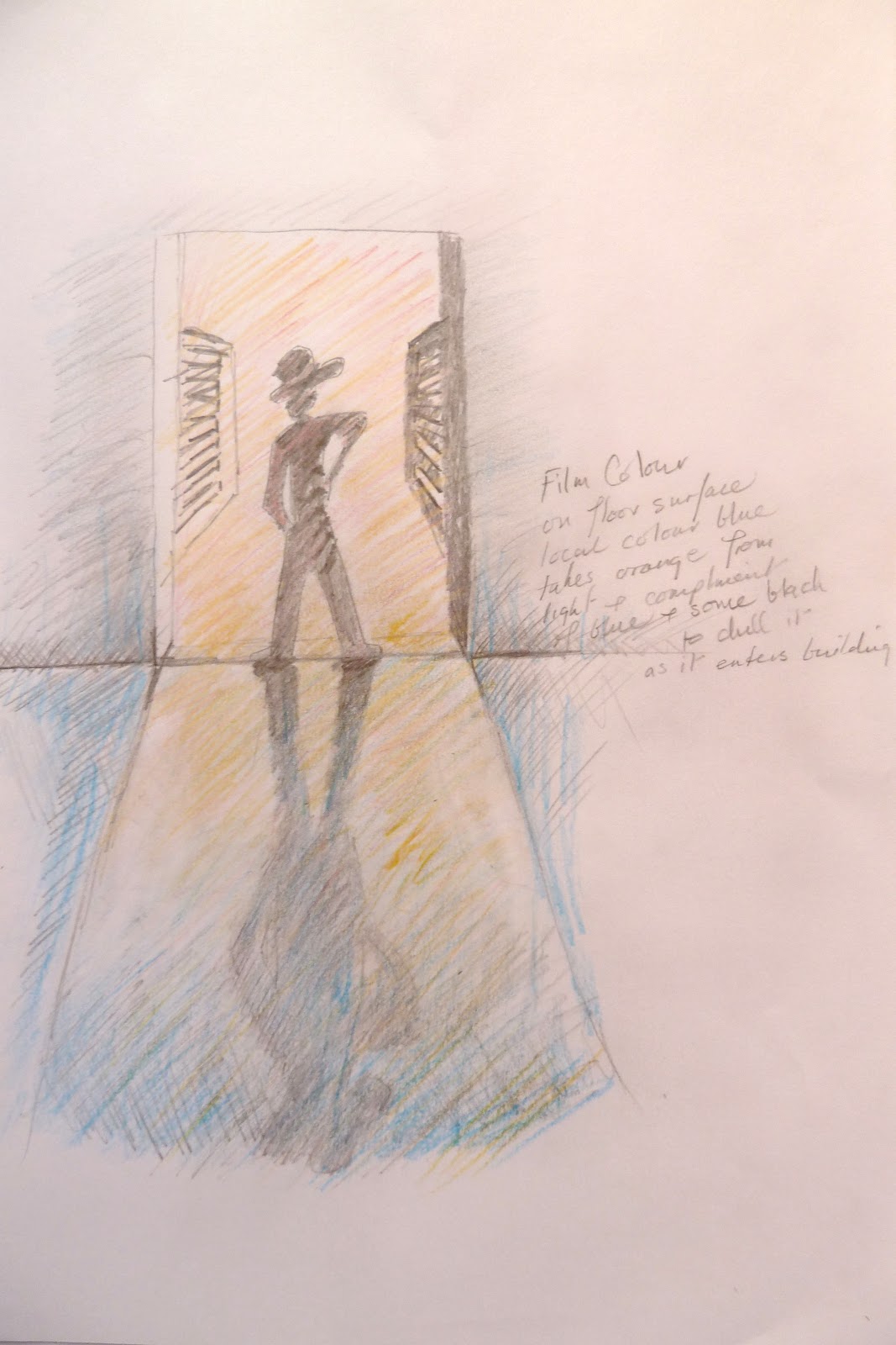
Albers, Joseph: Interaction of Color, Yale University Press, 1963 revised 1975
Feisner, Edith Anderson: Colour, How to use colour in Art and Design, Laurence King Publishing, 2006
No comments:
Post a Comment